TYPEFACE OF SAM
ALPHABET SOUP

ADDED INFORMATION
DESIGN SPECIFIC:
Prefers Upper Case to Lower Case.
Sans Serif rather than Serif.
Has nice handwriting.
Takes time over pencil drawings to ensure detail.
Clever design/Interactive design/Hidden meanings.
Bold and often simple designs based on shapes and colour.
PERSONAL:
Originally from Hull.
Mainly eats and sleeps.
Almost nocturnal.
Enjoys riding his bike.
Does not have Facebook.
Like to watch all kinds of films (peculiarly some Spanish films).
Listens to Indie Rock Music. (e.g. Black Keys, Alt-J, Wu lyf, We are Augustines, tame Imparla).
MY THOUGHTS:
At first I thought Sam seemed quite a quiet person, However,after our conversations I think his is very easy to talk to and have a joke with and he just has a very laid-back, down to earth personality. He seems content with himself and ,although quiet, shows confidence. Even though Sam is a very laid back individual I believe he is a hard worker and committed to his creative passion , even if most of his work gets done in the early hours of the morning!(Typical boy!).
A subject that also came up in our conversation was how much Sam's facial features and his hair style resemble of a Roman statue.
A subject that also came up in our conversation was how much Sam's facial features and his hair style resemble of a Roman statue.
I have also looked through Sam's blog to see what kind of Art & Design inspires him as an individual.
* * * *
MUSIC RECOMMENDATIONS
(TYPED INTO GOOGLE IMAGES TO SEE WHAT WHAT I GET FROM THEIR ETHOS)

(ALBUM COVER)

(ALBUM COVER)

(ALBUM COVER)

(SHOT FROM A CONCERT)

(ALBUM COVER)
* * * *
KEY ELEMENTS I BELIVE I WILL TRY AND FOCUS ON
BOLD SHAPES AND COLOURS.
LAID BACK.
A BIT GRUNGY ROUND THE EDGES.
(TAKEN FROM LISTENING TO THE MUSIC BANDS RECOMMENDED)
UPPERCASE - SERIF SANS.
DETAIL.
These are just vague, basic characteristics I will try and focus my typeface on. Detail and execution will come as my initial ideas develop.
* * * * * * * * * * * * * *
POTENTIAL TYPEFACES
(SERIF SANS/UPPERCASE)

POPLAR STD
ANJA ELAINE ACCENT
APPLE SYMBOLS
MANGLA MN

CAVIAR DREAMS
HARABARA
LEMONDROP
(I LIKE THIS TYPFACE BECAUS I THINK I COULD MANIPULATED THE BOLDER ASPECTS OF EACH LETTER SOMEHOW?)

LIMIT BREAK
MAJOR MINUS
SCIFLY
(I LIKE THIS TYPFACE BECAUSE SOME OF THE LETTERS HAD AN ANGLED HORIZONTAL LINE, SUCH AS THE A, THAT I MIGHT BE ABLE TO PLAY ON FOR THE 'LAID BACK' CHARACTERISTIC).

WIREFRAME
(I LIKE THIS TYPEFACE BECAUSE THE WIRE EFFECT GIVES SIMPLE YET BOLD SHAPE WHICH I COULD UTILISE)

THIN DESIGN
The brief states that we should use an existing typeface and manipulate this to create our personalised letterforms. Therefore I think i am going to experiment with a few of these fonts before i commit to a single one straight away. this is so the typeface i finally choose will enhance my ideas and aims more.
* * * *
* * * * * * * * * * * * * *
PROGRESS CRIT
12-10-2012
Before the group crit, I was struggling to come up with a theme for my typeface. I found it hard to choose which characteristic, hobby or likes that Sam has to base the concept of my typeface on. Because of this i presented the research i had done so far on the design style and music genre's Sam was interested in and explained the vague ideas I had.
After explaining what i think Sam's personality is like, the group agreed that basing my work on him as an individual rather than things he like would be the better way to approach the brief.
KEY POINTS
- Rather than using things that interest Sam (like music or certain design aesthetics) Base the typeface more on him as an individual and his personal characteristics.
- Do more experimentation on how you will create these letterforms. It may be that you just make subtle changes to a typeface to indicate the fact that Sam has a laid back personality back person.
- Maybe look into how the typical facial and hair characteristic of a Roman statue could be incorporated in to my letterforms.
MY THOUGHTS
I found the group crit very beneficial as it helped me narrow down the field of potential ideas and become more focused on what i want to do for this brief. Therefore i am going to focus my work on Sams laid back and relaxed personality along with his recognisable statue like features : )

(POPLAR STD)
Simple and subtle ideas to indicated Sam's 'laid-back' personality. Experimenting with different angles by keeping each letterform level but tipping the backwards then chopping off the bottom with a horizontal line.

 With his type of typeface were the ones are quite thin, I didn't know whether to leave each letter with an open bottom or to seal it up. Without lines on the bottom i think the letters could just look like they were sinking.
I am going to investigate this further through drawing them out.


* * * *
ROMAN FACE
To create a silhouette of a roman statue face I searched for the statue of Apollo that is displayed at the Vatican museum in the extremely historic city of Rome. I had seen this statue a few years ago when on Holiday in Rome and when i first thought of Roman Statue, this was the first recollection that popped into my head.
Simple and subtle ideas to indicated Sam's 'laid-back' personality. Experimenting with different angles by keeping each letterform level but tipping the backwards then chopping off the bottom with a horizontal line.

(CENTURY GOTHIC)

I am going to investigate this further through drawing them out.

CLOSE UP.

I printed and traced the 'A' letterform and experimented with the structure to display how the laid-back theme could be envisaged.

FURTHER EXPERIMENTATION.


Even though I liked the style i had come up with, when i tried to apply the same style to other letters, I did not get the desired affect. I think they just looked odd (the 'W' and 'K').
Because of this I have decided to stick with my original and more simple solution of just tipping the letterforms backwards on an angle.
I don't want to just settle with just having a pre-made typeface set on an angle because i think it is way too simple. I want my typeface to be very recognisable to Sam I have decided to also continue with the idea of simulating the features of a Roman style statue.
I don't want to just settle with just having a pre-made typeface set on an angle because i think it is way too simple. I want my typeface to be very recognisable to Sam I have decided to also continue with the idea of simulating the features of a Roman style statue.
* * * *
ROMAN FACE
To create a silhouette of a roman statue face I searched for the statue of Apollo that is displayed at the Vatican museum in the extremely historic city of Rome. I had seen this statue a few years ago when on Holiday in Rome and when i first thought of Roman Statue, this was the first recollection that popped into my head.


To replicate the shape of these strong facial features, I decided to use the pen tool on Photoshop to draw around the 'side on' view of the face.

I then filled out this shape and used it as a kind of mask in the side of each individual letter form.


After lining up and attaching the mask on to the letterform, i then tilted the letters backwards to continue with my initial idea. I experimented a little with each letter trying the face on different sides and contours until satisfied.


EXPERIMENTATION
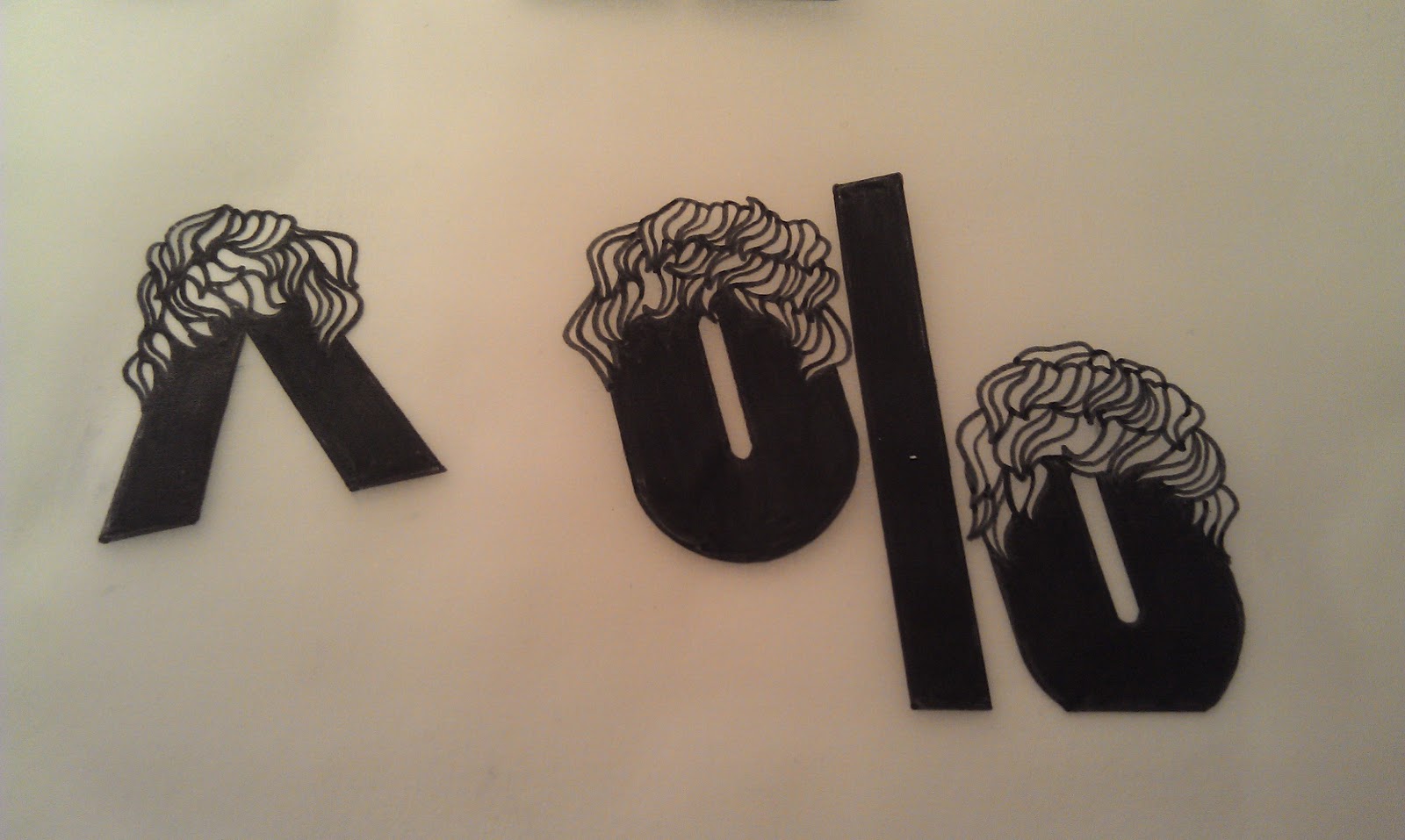
I thought as well as having the facial features of a roman statue I could also use the hair style. This could add a bit of range and diversity to the alphabet as a whole with some letters maybe having hair and other not.

LETTER FULLY MADE OF ROMAN HAIR


I didn't want my typeface to just look like a face had been slapped on the side of every letter. so through some swapping and changing I experimented with were the silhouette could be placed instead of doing the obvious. For example the middle stoke of the 'E' is indicated through the nose of the profile.


COMPLETE ALPHABET

* * * *
THE 6 GLYPHS
I could have carried on with the 'laid-back roman face' theme my alphabet has taken on but i felt i wanted something slightly different for the glyphs. I see glyphs as accents to the alphabet, so I am going to use this to my way of approaching these added feature. I have used the actual alphabet to represent Sam's physical appearance I think i am going to try and use the glyphs as a way of showing other aspects of his personality.
 |
| LIKES TO RIDE HIS BIKE? |


HE LIKE BOLD SHAPES IN DESIGN?
I tried to experiment with using bold shapes. The left '&' displays random shapes that I created with the various shape tools with the glyph placed over the top in white to simulate a type of stencil feel.
The right '&' follows the same method as the other one, however I used various triangle widths that are slanted at the same degree as the letterforms of the alphabet. I tried this to try and replicate the same angles in the alphabet and create that similarity but I don't think it is that appealing.
* * * *
While struggling to come up with glyph ideas i actually likes, I suddenly realised i could use the idea i had previously to use the Roman hair style.
It took me a good while to draw hair that actually resemble that of a statue. As well as making the hair look slightly tight and curly I also tried to make the each strand look a bit like they had been cut out of stone.


GETTING THERE
I looked at images on Google to help me work out the style of the hair as i don't want this feature to just look like 'normal' hair, I want it to be recognisable to the Roman statue style.
After finally being satisfied with the texture and the shape of the hair, I then scanned in my ruff sketches on to the computer and used the pen tool in the photoshop to trace over the original image.

After drawing around this patch of hair i then started to arrange multiples of it on top of each glyph. I did this by over-lapping layers, adding and deleting sections as I went to create a flow through the hair piece.


* * * *
COMPLETE ALPHABET WITH GLYPHS.

To lay out my alphabet and glyphs on to an A1 sheet I used Photoshop so i could utilise the guideline tool available. After measuring and laying out my page with individual boxes that ran symmetrical down the page (2 down each side for the letters) I placed my letter forms into these boxes. However when i cleared the guidelines the alphabet did not look lined up and even. I think this was because the letters are italic in a backward slant and also many of the letters differ in size to the others. Because if this i used this measured out version as a starting point and nudged each 4 letter line around until the layout and overall view of the page was aesthetically pleasing.
* * * *


* * * *
NAME BADGE
Because the letters in my typeface have features in each side, it was quite difficult bringing them together without it look bulky and awkward. Therefor I tried to play around with the size of each letter form to get them to fit better together.


I also tried putting the letters so close together that they merged slightly and even though this covered up some of the face on the A and S I think this just added to the subtle fell I was going for when creating the typeface.

THE A TALLER THAN THE OUTSIDE LETTERS.

LETTERS ALL THE SAME HIEGHT.
I like the letters being merged together and having each letterform at the same height. I then used the same technique as i did with the glyphs and layered hair over the name only covering the tops of the first two letters so that the face on the M was not hidden.

Because we had to present our alphabet in black and white, i decided to experiment with colour on the name badge.

Because the typeface is originally in black, I kept the letterforms the same on the name badge. When it came to the hair i used the mousey brown colours that Sam's hair is and tried to enhance the texture through different shades.
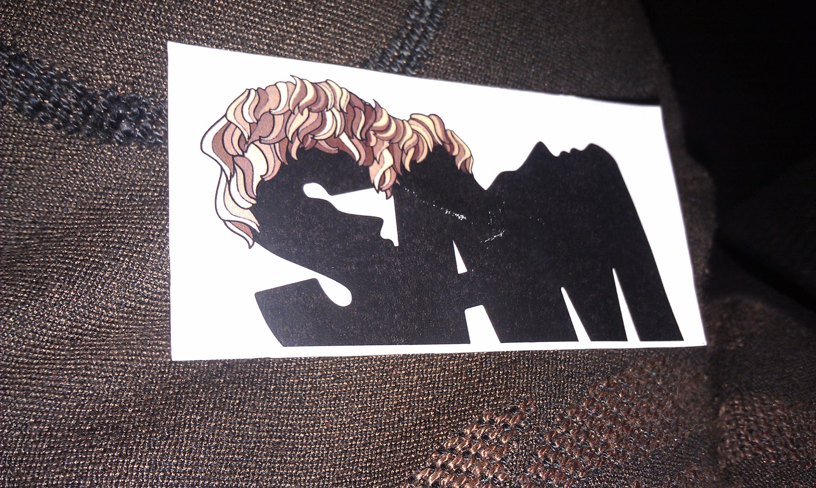
PRINTED NAME BADGE
* * * *
I found this quite hard as my typeface is pretty restrictive due to the unique features. Because of the strong male face on the letterforms the first thing that popped into my head was facial products for men such as shaving foam, aftershave or moisturiser.

The top design I think is the more successful one out of the two.
* * * *
No comments:
Post a Comment