1. What skills have you developed through this
module and how effectively do you think you have applied them?
|
|||||
I feel I have learnt how to
work through the process of elimination when it comes to research of ideas
and have applied them successfully when experimenting with my work. Through
workshops I have developed a better understanding on how certain software’s
work and now feel more confident when using them. Finding out more about
InDesign has helped me understand why it is better to use this over Photoshop
when designing with page layouts.
|
|||||
2. What approaches to/methods
of design production have you developed and how have they informed your
design development process?
|
|||||
Through my mistake of
creating page layout on Photoshop I now understand that I can utilise other
software more to gain a higher standard in the execution of my work. I understand
that using the library as well as using the internet is very helpful when
looking for ways to do things such a packaging. Researching thoroughly and
immersing your-self into your subjects helps you to think in new ways. This
has been very helpful when working on the Mafia subject.
|
|||||
3. What strengths can you
identify in your work and how have/will you capitalise on these?
|
|||||
I feel that I have gained
strength when it comes to the research of a subject as well as research on
how to create thing (boxes). I feel as though the execution of my work has
become stronger however I stll feel there is a lot of room for improvement. I
feel I am physically working better when making however need to remember to
document as I go. I feel that I can capitalise on this making process when
relying on research.
|
|||||
4. What weaknesses can you
identify in your work and how will you address these in the future?
|
|||||
I feel that my execution of
making id good however can be improved in the future. I need to remember to
document my process as I go with photos and updates on my blog. I would have
liked to experiment a lot more with stock and print, however lack of time hindered
this possibility. Towards the assessment process I was struggling to complete
my blog updates even though I had completed the actual product. This is
something I want to address in the future to avoid stress.
|
|||||
5. Identify five things that
you will do differently next time and what do you expect to gain from doing
these?
|
|||||
1.
Experiment with stock and other methods of print to experiment with different
outcomes.
2.
I want to start using the correct software when working with different types
of document to make sure that the best out come is reached and my work looks
more professional.
3.
Time management relating to my blog needs to improve to avoid a rush towards
the beginning of the assessment period. This will allow me to think clearer
and become more organised.
4.
I would have like to experiment with colour more in the future and experiment
with my ne knowledge of the pantone system.
5.
I would like to gain more knowledge on the materials that are available to me
such as card, fabric and other textures. I feel this would add a depth to my
work, making it more intriguing. Having this knowledge would be very helpful
in the future.
|
|||||
6.How would you grade
yourself on the following areas:
(please indicate using an
‘x’)
5= excellent, 4 = very good,
3 = good, 2 = average, 1 = poor
|
|||||
1
|
2
|
3
|
4
|
5
|
|
Attendance
|
✓
|
||||
Punctuality
|
✓
|
||||
Motivation
|
✓
|
||||
Commitment
|
✓
|
||||
Quantity of work produced
|
✓
|
||||
Quality of work produced
|
✓
|
||||
Contribution to the group
|
✓
|
||||
The evaluation of your work
is an important part of the assessment criteria and represents a percentage
of the overall grade. It is essential that you give yourself enough time to
complete your written evaluation fully and with appropriate depth and level of
self-reflection. If you have any questions relating to the self evaluation
process speak to a member of staff as soon as possible.
|
|||||
Thursday, 31 January 2013
Self evaluation (OUGD405)
Wednesday, 30 January 2013
Research Brief - Mafia (OUGD405)
7TH JANUARY 2013
OUGD405
RESEARCH BRIEF.THE MAFIA - INITIAL IDEAS.
Considering the research I have done on the Mafia and how I have narrowed this research the stereotypes of the mafia, I feel like I should focus on the aspect for the Studio Brief.
my initial idea was to create a mafia product that would be full of various bits of information. I also had the idea of having multiple boxes that people interested in the mafia culture could collect them.
The first product I thought about was a set of ten posters or booklets, one for each Mafia commandment.

EACH POSTER/BOOKLET.
A Mafia commandment.
A bit of terminology explained.
A mafia based statistic.
A weapon + explanatory diagram.
A stereotypical item of clothing or accessory.
A quote from a notorious godfather.
Because the Mafia are known to carry their guns in violin cases, i thought i could use this idea to distribute my product. I think that this would apply the same feeling of suspicion and intrigue to whoever would receive this product.
Because these boxes would be collectables I think it would come under the Packaging & distribution so they could be received through the post from various websites. i feel this would also add to the ethos that i am starting to feel my project would have in that these boxes are exclusive items for people that are knowledgeable and interested in the mafia. Therefor not having them in shops almost keeps them a secret, however people that are looking for this type of themed products would find it.
PRESENTATION PAPER FOR CRIT.
14TH JANUARY 2013

During this group crit I presented my initial ideas to see how they would be received. Feedback helped me to direct my project more as i had been worried on what I could do with the subject of the Mafia. I was told not to worry about audience because through the subject this had already been decided. I was also advised to ensure that what ever was to be put in my product included information graphics.

* * * *
At first I really struggled with what i could put inside the box to entice a customer as well as having information graphics running through out. I also didn't know whether i should have the boxes hold various bits of information on the mafia in general or make them more specific. I wanted something desirable within the box as well as having the feeling of exclusiveness, to do this i will have to make sure that what is in the box is not boring information.
After thinking about how i could distribute information on the mafia and how the stereotypes and maybe belongings they would have I came up with the idea of having 5 to 10 boxes each based on a Mafia member or Godfather. Each box could having information on the individual mobster and also various bits of information based on a stereotypical item of clothing, accessory, hairstyle and weaponry.
Through my research I found a few notorious Gangsters. However I had to be sure that they were based on the era were all of these stereotypes grew from (prohibition era). This helped me narrow down my choices even more.
MY CHOICES
MY CHOICES
- Charles Luciano 'Lucky'
- Al capone 'Scarface'
- Vito Genovese 'Don vito'
- Lester Joseph Gillis 'Baby-face Nelson'
- Vito Genovese 'Don vito'
- Lester Joseph Gillis 'Baby-face Nelson'
In the end I decided to do four boxes for collection. this will enable me to provide more in each box making each one as desirable as the others. I feel that if I make to many boxes, the novelty could wear off quite quickly and may also hinder the desirability of each box.
In each product i would like to present an object or objects that are connected with the mafia world such as accessories.


ACCESSORY OPTIONS/IDEAS.
- Cigars
- Lighter
- Bow Tie
- Tie
- Pocket square/handkerchief
- Pocket watch
- sovereign ring
- Trouser brases
- Pinstripe waist coat
- Whiskey
- Whiskey glasses
- Whiskey bottle stopper.
- Cut throat razor
- hair wax
- Shaving foam
- Shaving foam brush
- Brogue shoes (full wing tip)
- Driving gloves/leather gloves (leave no fingerprints.
- Rimmed hat.
As well as having A stereotypical accessory I would also like to include a type of weapon that the mafia are known for using. Im not totally sure on how I could present this but i would also like to include a diagram full of information on the gun to add intrigue and help to for fill the brief.
GUNS USED BY THE MAFIA.
- Thompson Gun 'Tommy gun'
- Shot gun
- Revolver
- Pistal / Handgun
- Machine gun
- Gatlin gun
- Assult rifle
- Machine pistol.
- Pistal / Handgun
- Machine gun
- Gatlin gun
- Assult rifle
- Machine pistol.
Because the mafia from around the prohibition era adorned very recognisable items of clothing, I think it would be a good idea to include some info graphics based on these specific items of clothing.
ITEMS OF CLOTHING.
- Suit jackets (descriptions on the various types).
- Waste coat
- Hat
- Shoes (Wing tip brogues).
- Bow ties (info on how to ties).
- Suit tie
- Braces
- Information on Pinstripe material, colours and styles (manufacture).

* * * *
My first idea was to have either an actual violin case that had been adapted to encase the various products inside. However I realised that whoever was to collect this serious of mafia based items would not really want to own 4 empty violin cases hanging around the house! Because of this my thought processes turned to the option of making a box from card that resembled the shape of a violin case.

I really liked the thought of the inconspicuous violin case, However I did feel that this almost playful approach may hinder the dark, serious and exclusive ethos I want my project to have. Because of this worry for a minute I thought about swapping the violin case for a briefcase however this idea diminished quickly to the same problem of the consumer receiving 4 briefcases.
After researching more on what types of containers are used for similar products to mine I decided that it would be better to just have a simple, corrugated and hinged box like the ones shown below.


ONE EXAMPLE FROM MY ADJACENT CRITICAL JOURNAL BLOG (DESIGN CONTEXT.
Before I could start to sketch and properly visualise the layout and dimensions of my box, I made sure that I know exactly which box would have what items in it.
To find out the most suitable items for each Mafia godfather I did a bit of further research.
I have decided not to add information on suits, hat ties and other clothing item because I felt that this would effect the 'hardness' ethos I am trying to create. I feel that having a diagram or information on an Item such as a hat will just feel a bit inadequate. If I had the financial ability to maybe include such items like a waist coat or rimmed hat and have them packaged with in this box in a unique way I could further experiment on how I could present this. However because I already have a lot to think about, don't have the money to buy such luxury items and feel that having a info-graphic on a boring image I am going to leave this aspect of my research out.
CHARLES 'LUCKY' LUCIANO
- When looking at images of him on various websites many of them show him indulging with various liquors, most likely whiskey.

.jpg)
ITEMS FOR THE CHARLES LUCIANO BOX
- Mug shot and background information.
- Whiskey Glasses (possibly a whiskey bottle stopper)
- Information on popular whiskey's such as a key or an explanation on the making of whiskey or how the different way in which the mafia managed to smuggle whiskey around the country.
- Shotgun diagram and accompanying information.
VITO 'DON VIT0' GENOVESE
Looking through photographs, Genovese looks as though he prefers to adorn a tie rather than a bow tie.

ITEMS FOR VITO GENOVESE BOX.
- Mugshots and background information.
- An exclusive tie (embroidered with entails or a possible logo).
- An old fashioned pocket watch.
- Information, diagram and instructions of the working of the pocket watch.
- Thompson gun (Tommy gun) diagram and information.
AL 'SCARFACE' CAPONE
Looking at various images of Al Capone, he is seen shaking cigars quite a lot.

ITEMS FOR THE AL CAPONE BOX.
- Mugshots and background information.
- Old fashion style lighter with instructions and information.
- Revolver gun Information and diagram.
(Even though I know Al Capone smacked cigars and I would be able to buy cigars easily, I am not one to promote a harmful habits. I am don't like smoking and the effects it can have on people. By not giving the customer cigars It does not directly imply to the customer that they should smoke.
LESTER 'BABYFACE NELSON' GILLIS

ITEMS FOR LESTER GILLIS BOX.
- Mugshots and background information.
- Vintage shaving brush, cut-throat razore and accessories.
- Information, diagrams and instructions on the shaving items.
- Machine gun pistol Information and diagram.
* * * *
OUGD405
GROUP CRIT.
JANUARY 15TH.
After presenting my more defined ideas and research second crit I recieved positive feedback overall. The opinions and suggestions received:
- Keep up with thorough testing of ideas.
- Start thinking about informational aspects of your boxes.
- Think about the arrangements with in your boxes.
During this crit I asked our tutor whether it would be possible to just concentrate on one of the boxes due to the short time period we had left to create and finish our products. I feel that concentrating on one box and giving reference to others in the collection will allow me execute one design more professionally than having to present 4 separate boxes of a lower quality.
* * * *
LOGO DEVELOPEMENT.
I started to experiment with the names an logos that could be used for my product. My first idea was to have 'the godfathers' for the name of my boxes. however I feel that this word is used a lot and is expected now. I want to make my product more original.
Through my research I have found out that the top mafia bosses of the Biggest mafia family names in the city of New York come together to form 'the commission'. I have also found that the name 'godfather' not really used in most recent times because of the over-exposure this now received. The more preferred name now is 'the commission'.
First I started with the idea of having 'the godfather' in a faint grey as if to imply it is in the shadows with 'the commission' at the fore front.


CF Dimond (grey) / Caviar dreams (yellow)


CF Dimond (grey) / Impact Label reversed (yellow)

Impact Label reversed - extra spacing.
I like this small typeface, because again it makes the name look somewhat inconspicuous. The small yet bright letters make each one stand out.


I feel that many having my logo on an upward bow to almost give the impression on a saloon type feel enhancing the vintage ethos.


I like the logo just continuing 'the commission' because not many people would know that this is what this is adding to the air of exclusiveness to those who do. I feel that having the logo in grey on a black background also adds to this. The yellow versions of the logos looked bit to 'piratey'

This is the logo I most preferred out of the experimentation. The typeface 'CF Diamond' has a vintage feel to it and feel that the diamond characteristics within the typeface replicate the symbols used in a pack of cards, which is strongly related to gangsters.
* * * *
BOXES.
Because my box would be posted, I went to the local post office a bought a decent sized box so I could start to physically visualise the package and its contents. The inside of this box measures 375mm x 247mm x 155mm.


Considering what I want to put inside this box, I don't think that it will be big enough. The box is also too deep which would effect how the contents would be presented when opened by the customer.

POSSIBLE BOX SHAPES.
In my head I imagine the contents of the box being reviled with a hinged lid. i also like the idea of having extra space on the inside lid of the box which would also add to the anticipation when opening the box.
I thought about just creating my own box however there wasn't anywhere practical I could get very large thick bits of card to make into the box shape I wanted.


EXAMPLES OF AVAILABLE BOXES.
I also looked on ebay to see if there were any corrugated boxes used for various packaging demands that I could just buy for cheap and modify. However they were all sold a batches and the smallest number of boxes I could buy was 10.
After struggling with my options and trying to figure out what to do, I looked around the house (in near deportation!) to see if there were any boxes that would be suitable for my project. Finally, I found a box suitable for modification.

* * * *
EBAY BIDDING.
RONSON LIGHTER
Through my research I looked further into Al Capone's smoking habits I found out that he owned various cigar lighter's at least one of which being a Ronson. At the time of Al Capone's reign on the Mafia world, Ronson was one of the most popular lighter manufacturers in the USA. As well as lighters the also created and sold many other accessories to do with the habit of smoking.
Originally, i was only join to use a old-style army lighter to display in my box and give to the customer. However after looking on eBay for such an item I was amazed to find many vintage Ronson lighters available to bid on second-hand.


EXAMPLE OF VARIOUS LIGHTERS AVAILABLE.
Some of the lighters on ebay came with the original boxes and information leaflets, however many of these went for quite high prices.
In the end I found this vintage Ronson Viking lighter that was made in 1952 (a few years after Al Capone's death). I liked the look of this lighter because it was simple yet strong in appearance. it also had a small Gold star on the front which gave me a very vintage impression.


I bid on this lighter and won is for £8.50 and was delighted when i received in the post a few days later.
* * * *
WEAPON IDEAS.


I wanted to display An object replicating the Pistol I found belonging to Al Capone (Design context blog), but I was completely sure how to go about it. At first I thought about making a paper model and looked on various websites for inspiration.
I liked the idea of having a model of a gun, However I don't think that with the time i have I could have completed something like this to the high standard I wish to present in my box.
Instead of having an actual model of a gun i came up with the idea of having a very vivd image of the revolver on a gun shaped box. I could then use this box to house inforgrraphics on the gun.
I decided to play around with the photograph of the revolver using photoshop.


I then experimented with the filter tool.


In the end I decided on the cutout effect and played with the clarity and nuber of colours present. i did this because I want satisfied with just having a normal photograph as the display, however I did want the page to be instantly recognisable.

I printed this image out on some regular paper and drew a simpler shape around the outside of the gun and played around and experimented with making this shape into a type of box.


I really like how this turned out and i defiantly want to use it in my box. However i think i will make the box first in black card and the stick the image on top. This will help the picture of the gun stand out more giving the illusion, when you first open the box, that this is a real gun.
* * * *
Now I have a few components to my product i could start to arrange them inside my box allowing me to visualise potential ways in which they could be displayed.


This bit of experimentation helped me build a firmer image in my head for what I want my final piece. I defiantly prefer having the gun on the right hand-side of the box, pointing inwards. This is because most people are right-handed which means that the gun is in the best potion to be picked up by the handle.
I started to create a new box from black card in the shape of my gun.


* * * *
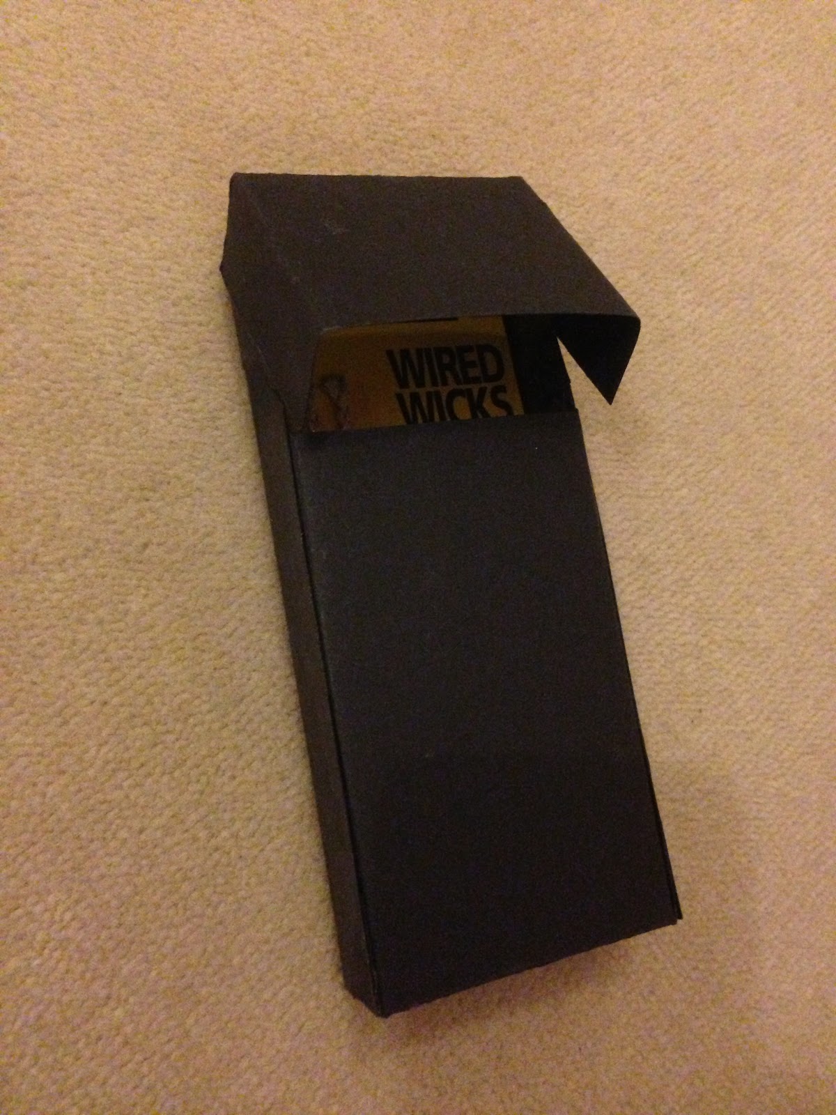
To accompany my Ronson lighter I decide to purchase some lighter fluid along with flints and wicks.

By having these items it gave me ample opportunity to explain what they are and how to use them through information graphics.
I made a box using the same card for the tin of lighter fluid. i wanted the box to have the same opening mechanism as the main box so I used the net for this but changed the measurements to accommodate the bottle.


I wanted to make a lable to go on the from of the box to indicate what was inside.


At first I created a complete panel to stick on the front of the box, however when I printed one out and added it to the box it just looked odd. i think this was because of the different textures of the card and the paper.


Instead of using a panel type label i decided to experiment with the idea of a sash to wrap around the box. i also realised that this would also help keep the box closed while packed.
I used the same colour scheme from the initial logo as well as using the same typefaces to keep every component uniform.

I arranged the box into a possible option for the finished layout to help me visualise again, however with the object I would actually be storing.
I really like how the sash for the lighter fluid box turned out and will create one for each of the items in the box to look neat and uniform.
* * * *
INFOGRAPHICS.
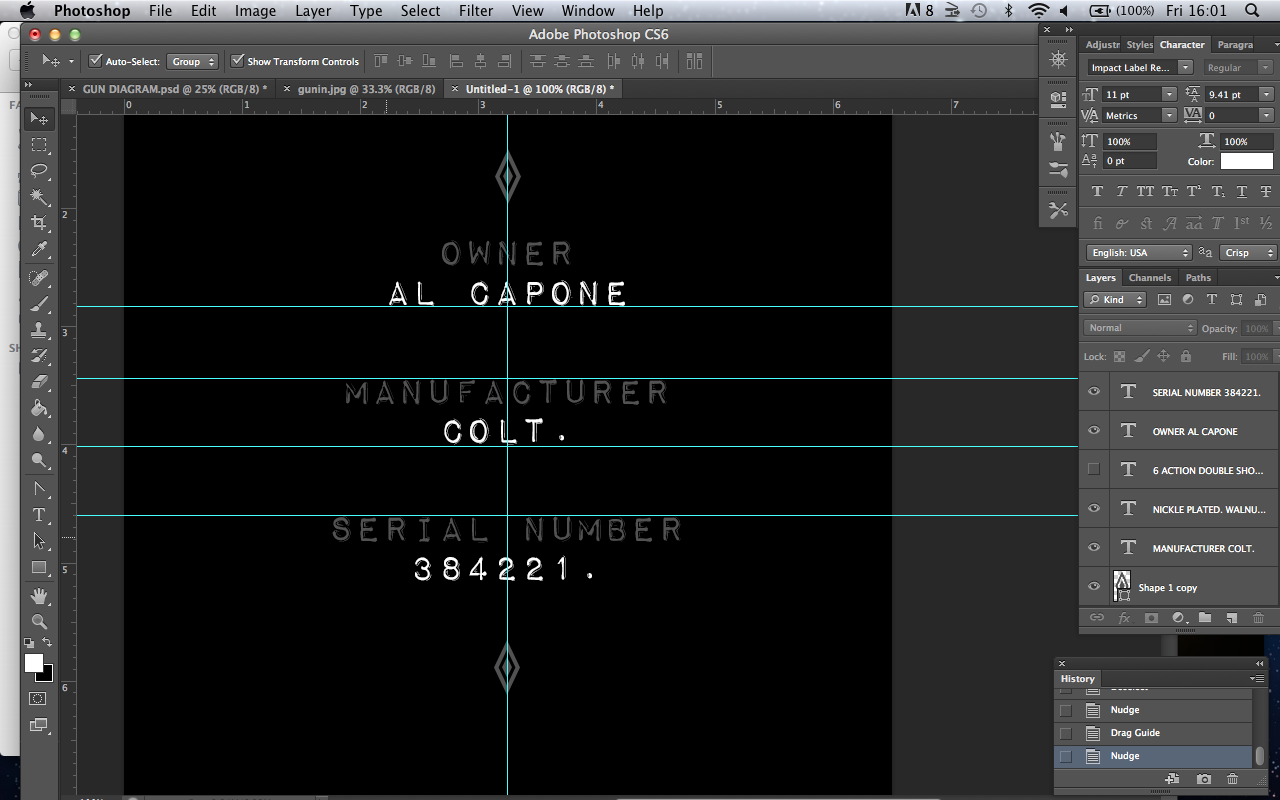
REVOLVER
To create a diagram for the gun I came up with the idea of splitting up the image of the weapon to individualise the different aspects of it.


While doing this i decided to make the metal bit of the gun monochrome rather than having hints of colour init. I felt that this made it sharper and uniform to the colour scheme.

Using a diagram I got from a specialised website (dc blog) I labelled and explained how each component works


After finding information on the Al capone revolver I decide to create an ownership card to go with the gun image and box. I feel that this will add a feeling of relation to the Famous mafia box enhancing the exclusive feel.


* * * *
INFOGRAPHICS.
LIGHTER.
For the info-graphics on the lighter I decided to use the same method i had previously applied to the weapon design.
8E9s4l8hsmBQ6b+m)Di!~~60_58.JPG)

First I adjusted the contrast and brightness of the original image and changed it to grayscale. I then applied the same cut out filter as i did on the revolver.

I then selected the individual components of the lighter and displayed them around there outlined image (created by the pen tool).


I dis-assembled the lighter slightly to take pictures of the bits that have to be removed in order to refill the lighter.
I used the same effects on photoshop on these images as i did on the lighter and the gun.


Options for the heading of the instructional paper.


(SPELLING WAS CORRECTED BEFORE FINAL PRINT)
I added the uniform lines to the top and bottom and made sure the page was balanced.
Because this bit of paper will be folded in half to fit inside the box, on the back I kept this in mind. This page is for the back of the first diagram.


* * * *
INFOGRAPHICS.
AL CAPONE - BACKGROUND.
To accompany the background information I took original mugshots of the gangster for the internet and played with them in a similar way i did with the gun and lighter image.


I then created a page the same size as the lid of the box and started to arrange information around it.


'Capone’s life of crime began after he was
expelled from school at the tender age of 14.
He started hanging around mobsters while he
worked odd jobs around brooklyn becoming
familiar with the notorious ganster johnny
torrio who eventually was concidered capones
mentor. he gained the notorious nickname
‘scareface’ after an insident while capone was
working at a saloon bar. It was said that
capone inadvertantly insulted a woman and was
attacked by her brother as a result. he was slashed down the left side of his face. in later years capone
would hire this very same man to be his bodyguard.
He moved the city of chicogo in his early twenties taking advantage of the cities coastal location
smuggling illegal alcoholic beverages into the city during the prohibition era. he also took part in
various other criminal activities such as bribery & prostitution.
On december 30, 1918, capone married mae josephine coughlin, who had given birth to capone’s son (albert
francis ("sonny") capone). the young gangster’s parents had to consent this marriage in writing as capone was
under the age of 21.
Despite his criminal occupation, capone was seen as a very reputable man becoming a popular public
figure. he made multiple donations to different charitable institutions & events using the money he made
through his organised criminal activities, this gave him a repuation as a "modern-day robin hood".
however capone's public reputation was tarnished after many acustions of his involvement in the 1929
saint valentine's day massacre, where he was said to have ordered the shootings of seven rival gang members.
After his reputaioin had been tainted, federal law offices started to investigate capones movements in an
attempted to find violations they could convict the mobster on. in the end capone was arrested and charged
with tax evation in 1931. he was sent to federal prison and was also tempararily incarcerated with in, the
then-new, alcatraz federal prison. capone's control and interests within organized crime diminished rapidly
after his imprisonment.
On january 21, 1947, capone had a stroke & even though he regained contiousnous and started to make a
recovery, he contracted pneumonia & he suffered a fatal cardiac arrest the next day. on january 25,
1947 al capone died in his home, surrounded by his family, and wаs buried аt mount carmel cemetery
(illinois, usa).'

* * * *
BRINGING THE BOX TOGETHER.

Testing the visuals

To hold the ownership card to accompany the gun I decided to create a draw box.
To hold the flints and wick I made a cigarette type box to enhance the smoker feel. (I forgot to take a picture at this stage).
To hold the lighter I already had an old jewellery box that i modified by spraying black.
Lighter box.


Ownership card box.


Lighter Fluid box.


I added blocks of car inside the box to hold the tin still while in transit.

I made each box a sash each with the commission logo on it as well as what it inside the box. I created these in the same way I did with the lighter fluid design to insure consistency.


Through previous testing I gathered exact measurement to which each sash had to have. I used this in formation to create the sashes on photoshop so they can be then cut out on the guillotine and wrapped neatly around the box.


After looking through a few more options for the arrangement in the box I finally decided on what I felt looked best
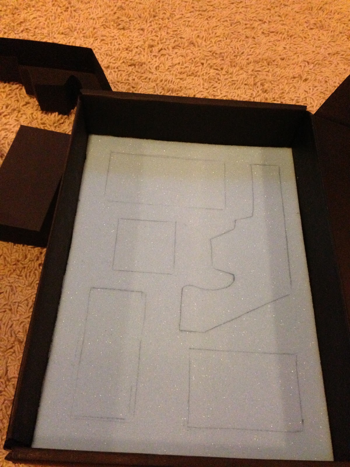
To have all these these boxes will have to fit in my box. To stop them from rattling around i decided to se them in some upholstery foam. To do this i set out the boxes in my preferred arrangement and drew around them. I then cut these shapes out.
As well as using foam for the boxes with in the box, i used some left over foam to do the same thing in the lighter box. This enhances the presentation.


I used the same black spray paint from the outer box to cover this foam. Having it black makes the lighter stand out a lot more.
* * * *
FINISHED PRODUCT.


Instead of using black again to colour the foam, at the last minute, I decided to soften the appearance slightly by spraying the foam great. I felt that having the foam a lighter colour would enhance the individual boxes more as they differed in contrast.
* * * *
EVALUATION.
Personally I feel that the outcome of the project was very successful. I feel the colours scheme and layouts along with language used creates the ethos I have been striving for. The only hang up I have on this work is some of the boxes opening mechanisms are a bit shaky and sometimes get a bit stuck, however I know that If I had time to do this again I would have re-mad the boxes with thicker card. I would also have added more sealing flaps In the template to stop the car warping slightly when glueing. I would have also liked to have experimented with screen printing on the actual box, However i don't know whether I would have used it as i think that the box not having anything on it adds ti the inconspicuousness of the package. I feel that the ownership card box looks a bit naked, so I would like to make this box a sash to just to keep the appearance consistent with the other items. The reactions and feedbacks I got in the final crit were overall positive which I was very pleased about. The only slight observation was again related to some of the boxes and how they opened.
Subscribe to:
Comments (Atom)