Because I commute from home, I though about basing my project on students that also do this. When first starting at collage I know that people that live at home and commute everyday did feel a bit left out as many of the student in halls were living together and spending tie out of collage with each other. However I didn't feel as though I would have enough material to make an in-depth and successful product.
The subject of organisation kept creeping up in many section of collage life. Keeping organised through out these section helps to make life easy and aids you in being a successful student and Practitioner.
WHAT NEEDS ORGANISATION:
COLLAGE
Equipment
Paper work
Individual Module work
Blogging
What to bring in each day
Production of work
Time keeping
Hand ins/Deadlines
HOME/Living away
What to bring from home
Time Keeping
Food shopping
Storing food
Washing clothes
Keeping tidy / Storing work
Rent
Budgeting
HOME/Commuting
Travel Passes
Budgetting
Storing work
Carrying work
Time keeping
These are a few things I though about when thinking about what can and should be organised. Even with in many of the subjects there are sub-catagories that can be organised in greater depth.
I started to write down and document what I thought first years of Graphic design should be aware of as well as basic objects and products that are seen as essential to have. Having these things could help prepare and organise these new students which in turn should make there lives easier having less to think about.
Even though I know what the essential food items are, i think that they can very between people and often students have different opinions on what they think is a basic essential.
Because of this I posted a question on Facebook asking what are the essentials on there weekly shopping trips.
After asking fellow students what is in there essentials shopping list, i came up with food lists of bare essentials that you should have in your cupboard.
As well as food i asked what they bare essentials were when it came to home equipment as well as cleaning things that you should remember as they will be very useful when living independently for the first time. some one else had also posted a similar question over Facebook, so I also used this as a reference. If I had asked the same question I think that this would have just annoyed people!
Another issue brought up was certain things that people missed once that had moved in. Thisngs to decorate there new space as well as things to help them feel more comfortable. i thought that this would be a nice touch in helping people move in to accommodation.
To be successful on the course its is very important to be organised through out. I started to list the different things that need to be organised to get th most out of your work and the course is general.
This obviously included the equipment we should have and a bare minimum to get by as well as what we should have when coming from home and the different documentation we should keep with us. I felt that this also regarded tie keeping and the different tools this can take form in.
Because all of these categorised things were objects, i liked the idea of working with them through visual photographs. Because my project is all about organisation, I wanted the format of my product to comply strictly with this theme.
Through research (shown on Design Context) I really like the idea of arranging these items in a strict organised fashion through photography.
this is something that i have previously experimented with on my Foundation corse and I know that when done well can be very aesthetically appealing.
In preparation for the first crit of the brief, I created 3 design sheets displaying the concept, production and method of delivery for my idea.
After categorising the different aspects of collage life that can be organised, my initial idea was to have separate booklets to house each bit. One for collage things, one for food and one for home life. As well as having actual items i also had a few ideas on other related information that could be added.
FOOD
local sandwich shops
Tips on cooking
Tips on freezing food
Tips on storing food.
COLLAGE
Locations of useful workshops for Graphic Designers
Tips on blogging
Suggestions for blogs and websites
Different tutor contacts
HOME LIFE
Booking trains, transport
Storing and looking after work
* * * *
GROUP CRIT
22ND MARCH
Unfortunately due to averse weather conditions, I could not travel into collage. This meant that I could not take part in the crit. After speaking to a tutor its was suggested that i show some of my peers my design proposal sheets to see how my idea was perceived.
I feel that I had a lot of material to work with which in turn allowed me to really follow through with the organisation theme.
I started to the think of specifics I could visualise in ways which represent organisation.
As well as actual physical items I could photograph, I also started to think of a format to which my product could take.
* * * * * * *
DESIGN SHEETS
I started by drawing the inside of a fridge thinking about how this space could be arranged and photographed.
This allowed me to look ate what format my book could take as well as whether it worked better as landscape or portrait.
To help me visualise these sketches I took some photographs of my fridge to see the different compartments and what was stored were.
I also asked one of my friends who lives in student accommodation to send me an photo of his shared fridge.
As you can see its pretty messy which is usually quite normal for young people who have to share this space.
Because this is such an un predictable arrangement, it has put me off trying to organise this specific piece of information. i think that if i start to tell students how the should clean and organise there fridge i will start to sound like their mothers which is a big turn off!
I started to sketch the main categories i had previously come up with so i could start to visualise how i could arrange and place each thing.
As I was drawing I started to realise that I can't really get anywhere by sketching these possible layouts because I cannot judge the size of each item. with my previous sketches of the inside fridge, this has given me an idea of how i could set up pages as well as possibilities in type setting.
I feel that it would be a waste of tie to make design sheets for something that isn't a set thing and i feel that i would benefit more just diving straight in and photographing and arranging these items until i get the best outcome for each.
* * * *
BOOK COVER IDEAS
My initial idea was to have the heading of the front cover simply stating the work 'ogansised' i feel that this is abrupt and straight to the point (like the course its self).
When the word organised is displayed on its own, I feel that it is naming the book. So it is stating that everything in the book is organised.
However when a question mark is added to this word. I feel that the emphasis is directed at the person reading the book. I like how this almost challenges the student asking whether they are organised and how the book has a kind of hierarchy.
I looked up the dictionary definition of organised
organised past participle, past tense ofor·gan·ize (Verb)
Verb
- Arrange into a structured whole; order: "organize lessons in a planned way".
- Coordinate the activities of (a person or group) efficiently.
|
|
I really liked using this definition of the word organised because i feel that it emphasises the importance of what this term means with in this course. I like how the multiple explinations help to drill in the term and. Looking from the point of view I now have as a first year about to move on, I feel that this almost obsessive approach to displaying the term organised will not be fully understood by the new first years as the have no idea what they are in for and that they will only truly realise the importance of being organised. Because of this I think that this may stay with the new students as they slowly realise the importance of being organised through out the year
I started to experiment with how each of the individual books could work together as a set.
I started to play around with patterns. I feel that arranging simple shapes to assemble a pattern represent the action on organisation. i feel that having something graphically illustrated also stays with in the Graphic design field.
I also like the journal feel and almost gives a sense of strictness which leads to a unsuspected content
* * * *
GROUP CRIT
12TH MARCH
I took all my design sheets and concept boards to this crit and explained:
- I wanted to make 3 individual book (food, collage, home)
- I wanted to work photographically
Overall I received positive feedback from members of the group. They liked the fact i would be working photographically and were excited when I showed them imagery and blogs that follow the same idea I am wanting to pursue.
It was suggested that:
- i should consider what type of binding I want to use.
- Consider small added bits of information that correspond with what I have already got.
- Keep in mind printing when it comes to time management.
- Include a poster that could guide students.
* * * *
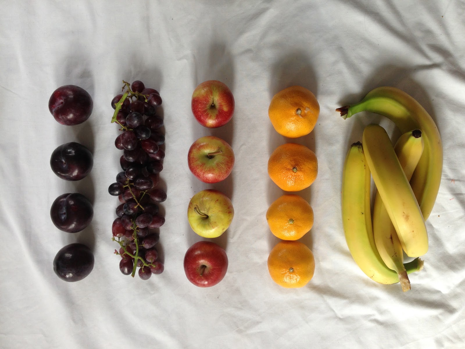
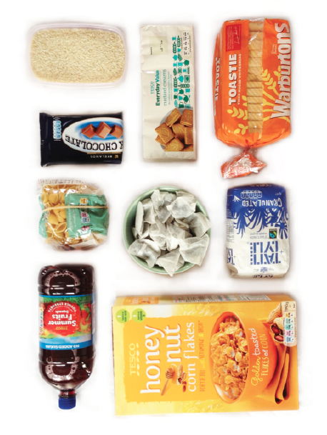
ARRANGING CATAGORISED ITEMS.
To truly start to understand how i could go about arranging and displaying my categorised items i just had to jump right in. To do this I laid out a white bed sheet in a well lit room and started to arrange the different items. This means i can then adjust the photographs using the photoshop software later on.
(Even though i would have loved to, it was not very practical for me to bring all the food items and home products into collage to use facilities available. i have to travel in on the train which hindered my chances of getting so much into collage and have it in reasonable enough condition to photograph).
FOOD ITEMS.
Cupboard arrangment
Sauces arrangement
Vegetable arrangement
Tinned arrangement
Fridge arrangement
Fruit arrangement
Freezer arrangement
While I was working with the different food items, I started to think about what these items could be. in previous brain storming i had though about including basic recipes, however while taking these images I thought to my self that I should have recipes that are made using the items in the photos so that these essentials are justified.
Obviously these items are not exactly what students should have, however it is a guide and i feel i should elaborate more on how they can be used.
I experimented a little with this concept using a chicken salad recipe. Even though i like the way each component is sectioned off, i feel that this setting is too informal and does not suit what i have done in my previous images.
I started to think about all the recipes that can be made using the essential items i have stated.
- Tuna, pesto, mayonnaise and pea pasta.
- tuna potato cakes (with a side salad)
- Chicken and cheese omelette
- Cheese and tomato omelette
- chips and fish fingers (with side salad)
- chicken and vegetable stir fry (with plain rice or egg fried rice)
- Baked potato and beans
- baked potato and tuna with mayonnaise
- tuna salad, chicken salad, cheese salad
- potato, carrot, onion and chicken in tomato stew.
- chicken curry with onion, tomato and rice
- chicken, cheese and pesto sandwich
- tuna mayo sandwich
- cheese salad sandwich
- fish finger sandwich
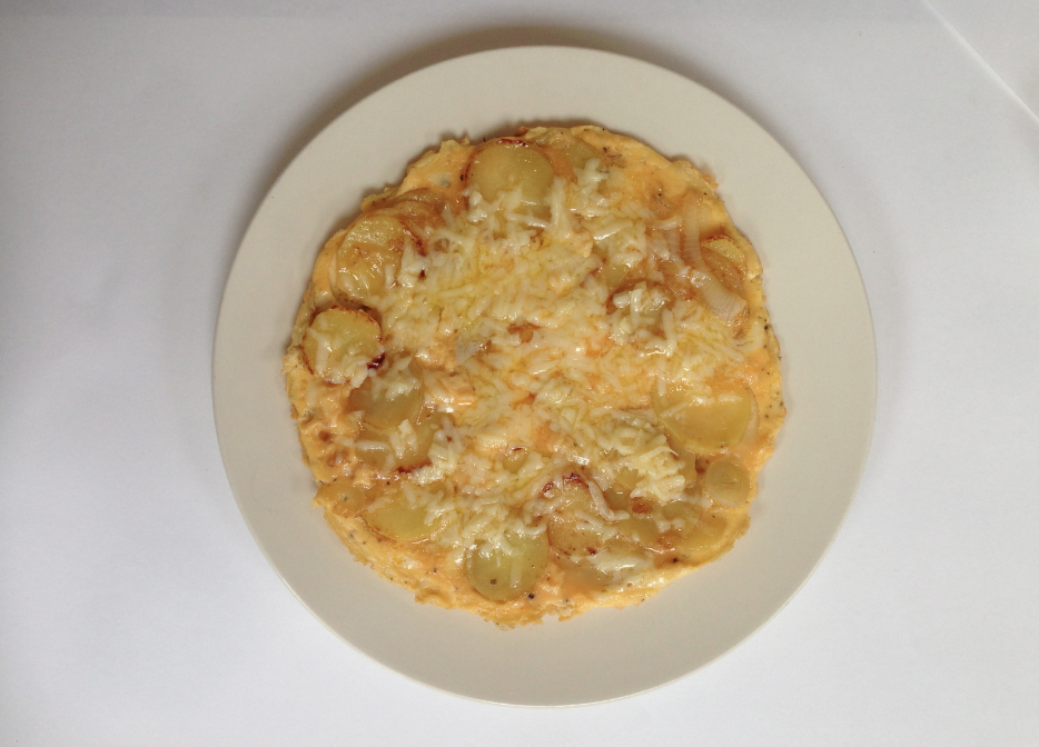
- Potato frittata with onion and cheese.
- Beans on toast
- cheese on toast
- soup and bread
- potato salad with onion and mayonnaise
- tomatoey rice with chicken and potato
- Fruit and yogurt
- cereal and milk
- bananas and chocolate
- banana and chocolate sandwich
- apple and cheese sandwich
These are recipes I thought of which could be made form the food essentials. I'm sure there may be more!
Because I would not be able to make all of these recipes in such a short amount of time, I have decided to narrow them down and choose five which can be displayed in a photograph.
I decided that i should make the recipes, yet take images of what is in the recipe as well as the process of cooking and the finished product. By doing this i can choose images for my book showing the most suitable arrangement.
TUNA PASTA
COMPONENT IMAGES
POSSIBLE ARRAIGNMENT OF OF PASTA ITEMS
STAGE OF BRINGING RECIPE TOGETHER
I really like the coming together images of this recipe and how the sae display is just added to through out.
FRUIT AND YOGURT CRUNCH
FROZEN BANANA
POTATO FRITTATA WITH ONION AND CHEESE.
CHIKEN, CHEESE AND MAYO TOASTIE
* * * *
HOME LIFE
These items include this for cleaning as well as things to help a new university student settle in after moving out for the first time.
KITCHEN EQUIPTMENT
CLEANING PRODUCTS
TOILETRIES/BATHROOM
COLLAGE LIFE
Things that apply to collage life and make our study life easier as well as helps to be successful. Many are basics that are simply standard every day at collage as well as othe things you may need to remember.
TIME KEEPING
This was quite a difficult picture to take because of the laptop screen. But i wanted to get it in somehow to show e-studio.
COMING IN TO COLLAGE
DOCUMENTATION
this was a tricky subject to layout for a photograph. because i wanted to have the laptop as a part of this image to show the blog, holding the laptop and taking the image was quite difficult. I took some images of the webpage on its own so i could see whether I could make this section into a double page spread with the computer on its on page. This is something i will play with later on.
EQUIPTMENT/PENCILCASE
SIGNING IN AM/PM
I did think about taking one of the sheets down and taking a full square on shot of the paper. However when looking at them on the notice board i felt that leaving them up there to take the photo would give a more recognisable appearance as they have been kept in there original location. Im not sure how I will be able to have these images on a page, but this is something i will experiment with when the time comes.
AVAILABLE FACILITIES
Because my book is almost fully based on photographic information i wanted to do the same for this slightly different approach of displaying what king of facilities are available to Graphic design students. After wondering around and taking these photos I was not happy with the images as the do not really show consistency with my concept.
I thought that having the image of these doors would make them more recognisable to were they are in the building however this is not that case
I even tried using the histogram app to spark up these images making them look more interesting, but i think this still isn't what i was looking for when i thought of the idea. i might just have to use text to explain the facilities available specific to graphic design students.
* * * *
After choosing photographs that were the most even and aligned. I used the photoshop software to brighten and enhance the images. This enhances clarity as well as giving a professional feel. I also used the eraser tool to soften the sheet in the background to give the impression of a lightbox.
Here are the chosen photographs and their book ready versions.
HOME ESSENTIALS
COLLAGE ESSENTIALS


I am very happy with how these images came out. Even though it took many many hours I feel that the arranging and re-arranging and the photoshop touching was worth the out come I have now.
* * * *
Now I have the categorised images sorted i started to play with them on indesign to see how I could apply them to a double page spread.
I tried spreading the image over the centre line with large headings aligned down the opposite edge on the corresponding page.
I try offsetting the larger type slightly, tilting it to the left. i also did this the image o the opposite page to give the impression the content was running up the page.
i kind of like this layout however I think it is to much, especially when the book is going to be a mailer scale to fit the theme of a manual.
i want the image to be the main focal point so i have to be careful not to distract from the image bay laying it out in a complicated spread.
I like the basic straight forward layout here. The image sitting in the middle of the page enhances the organisation of ite and the type is small and subtle so as not to distract from the image
I tried overlapping the image over the centre crease making the photo larger. I think that having the image like this will hide a lot of the image which i think will spoil the ethos i am going for.
I tried multiple layout of type layouts to go with some of the experimental image layout.
I like having the image square on the page with the numbered text. the smaller lettering is the list of food items shown on the page opposite. i applied this layout to multiple items to see how they corresponded with each other.
I also looked at portrait versions of these pages. i feel that having a portrait book would suit the appearance of a manual book better than a landscape one.
* * * *
CRIT - 22nd April
in this crit i presented
- my images
- possible stock examples
- and a question on whether i should make my initial three books into one large book.
- Ask about the size of my book (13 / 15 cm) shown in printed form at the tutorial
(This size was a initial measurement I had used to simply visualise my book and the page layouts).
during the crit it was suggested that I should make a single book rather than three small. this way the books won't get split up by an un-tidy student. It also confirmed my worries to which the home book would be to small to have as single booklet.
I also showed my photographs which had been printed on multiple stock to see which would be more suitable for the imagery as well as type. At first most people suggested i use the 'antique white' stock as its texture and off colour gave a friendly feel.
I asked whether I should display my book pages as landscape or portrait. Most people said that they preferred the portrait version to the portrait which is something that I had already started to prefer.
After deciding to have one book with devisers, I asked about the ordering of each section and we all agreed that having the larger food section in the middle would keep the book balanced.
It was suggested that I should look at either 'Coptic stitch' binding or Japanese binding as it was realised that i would have quite a lot of pages and a saddle stitch or staple technique may not be suitable.
After the crit i looked closer at my stock examples.
Here is a close up of the antique stock. As you can see, the edges of each image is blurred due to the ruff texture of the paper.
On images that have orange and yellow tones you can see that this paper plays with this making the yellows in the objects almost look luminescent. Even though I do like this stock I feel that it is not suitable for many of the images in the book.
I tried Bulky news print and cartridge paper because these stocks are lighter however are still a little off white.
I like the texture of the cartridge stock however this also hindered the quality of the image as you can see below.
i preferred the Bulky newsprint because it still had a softer feel as it is off white and it also had a hit of gloss which helped to enhance the photographic images. An example shown below.
* * * *
After my crit I was more decided on the layout.
each image will be accompanied with a list of what is shown in the photo and there are also small pointers on underneath the list that give tips on things such as how the items should be stored and how they can be beneficial to the readers diet.
the large numbers indicate the each new category with in the three main categories. the subheading for each page will either say foo essentials, home essentials and college essentials. The specific items are the indicated through the bold lettering underneath.
Through research shown on my context blog, I have decided to bind my book using the japanese binding technique. this is because it allows the pages to lay flat. Because there are going to be many pages I feel that this technique would be more suitable as it can suffice multiple sheets at a time.
I have decided that my book will be 14cm by 16.5cm including the margin designated for the binding. This means that the visual page size will be 12.5 by 16.5 cm.
I set up my document in indesign with the page size. i then added in guide lines that indicate were the biding will be sso i don't place any content somewhere were it would be obstructed.
Once I added the inner binding margins I then added in a guide line that shows were the middle of the page is regarding this margin. This is so all my images are aligned to the centre.
I started adding in my chosen style and layout of content.
COLLAGE ESSENTIALS
After struggling with the images I tested for the available facilities section, i decided to just have portions of text that show the name of the facility, the location in the building and a short description on what the facility includes and why they are beneficial.
FOOD ESSENTIALS
while cooking the recipe examples I really liked the step by step like flow the photos had. I wanted to have this as the display for possible recipes. this means that the cooking process will flow from left to right. I used the same style of type to head the page showing what the page is about and what is being made. i decided to only have this text because the images speak strongly for themselves and I don't want to treat the viewer as if the are stupid.
With the frozen banana recipe I had trouble arranging the images on the page due the the odd shape of the bananas. i took me a while of juggling about the content until i reached an aesthetic i was happy with.
I feel like this little section were the recipes are shown breaks up the book a little bit and interjects an air of fun with in a book of strict guidelines. I also think that these recipes hold an air of relatability that others can be drawn to.
HOME ESSENTIALS
I wanted to end the book with the comfort page as it finishes on a softer note that students can relate to considering living away form home.
* * * *
FRONT COVER
& CATEGORY DIVIDERS
I had already played with a few idea a few weeks ago and I knew that because I want the book to look similar to a kind of manual that it would have to be minimal. Because everything inside id photographic I also think that having the cover plain keeps the book looking clean and professional as well as having an element of surprise once it is opened.
I want to incorporate a bely band to keep the book closed and hep protect it.
In previous week I had played with the idea of using a pattern as simple decoration to the book. I also feel that a pattern in its self shows a sense of organisation.
I preferred this triangular pattern compared to the others I had tried. I created the pattern using illustrator and made sure that it all lined up correctly.
I started to experiment with colour, however I realised that i will have to take into consideration the devisers that will be part of the content. these will definitely be coloured but I don't want them to clash with the outside cover. because of this I looked at possible divider designs before I could choose a cover.
I really like these very simple yet structured designs however i feel that they do not look constant with the content in the book.
I decided to use the same number style used in side the book to label the section. I then played around with some colours to see which colours would run well together.
Because I a using bright colours with a pattern on the dividers inside the book I feel that it is best to have a simple, plain colour with a suitable belly band.
I feel that a lighter grey colour would be most suitable and would remain consistent with the colour of the type with in the book.
I decided to get rid of the pattern completely on the front cover and in stead added it to the belly band feature. This uses the patted and a accent making it easier on the eye and reframes fro clashing with what is inside. I made the title separate on the sash so the book and the sash are a definite pairing that have to work with each other to make sense.
I have decided to used these three colours as the divider pages and the are all lighter shades.i used the guideline tool to mark off were the margin would be to make sure the my text would not over exeed the length of the visible page.
The dividers and the front and back cover will both be printed on cartridge paper that is off white in shade. This means that the white in the design will come through as the stock making the colours and contrasts softer. i tested the printing of these features a few times to see what effect the paper would have on the printed colours.
* * * *
PRINTED MOCK UP
After printing ou my book on some cheap paper I used the crop and bleed marks to guillotine each page down to size.
I then followed the tutorial from youtube and bound my book using the japanese method. Once I got the hang of the flow of the stitching I found this technique easy and simple to do.
The only issue I have here is that I don't think i pulled the thread tightly enough through the book so the thread appears to look bait slack and wonky. However this is something i can defiantly address when working on my final book.
Other than the slack binding, the boo flowed well and functioned how it should.
* * * *
FINAL BOOK PRINT AND BIND
Template for the whole punch
Bulldog clip to hold pages in place
Measuring out the thread.
FINISHED BOOK.
I am very happy with how my finished book has tuned out. I feel that the binding has worked very well and the hit of the sash keeps the book consistent with what is inside. I think that the Bulky news print stock enhances the images rally well making the stand out. The cartridge paper adds character to the boo and works well as the clover and also with in the book.
* * * *
POSTER DESIGN.
Since it had been suggested in a crit, I wanted to make an accompanying poster to the ooh that would remain consistent with the photographic theme. The poster would be put up in the students flat near to their way out form the accommodation so it could be seen on the wy out. The poster will have what the student should have on them when they work out of the door and off to Uni.
It took me a while to organise everything however i managed to display each item with in the poster. I then started to enhance the image using photoshop as well as getting rid of some of the sheet marks.
when photos hoping this image I had trouble with getting the gaps white without string on to the image. This would then give the items in the image look faded around there edges. Because of this i decided to make the background of the poster grey (like th front cover of the book) This helped me shade in the shadows from the background better.
I the started to experiment with possible layouts of the poster and what could be written on it. I played about with the quotes 'are you ready' and 'ready to go'.
I think that having the poster slightly longer than an A2 size means it can be placed on the back of a student door so it can be seen on the way out.
To make the poster more uniform to the actual book I tried incorporating the pattern developed previously. I use this as an accent on the poster.
I also tried adding a list of stuff just like how the images are presented in the pock. I set this running along the bottom on the question heading. At the item of the page I added the same information that is on the back of the book 'leeds college of at, Ba (hons) Graphich design. Having this at the bottom makes the poster specific to that student as wiell as specifying the discipline.
POSTER FINAL PRINT
I really like the layout of my poster however the printing quality is lacking slightly as there are line running across the sheet. Other than that I think that this poster stays consistent with the book in the way of image colour scheme and layout. Having the poster slightly longer than an A2 fits the size of ann average door well.
* * * * * * *
EVALUATION.
Overall I am happy with the way in which my final product turned out. I feel that this portable hand-sized book would come in handy to students that are starting fresh on this corse. Knowing what to bring to collage along with recipes, shopping lists and home items are vital parts of being a student However are often forgotten or are made less important. This book is to help student build a base to which they can add and build on as they get more used to there surroundings and become a fully-fledged student at Leeds collage of Art.
One issue I did have was when I went to guillotine the other edge of my book in the specialised machine in the library. The blade would not cut all the way through the page and there were no staff on hand to help me. I spoke to the tutor about this issue as it had made the edge to my book un-even, However I was told that this wouldn't be an issue. I was annoyed at this as I had spent so long on making this book perfect when designing, cutting out and finishing. Other than tho I feel that i have fur filled the brief.
I have enjoyed working with photography and arranging the items neatly even though this was very time costuming. I would have liked to have used photo facilities at the collage however my commute to collage hindered this possibility. If I had the opportunity to do a similar project I would defiantly look into these facilities more.
* * * * * * *


