Monday, 30 December 2013

Responsive / Eshkim / Initial ideas & First crit

18 / 12 / 13
RESPONSIVE / OUGD503
ESHKIM / POMEGRANATE SYRUP.
INITIAL IDEAS.


I started by doodling some possible logo ideas. I liked the thought of having some hand-drawn type, however i feel that because the name is from a different language, the letters do not look right together, and i feel that the fact that it is unusual to see these letters together, this makes it more awkward for the english eye to read.


I really like the design that is just a cursive uppercase E. I think the roundness and the way it stands alone make it look strong and the crown shape over the top represents the crown of a pomegranate top but also symbolises the quality of the product.


I also adapted this again slightly because after a while it started to resemble a logo that may be seen as part of a hotel or resort.


I do like this design and to enhance more of a feel of a pomegranate, i used the typography decoration coming from the K to loop in a rounded shape which gave a hint of a pomegranate shape. I like how this is subtle and may not be distinguished at first but adds depth to the logo.

I also like this design as I feel it has a more traditional style with the ribbon. this could be further enhanced through digital rendering and also the way in which it could be printed.


Because I have been asked to keep the aesthetic one that appears modern and high-end I am thinking of working with a foil, perhaps gold to give the appeal of a quality. (This could work with the uppercase e logo as the crown could be foiled).

I feel that the shape of a pomegranate, from the outside, is pretty ugly looking so I kind of dismissed this shape to begin with as i felt it wouldn't bring much to the aesthetic apart from stating to obvious.


To me the inside of the pomegranate is what holds the beauty of the fruit. The seeds of the pomegranate to me look like gems, and the way in which they stack up and fit together inside the fruit is very unique.

I started playing with the shape of a pomegranate seed and playing with the concept of the seed being a jewel, making the juice/syrup taken from it as being valuable.


I took the basic shape or a pomegranate seed and played around with the possibilities.
I layered the shape numerous time to see what sort of pattern could be made however I think the that boldness of tho individual factor is a little too heavy to be used in this way.

Because I liked my previous idea of incorporating some sort of gold foil, I started looking at ideas that could use this.


 Because i started to look into working with this shape as a single piece for a possible logo. Similar to the sketch a drew up previously with a pomegranate shape, I drew up half of the ribbon, then to save time, duplicated this, turned it on its head, then attached it to the other end. This is so the ribbon is consistent and balanced.


I then started to add type.


I liked this typeface because of it simplicity and adding tracking to the letterforms also gives a strong and modern feel.


to symbolise purity and constancy of the syrup I added a droplet to the bottom on the seed so it looked as if it was juicy with the 100% in the middle of it.

After a while looking at this i couldn't help but think it looked a little gruesome! I realised the pomegranate seed resembled a heart in a way and the drip looked like it could be blood. Maybe a good logo for a butchers but this was certainly not suitable for the Eshkim product!

I decided to look at other options for a possible logo based on a typical pomegranate shape.

With in Turkish communities, many older males have moustaches as it symbolises manliness as well as some political reasons.


I felt by adding this to the pomegranate shape may add to the traditional ethos as well as adding a little fun. However I do think it resembles the Pringles logo a little too much.


A started to apply type to the different idea and imagery so I could show them in the up and coming crit to see what others thought of my ideas so far.


I experimented with the different type. I felt like the serif fronts worked a little better for the ethos am trying to create as the are the more traditional styles. i added a dark background because i liked how it made the vibrant pink colour pop. i also this that this pop is also a good way of representing the spike of flavour the product has. If I was to foil on this design, this would also stand out more on a darker background.


*  *  *  * 


GROUP CRIT

I presented my boards to the group, but stated that these are still in development as I am not happy with any of the outcomes so far.

FEEDBACK


- The pomegranate seed may not be the best thing to use as many people are unaware of what this is due to the lack of contact they have in the western markets to this type of fruit.

- the pomegranate seed and the ribbon design does look to much like a heart (relates to previous comment).


- The stronger aspects of my ideas are the typography pieces, consider using type alone and discarding the imagery all together.

- The typeface used in the upper left corner of the black design board is very suiting to the ethos I am trying to put across.


THOUGHTS
The suggestion of loosing the imagery all together was like a realisation to me and i kind of realised that I was pushing this a little to much and it was almost making my work a little over the top.


*  *  *  * 


After recommendation from the crit I started to work with the typeface that was preferred for this brand i am trying to create.


This is the typeface. FT Roscube. as you can see its a little wonky so using tools on illustrator  and outlining the letterforms a tidied this up appropriately.


I looked into how this would look when foiled by applying it to a mock up i have downloaded from the internet.


I really like the look of this, and I also like the background being a darker navy blue rather than black suit does not seem as heavy.


*  *  *  *


Responsive / Eshkim / Development


3 / 1 / 14
RESPONSIVE / OUGD503
LIVE BRIEF / ESHKIM.
DEVELOPMENT.


 After concentrating mainly on the typographic side of the identity, I felt that i could not just have a logo based on type with out some kind off added texture or decoration with it.

I had already experimented with the shape of the fruit and the seed so i started to look at the foliage that comes on the trees. i felt it may be fitting to use something like this due to the fact that tis company has and uses its own orchards for the Eshkim product.


I started to sketch pomegranate leaves to get an idea of how these could work as part of a pattern.

I digitalised this shape and had a little idea on how this may be used as part of a logo. I placed it iside of a droplet to symbolise the syrup and the juice of the fruit.
 

 I realised I was then getting distracted from my original plan for this shape and decided to move on. The logo looked a little too corporate anyway fro the ethos I was trying to present.


I overlapped the image over and over to create this pattern.
I really like the way in which this turned out and I felt as well as being aesthetically pleasing it was also appropriate fro the traditional feel and the far that it is a component of the actual plant.
 I started to look into different way I could make this pattern and the typography work together as a logo or a visual as part of the identity and the label.


 (This started to look like a tie! )


 To make the pattern a little less heavy I spaced out the leaves a little more.


i used the FT Rosecube typeface, which i adapted slightly to neaten it up, and the Dense typeface as a kind of sub-heading. I think that this works well in creating a traditional yet modern feel to the brand and sectioning it off from the patterned background helps to keep it distinguished and at the forefront.


I also looked at adding in pomegranates to the pattern and but i felt it was just unessesry.


*  *  *  *

BOTTLE  /  PACKAGING

Originally I did like the idea of having a bottle that was the same shape as the pomegranate seed so they could then be stacked on top of each other in a similar way to which pomegranate seeds do in the fruit. However I had to reign in these ideas simply because they had to be workable. The Eshkim company is a new and up and coming business and investments at this point in the game need to be reasonable and having a custom made bottle shape would be something that is not possible at the stage.

I have been looking at possible packaging on my context blog. It isn't really up to me the shape of the bottle for the product, but I decided to look into it anyway just because I wanted to see what bottles are standard shapes as this may make it easier to manufacture, or buy from somewhere else in bulk. If I could also find a bottle I could buy for cheap i could use this to test out ideas.


As well as looking online at bottle types. I also went to my grandma's as she used to own an antiques store and i knew that she would have a couple of things i could look at.

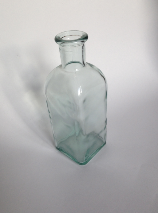
I found this bottle and fell n love with it straight away. The fact that this is a square sided bottle makes it easier to work with interns of labelling as you do not have to worry about the effect a curve can have on the visuals of the lable. it is also quite a traditional shape and the fact the the contence has to be sealed with a cork only add to this.


*  *  *  *

Now i have created an aesthetic that is suitable for the brand i started to apply this to the products that are needed for the company.

I started with the business cards by using a mock up I had found on line that is of letterpresses cards. i liked the thought of using letterpress as it is something that i have not used before. I also think it would offer the aesthetic I have created more depth as this is a traditional type of print and this is the theme I would like to come across.

I used the mock up to start with because I do not have the facilities available to me to do it my self and I want to ensure this process was indeed suitable before I went through with the actual sending off and buying for proper prints.

The mock up allow me to apply my layout and the contact details needed.


On the front of the card is the logo and the background pattern I had created and on the back are the details sent to me by Taner regarding the contact details as well as his role in the company.


Using the vibrant prink colour again as part of the text and card edges symbolises the spike of flavour the pomegranate syrup has.

Im really happy with the outcome of the business card and I feel that having this little piece of design can now help me to go on and develop the rest of the components need for the brand using this a reference.

before sending this to the client I wanted to do more one the actual packaging for the product so i can present how the aesthetic flow through the different aspect.


*  *  *  *

Because I really liked the aesthetics of the of the letterpress I wanted to use the same kind of technique for the label of the product. at first i wasn't sure that this would be possible as I was un aware that letterpress could be used as a packaging print. After a bit of research into it, it became clean that this in fact a possibility! (Context blog)

With tho in mind I started to play with a labelling design.
I took the mock up file from the business card file and adapted it so I could then work at a larger scale but still get the same effect for the letterpress aesthetic.


 I added in the simp design i had created previously to get an idea of how this would look in the letterpress style.

For the bottle, I took a couple more picture on a white background so I could the touch them up and use them for a mock up one i had a label ready.


For an up and coming crit I placed the letterpresses label over one of the bottles to give an idea of what the packaging would look like however I know it needed a lot more work.

I also applied the same aesthetics to a stationary mock up to show how the identity could remain consistent across different components.


*  *  *  *

GROUP CRIT

I left my boards out on the table for the other group to crit.

The feed back i received was overall positive.
The only comments worth taking from this was making sure that he mock ups are clean and relevant to the brand as well as pushing the design for bottle further, however these are things that i am already away of.


*  *  *  *

FURTHER DEVELOPMENT
After the crit, I continued with the development of the bottle label. previously when I tried a similar shape to this It really look alike a tie, so with this in mind I adapted the idea slightly.


I like this shape because of the traditional feel and I think, because the label design has a simple, structured layout and framed in this way enhances this. the patterned background also helps to offer a little more decoration and texture without being overwhelming. 

I again added a droplet to the bottom of the label to make the concept of the pink colour being a symbol of the products flavour a little more obvious.
I added this to the bottle by cutting out and distorting the original file in order to fit the bottle. I dded the lines that run from the top, into the label to make it look like the drop at the bottom had run from the top however i didn't really like how this came out.


I got rid of this and made the top of the label longer so it would cover more of the bottle and start higher up the neck. i think this adds a little more class to the aesthetic and also shows off the pattern a little more.


Im really happy with how this turned out and I feel like making the lable longer eventuates the shape of the bottle and the face that the label is printed using a more luxurious print method then reflect this to the actual product making it appear of a high quality.


I added a crown to the neck of the bottle in order to add to the luxurious feel and to also use it to promote the fact this product is 100% natural. 

The line of label that leads up the neck of the bottle could possibly run up and over the cork to acts a seal, but this is something that can be finalised once everything else is in place.

After finishing the front of the bottle I looked in to creating a a label for the back of the product that can hold details on the ingredient as well as the nutritional information and possibilities for the product.
 I used the same layout for this but simply made the space for content bigger.
If the client wishes to add any information, such as an address or some kind of food certification this can be added and arranged in the future.

I tried to mock up the bottle filled with the dark content that would be pomegranate syrup but I wasn't able to do so in way that looked real.

I also re-did th other stationary items and ,as suggested with in last crit, made them more relevant to the brand and what the company needed.

As a little more further development for the company, i suggested an online presence even if it is just a simple app that can be used to help budding chefs who may not be familiar with this type of product what it can actually be used for.

This is due to the fact that, were as this is an everyday item in kitchen across eastern areas, more western societies are not familiar with this type of product and may not no how diverse it can be.

(This is not a priority for the company at this stage.)