3 / 1 / 14
RESPONSIVE / OUGD503
LIVE BRIEF / ESHKIM.
DEVELOPMENT.
I had already experimented with the shape of the fruit and the seed so i started to look at the foliage that comes on the trees. i felt it may be fitting to use something like this due to the fact that tis company has and uses its own orchards for the Eshkim product.


I digitalised this shape and had a little idea on how this may be used as part of a logo. I placed it iside of a droplet to symbolise the syrup and the juice of the fruit.


I really like the way in which this turned out and I felt as well as being aesthetically pleasing it was also appropriate fro the traditional feel and the far that it is a component of the actual plant.


I also looked at adding in pomegranates to the pattern and but i felt it was just unessesry.
* * * *
BOTTLE / PACKAGING
I have been looking at possible packaging on my context blog. It isn't really up to me the shape of the bottle for the product, but I decided to look into it anyway just because I wanted to see what bottles are standard shapes as this may make it easier to manufacture, or buy from somewhere else in bulk. If I could also find a bottle I could buy for cheap i could use this to test out ideas.

As well as looking online at bottle types. I also went to my grandma's as she used to own an antiques store and i knew that she would have a couple of things i could look at.


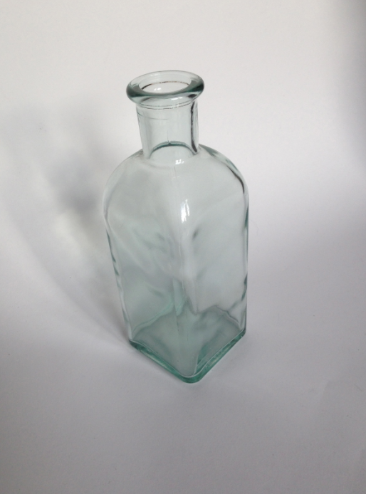
I found this bottle and fell n love with it straight away. The fact that this is a square sided bottle makes it easier to work with interns of labelling as you do not have to worry about the effect a curve can have on the visuals of the lable. it is also quite a traditional shape and the fact the the contence has to be sealed with a cork only add to this.
* * * *
Now i have created an aesthetic that is suitable for the brand i started to apply this to the products that are needed for the company.
I started with the business cards by using a mock up I had found on line that is of letterpresses cards. i liked the thought of using letterpress as it is something that i have not used before. I also think it would offer the aesthetic I have created more depth as this is a traditional type of print and this is the theme I would like to come across.
I used the mock up to start with because I do not have the facilities available to me to do it my self and I want to ensure this process was indeed suitable before I went through with the actual sending off and buying for proper prints.


On the front of the card is the logo and the background pattern I had created and on the back are the details sent to me by Taner regarding the contact details as well as his role in the company.

Im really happy with the outcome of the business card and I feel that having this little piece of design can now help me to go on and develop the rest of the components need for the brand using this a reference.
before sending this to the client I wanted to do more one the actual packaging for the product so i can present how the aesthetic flow through the different aspect.
* * * *
Because I really liked the aesthetics of the of the letterpress I wanted to use the same kind of technique for the label of the product. at first i wasn't sure that this would be possible as I was un aware that letterpress could be used as a packaging print. After a bit of research into it, it became clean that this in fact a possibility! (Context blog)
With tho in mind I started to play with a labelling design.
I took the mock up file from the business card file and adapted it so I could then work at a larger scale but still get the same effect for the letterpress aesthetic.


For an up and coming crit I placed the letterpresses label over one of the bottles to give an idea of what the packaging would look like however I know it needed a lot more work.
I also applied the same aesthetics to a stationary mock up to show how the identity could remain consistent across different components.

* * * *
GROUP CRIT
I left my boards out on the table for the other group to crit.


The only comments worth taking from this was making sure that he mock ups are clean and relevant to the brand as well as pushing the design for bottle further, however these are things that i am already away of.
* * * *
FURTHER DEVELOPMENT
After the crit, I continued with the development of the bottle label. previously when I tried a similar shape to this It really look alike a tie, so with this in mind I adapted the idea slightly.

I like this shape because of the traditional feel and I think, because the label design has a simple, structured layout and framed in this way enhances this. the patterned background also helps to offer a little more decoration and texture without being overwhelming.


Im really happy with how this turned out and I feel like making the lable longer eventuates the shape of the bottle and the face that the label is printed using a more luxurious print method then reflect this to the actual product making it appear of a high quality.


The line of label that leads up the neck of the bottle could possibly run up and over the cork to acts a seal, but this is something that can be finalised once everything else is in place.
After finishing the front of the bottle I looked in to creating a a label for the back of the product that can hold details on the ingredient as well as the nutritional information and possibilities for the product.


If the client wishes to add any information, such as an address or some kind of food certification this can be added and arranged in the future.
I tried to mock up the bottle filled with the dark content that would be pomegranate syrup but I wasn't able to do so in way that looked real.

I also re-did th other stationary items and ,as suggested with in last crit, made them more relevant to the brand and what the company needed.
As a little more further development for the company, i suggested an online presence even if it is just a simple app that can be used to help budding chefs who may not be familiar with this type of product what it can actually be used for.

(This is not a priority for the company at this stage.)
No comments:
Post a Comment