5TH NOVEMBER 2012
MESSAGE & DELIVERY - PART 2POSTER SERIES.
OUGD403

MESSAGE & DELIVERY PROPOSAL.
INSTRUCTIONS.
Produce designs for a set of three high impact posters that deliver a personal identified message produced from the research gathered in part1 of the brief.
RESTRICTIONS.
- Only use 2 colours (3 including colour of the stock used) different opacities of your chosen colours can also be utilised.
- Each poster should be 2:1 to the height of an A3 sheet of paper (21cm by 42cm).
- Posters must be consistent in style. 1 should be based on Typography, 1 should be based on Image and 1 should be a combination of each.
* * * *
Even before I started on this research brief already had a strong opinion on the issue of doping and It something I am certainly against. Not only because it is a blatant form of cheating, but because of the in-justice it causes to fellow athletes who spend there whole lives exerting physical and mental energy to purely strive to be the best that they can be. While researching the different types of illegal substances sports people take, it made me reflect on what i used to do to achieve similar results (legally obviously).
STIMULANTS
- ILLEGAL SUBSTANCES (Amphetamines, Cocaine, Diet Pills, Methaphetamines etc)
Stimulants give an athlete a feeling of a increased energy as well a numbing the sense of fatigue. They make an individual more alert which, for a sports person, can improve reaction times. They also give a boost in self confidence which can allow an athlete to overcome the stresses of competitive competition.
LEGAL ALTERNATIVES (Energy drinks, Jelly sweets, Chocolate, Tea, Coffee etc)
These various substances give similar affects to the banned stimulants listed above. Many of the legal counterparts contain multiple types of sugars and have a high glycemic index. This allows these sugars to get into the bloodstream very quickly which, in turn, increases energy levels.
ERYTHROPOIETIN/BLOOD DOPING
- These two doping method are similar in affect but are different in the way they are administered. Erythropoientin (EPO) is taken in pill form, Blood doping is taken through an injection. Both of these doping methods are to solely increase the levels of red blood cells in the body. red blood cells are the vessels in which oxygen is delivered around the body. Therefor the more red blood cells present in the bloodstream, the more oxygen there can be administered through the body. The extra oxygen is then distributed to the muscles allowing them to exert high levels of energy for longer periods of time. this is a benefit for endurance athletes in particular.
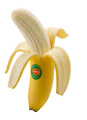
LEGAL ALTERNATIVES (Bananas, Beans, lentils, Pasta, Rice, Yogurt etc)
Many of these alternatives are effective in a similar way to which the illegal methods give energy.They are maid up of mainly carbohydrates and protein sources as well as various vitamins and minerals. An example of a legal form of high energy counterpart to EPO or Blood doping is the humble banana. A banana cantains glucose which is an easily digestible sugar that absorbs quickly in to the bloodstream which gives a quick burst of energy. However the aspect of a banana which can be very beneficial in the same way as the illegal alternatives is the Fructose sugars they process. The fructose sugar is absorbed into the blood stream at a slower rate, therefor providing a steadier and more lasting release of fuel.
ANABOLIC STEROIDS
- Anabolic steroids is administered through pills or injection. They imitate certain hormones in the body which ,in turn, overtakes regulation of how the body develops. They are taken by athletes who wish to gain muscle mass (if there discipline requires) and they also allow individuals to train harder, and for longer periods of time. They also aid a faster recovery.
LEGAL ALTERNATIVES (Eggs, Nuts, Lean Meats, Fish, Cheese etc)
The legal alternatives all contain a high source of protein. The muscles in our bodies are made up of various proteins called amino acids. Protein aids recuperation of the muscles after a work out. During heavy exercise the muscle tear slightly and during the recovery period these tears are repairs making the muscles grow bigger gradually. Protein assists this recovery process.
* * * *


1ST IDEA SKETCHES
(DONE ON THE TRAIN)
I wanted to create a single image that put my message across in a simple way.
Because I am trying to show that there are natural, humble alternatives to drugs I wanted this single image to incorporate both sides to emphasise the 'unesseseryness' of doing drugs.
TARGETING STEROID ABUSE.

-TUNA SYMBOLISES SOURCE OF PROTEIN.
-USED AS A WIEGHT HINTS THE FACT THAT PROTEIN HELPS TO MAKE MUSCLES BIGGER.


- (LEFT) EXPERIMENTING ON HOW TO DRAW BEANS.
- (RIGHT) USING THE SIMILAR SHAPE AND SIZE OF A BEAN AND A PILL. USING A CROSS AND A TICK TO SIMPLY BUT STRONGLY INDICATE WHICH IS WRONG AND WHICH IS RIGHT.

(FROM THE LEFT - TABLET, ALMOND, BEAN, EGG, CHICKPEA, PILL, PEANUT)
- CHOOSING THE ODD ONE OUT FROM A LINE UP OF VARIOUS TYPES OF PROTEIN WITH ILLEGAL PILLS HIDDEN WITHIN.
- COULD ALSO SYMBOLISE THE CHEAT FROM THE REST OF THE ATHLETES
PILLS = CHEMICAL/NOT RIGHT (WHAT EVERYONE FROWNS APON)
FOODS = PURE/NATURAL (MAKE A BETTER/FAIRER ATHLETE)

BEANS ARE A GREAT FROM OF NATURAL PROTIEN.
THE HUMBLE/LOVEABLE MEAL OF BEANS ON TOAST GIVEN A DARK SIDE.

LEAN MEATS ARE A GREAT SOUCE OF PROTIEN.
A JUICY BURGER MAY LOOKS SO MUCH MORE INVITING THAN PILLS.
* * * *
TARGETING STIMULANT ABUSE.
 |
| IMAGE - http://www.huffingtonpost.com/2011/10/24/jason-arbeeny-trial-revea_n_1028284.html |

COM-BINDING A CRACK PIPE AND COFFEE.
TAKING THE CYLINDRCAL SMOKE RELEASE AND MANIPULATING IT INTO A COFFEE CUP.

A DIFFERENT SHAPE OF CRACK PIPE.

A LOLLIPOP CRACKPIPE.
AN ALTERNATIVE OF PIPE SHAPE THAT COULD BE TRANSFORMED INTOA LOLLIPOP DUE TO SIMILAR SHAPES (SUGARY SWEETS AS STIMULENTS).

COM-BINDING MELTING COCAINE AND COFFEE GRANULES.
USING THE FACT THAT SOME COCAIN USERS MELT THEIR DRUGS ON A SPOON WITH A LIGHTER.


OTHER ALTERNATIVES TO THE SAME IDEA.
(LEFT) SPRINKLES
(RIGHT) A CHOCOLATE SQUARE.


OTHER ALTERNATIVES TO THE SAME IDEA.


USING ANOTHER METHOD USED TO GET COCAINE INTO YOUR SYSTEM (SNORTING)
INSTEAD OF COCAINE USED SPRINKLES / HUNDREDS AND THOUSANDS.(GOT PUT OFF THIS IDEA AS SPRINKLES ARENT REALLY SWEETS).


MAKE A GUMMY BEAR LOOK LIKE A PILL BY USING THE RECOGNISABLE COLOURS AND CAP SHAPE.
* * * *
TARGETING BLOOD DOPING ABUSE.

TRYING TO GET IDEAS BY DRAWING THINGS THAT GIVE YOU ENERGY
(LEFT) PEANUTS IN AND OUT OF THE SHELL.
(RIGHT) PASTA-IN SPAGHETTI HOOP FORM DUE TO THE WAY THEY ARE SEEN AS HUMEROUS AND CHILD LIKE. A STRONG CONTRAST TO THE DRUG ISSUES.

A BANANA COM-BINED WITH A DRUG SYRINGE.
SWAPPING THE FLESH OF A BANANA WITH THE SYRINGE AND USING THE BANANA PEAL TO MAKE THE IMAGE RECOGNISABLE TO THE POPULAR ENERGY GIVING FRUIT.

BANANA INJECTION.
DRAWING WITH FURTHER DETAIL.
I wanted to look further into using a banana as a main image for my poster designs. The banana is a recognised energy source that even people that are not really interested in sport know about. Therefore my posters could intrigue a wider audience (sub-audience) as well as my target audience.
They shape of a banana and the way it is eaten gives me quite a bit to work with as well as being a food that is often seen in a comical way.

AN INTERNET IMAGE TO AID MY SKETCHES.

PILLS IN A BANANA.
I really like this idea of the pill emerging from inside the banana. In a way it really emphasises symbolises how unnatural it is to take pills that alter the way in which your body works. I want to push this idea further and try to develop it so it works successfully as a poster.
* * * *
DIGITAL TRANSFORMATION.
I decided to upload my sketched image on to photoshop and transform it into a digital image.


I did this by using the pen tool but before I got started I adjusted the contrast of the image to enhance the sketch line so they were easier to see.
I then proceed with the pen tool and traced around the image, adjusting each anchor point as I went along.

FINISHED OUTLINE.

I then started to experiment with the colours. I new that I had to use yellow so as to strongly identify the banana. so once I had chosen the right shade of yellow i then based the rest of my colour choices around it.
I felt that having a black outline to my banana was too harsh against the yellow. so using the yellow I had previously chosen, I made the outline strokes brown. I think this make the image feel softer.

PALER INNER FLESH.
Because we are limited to three colours (including stock) I decided to use the same yellow colour for the inside of the peel but adjust the opacity of it. This took the edge of the bright yellow colour and made it paler.

BANANA COLOURS.
After completing the banana colours i now have to decide how to colour the pills. Because of the colour restrictions have three colours to choose from.


PILL COLOUR OPTIONS.
PREFERRED COLOUR COMBINATION FOR BANANA SKIN AND PILLS.
Because of the shine marks on the pills I think i should use white as my last colour their will help to maintain the clarity of my image. However I don't really want the background of my poster to be white.


BACKGROUND OPTIONS.
I feel that using the same colour as the inner peal of the banana makes the image look flat. Therefore I used the method of half-toning agin to make the background slights weaker. I feel that the faded colour for the background makes the banana image pop and stand out more.
* * * *
ALTERNATIVE.
STIMULENT IDEA ELABORATION.

STIMULANT ALTERNATIVE.
JELLY BABY / COCAINE
Because I liked this idea in my initial sketches I wanted to develop it in a similar way to how I digitalised my banana image. Even though I really like this concept, due to the tight deadline i think it would be silly to concentrate on this as well as my main banana poster.
* * * *
TYPOGRAPHY DEVELOPMENT.
After completing the image part of my poster, i then had to come up with text that would comfortably accompany my image through what is said and what typeface is used.
INITIAL THOUGHTS FOR ACCOMPANYING TYPE.
- 'Why take the risk'
- 'Doping is cheating'
- 'Don't be a dope'
- 'Why not have a banana'
- 'There should only be one option/choice'
- 'Career destroying'


'WHY TAKE THE RISK'
TYPEFACE - AMERICAN TYPEWRITER
EXPERIMENTING WITH THE LAYOUT OF THE QUESTION AND WHTHER TO USE UPPER OR LOWERCASE.


TYPEFACE TRY OUTS.
(LEFT) TYPEFACE - LETTER GOTHIC.
(RIGHT) TYPEFACE - BALLPARK.

'WHY TAKE THE RISK? - JUST HAVE A BANANA'
TYPEFACE - HARABARA
I like this typeface because, when in uppercase, it is strong and very clear, however the curved bend on the top left corner of every letterform soften the type slightly. I think that this numbing of the harshness matches the light hearted feel of the image. I think that having the main question in the brown makes it stand out more and the sub-heading in the brighter yellow creates a follow on effect.
Adding 'just have a banana' creates a strong relationship with the image which i feel bring the whole poster together giving it more clarity and relate-ability. However I'm not too happy with the layout so this is something i will continue to experiment with.

I also added 'doping is cheating. no one likes a cheat.'. This makes the overall poster more direct to the issue i am trying to draw attention to. Having this statement in shorts sentences suddenly gives this light-hearted poster a more sevier edge to it. This is so the balance of ethos tilts towards the seriousness of doping.
Having each statement on its own line as well as separating them through colour, makes it easier to read and take in.


MORE LAYOUT EXPERIMENTATION.
After reading 'Why take the risk' a few times, it started to seem weak to me as well as a bit too 'wordy'. I decided to change this question into a statement.'don't be stupid' gives the poster more of a punch. It also follows my personal opinion on doping as it is something that i think is just pathetic! I think because this is such a blunt statement, it adds to the comic side of the poster, however it does not take away from the straightforward and moral directed feel.

LANDCAPE

LANDSCAPE WITH ADDED TEXTURE ON THE BACKGROUND.

LANDSCAPE.
Out of all of theses alternative layout, I prefer the top (portrait) version. i think having the image at the top brings attention to the poster first and then having the typography below that lets the audience know the meaning of the image. Again, having each statement on its own line helps the flowability of the poster.
* * * *
POSTER BASED ON IMAGE.

LANDSCAPE.

PORTRAIT.
Because the banana image is the only image present in my mixed poster i decided to just use this (also due to a tight dead line). instead of simply having the image in the middle of the page, I decided to enlarge to image so parts of it are cropped. i think this gives the image poster a air of mystery and intrigue causing the audience to become curious on what the image could symbolise. therefore that are captured but not sure why.
* * * *
POSTER BASED ON TYPE.

TYPOGRAPHY ON A HORIZONTAL LINE
Because of the mandatory shape of the paper size, having the type on a horizontal line leaves a lot of negative space. So I tipped the type on a slight angle.


TILTED TYPOGRAPHY LAYOUT OPTIONS.
I made the main statement a lot larger, because of this I had to speed it on to 2 lines. I then experimented on wether to have the type at the top or the bottom of the page. Somehow I felt that the poster still seemed a bit bare and nondescript, however i didn't really want to go into the technical/scientific side of drug doping as i felt that this would bore the audience.

TESTING OF LAYOUT & COLOUR.
I decided to simply list the main nutritional measurements of a banana that would be relevant the a sports person. I listed them in a similar way in which supermarket packaging does so that the information is recognisable and relatable. I also experimented with the colours and the layout of the type to ensure they are clear and legible. I also tested uppercase and lowercase.


(LEFT) BANANA NUTRITION AT THE BOTTEM OF POSTER.
(RIGHT) BANANA NUTRITION AT THE BELOW MAIN TYPE.
I think having the typography on a tilt follows a similar style to my image poster. In away they both look this the contents has been stamped across the page. I prefer the type being grouped together.
* * * *
FINISHED POSTERS.
IMAGE AND TYPE.
TYPE.
IMAGE.
* * * *
EVALUATION.
MY THOUGHTS.
Over all I am happy with my responce to this brief. I think that my own personal message has been presented in a simple yet strong way. I think my views on doping are reflected quite vividly through the main image and accompanying text. I think that 'Don't be stupid, just have a banana' really emulates my feelings that doping in any sport is just stupid that there are no 'real' gains from participating in something that is so unfair as well as dangerous.
Even though at the beginning of this brief I was a bit anxious about the restrictions on colour, I have defiantly come round to appreciate the strength of having a limited colour scheme. I think this aspect of my posters is one of the reasons they are so successful.
I am happy with the overall colour, layout, imagery and language of my posters. However the 'image' poster and the 'type' poster do not communicate well as individual posters. I found deciding on the layout and features of these two poster very difficult because the type with out the image lacks visual representation and effectiveness, and the image without type lacks understanding and attitude.
I would love to revert back to my initial sketches and re-create some of my ideas in this way to create a bigger series on the issue of doping is sport. However because of the tight deadline I could not elaborate on these.
* * * * * * *
No comments:
Post a Comment