6TH NOVEMBER 2012
These interpretation have been created and learnt by masses of people, therefore it is understandable. It is something that is not in your brain at birth which means it is un-natural.


6TH NOVEMBER 2012
OUGD404
DESIGN PRINCIPLES.
VISUAL LITERACY & VISUAL LANGUAGE.
WHAT IS VISUAL LITERACY?
- The ability to construct meaning from visual images and typography.
- To interpret images of the past and present as well as from a range of cultures.
- Producing images to communicate a message in a strong and understandable way.
VISUAL COMMUNICATION.
- Base on a shared level of understanding.
- Effected but the type of audience it is presented to.
- Effected by the way in which it is presented to the audience (method of deliverance).
- Effected by the context in which it is presented.
LANGUAGE ITSELF AS A FORM OF COMMUNICATION THAT HAS BEEN AGREED AND DECIDED UPON SO IT CAN BE SHARED AND UNDERSTOOD BY MASSES OF PEOPLE.
+ - On its own this symbol can communicate a wide range of different meanings
(plus, first aid, international flags, positive etc.)
+ = - When this symbol is put along side the equal sign, it give it context.
Therefore we now know that the symbols are of mathematical meaning.
These interpretation have been created and learnt by masses of people, therefore it is understandable. It is something that is not in your brain at birth which means it is un-natural.
* * * *
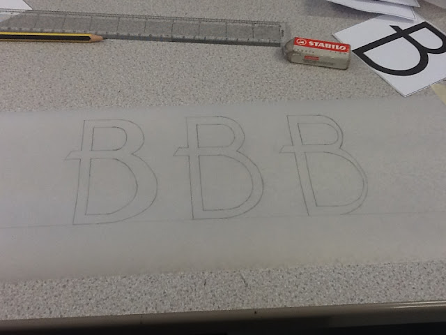
TYPE AS IMAGE
Here we experimented with the different anatomy parts of the upper case and lowercase A B C letterforms.

With the upper case Roman B we were asked to double the stem.

We also changed the width of the bowl on the uppercase B. left is the bowl double and the right is the bowl reduced by half.


for the second task we were asked to:
- Make the stems as bold as possible of the uppercase and lowercase a and make the bowls as thin as possible.
- For the b do the opposite to what you have applied to the a.
- For the c letterforms, make one as light as possible and one as bold as possible.
It was very interesting to see how these letterforms changes by altering single features of there anatomy
* * * *
6TH NOVEMBER 2012
OUGD404
DESIGN PRINCIPLES
THE ANATOMY OF TYPE.1 - AN INTRODUCTION.
WHAT IS TYPOGRAPHY?
Type is a visual language that is created through design and illustration.
There are 6 main categories that typefaces are classed through. These are based on how their ancestor types where crafted and created.
STONE - Carved/ chiseled
Letterforms that were carved into stone had to have serifs to allow movement and flexibility for the carving tools. Very straight and rigid in character (Originated in Roman times).
STONE TYPEFACE EXAMPLE
SABLE - Brush
Letterforms created through the stroke of a brush using paint or ink. These typefaces are flowing in character and have various stroke widths do to the fact they are written by hand. (Originated the orient regions).

SABLE TYPEFACE EXAMPLE
BONE - Quill
Letterforms created through ink with a flowing yet sharp in appearance. Written by hand and emerged through religious scripts such ad arabic (Originated in the Middle East).

BONE TYPEFACE EXAMPLE
WOOD - Carved
Letterforms carved from wood similar to stone but because wood is a softer material it allows more detail and had no need to have serifs. therefor sans serif typefaces started to emerge.

WOOD TYPEFACE EXAMPLE
LEAD - Print
Letterforms created in lead and printed using various types of prints. Lead used in letter press allows thinner lines than wood could give therefore many different styles of typography can be produced.

LEAD TYPEFACE EXAMPLE
SILICON - Digital
Gives reference to all previous methods and made typography affordable and accessible to everyone. Allows an even wider range of experimentation through various softwares.

SILCON TYPEFACE EXAMPLE
BAUHAUS.
This was the first design institute to recognise typography as its own art form. They gave principles to typography following the fundamental belief that 'form follows function'. This means that the aesthetics of the typeface should not come before the legibility of what is written.
TIMELINE OF TYPOGRAPHY.

* * * * * * *
6TH NOVEMBER 2012
OUGD404
DESIGN PRINCIPLES
THE ANATOMY OF TYPE.
2 - THE LANGUAGE OF TYPE.
The way in which we describe and interpret each letterform through out its typeface (through typeface characteristics).

'THE ANATOMY OF TYPE'
IMAGE
MY 5 TYPEFACES.
FROM THE COLLAGE SOFTWARE.


BRAGGADOCIO
UPPER & LOWER CASE


COURIER
UPPER & LOWERCASE


DAYS
LOWER & UPPER CASE


LUCINDA BLACKLETTER
LOWER & UPPER CASE


BASKERVILLE
UPPER & LOWER CASE
* * * *
TASK 1.
Take your partners 5 fonts and find out the names of each.
****BAUHAUS****
****WESTERN****
****BRAGADIO****
TASK 2.
Choose one typeface from these 5 and go in to more depth on the origins of this typeface and also write a detailed description on it characteristic using your new knowledge of the Anatomy of Typography.
I decided to choose American typewriter.
BACKGROUND.
- Designed by Joel Kaden and Tony Stan for the type manufacturer founder 'International Typeface Corporation'.
- The design was based on an early edition Typewriter.
- it is a monospaced typeface. This means that every letterform in the alphabet remains consistent in width (this is due to restriction the typewriters mechanic gave).
CHARACTERISTIC.
- This font is a serif typeface.
- The 'terminal' and 'ear' characteristics of the lowercase letterforms are curled in style with a rounded, ball shaped tip.
- The 'bowl' part of certain letterforms are very large and round, however are not perfectly circular.
- The 'ascenders' of various lowercase letterforms do not rise too high above the 'cap height'. However they do slightly rise higher than the uppercase letterforms.
- The lower case g of the typeface is double-storey
- This typeface gives of an old and vintage appearance due the strong connection to the vintage method on which it is based. It could be used by anybody seeking an atmosphere of nostalgier as well as a strong corporate image.
VARIANTS OF TYPEFACE.

* * * *
13TH NOVEMBER 2012
OUGD404
DESIGN PRINCIPLES
THE ANATOMY OF TYPE.
3 - TYPE & CHARACTER.
TYPE IS SPEECH MADE VISIBLE.
Through the process of the industrial revelation, reading and literacy became key. Before this language was mainly spoken and only well off people could read and write.
The way in which the language was spoken was dependant on accents, and voices gave it its charactoristics.
WE ASSOCIATE TYPOGRAPHY WITH OUR EXPERIENCES.
(girly, playful sporty, speedy, childish etc.)
IMAGES HELP US INTERPRET TYPEFACES.
(However images can not always be used.)
TYPEFACE.
A collection of characters, letters, number, symbols, punctuation which have the same distinct style.
FONT.
The variants with in a typeface. (light, regular, bold, italic etc.)
GOTHIC = Stripped down sans serif fonts.
ROMAN = Serif fonts (stone carved style).
BLOCK = Largely used for headings.
SCRIPT = Fluid style / hand written.
* * * *
13TH NOVEMBER 2012
OUGD404
DESIGN PRINCIPLES
THE ANATOMY OF TYPE.
4 - LEGIBILITY & READABILITY.
THE ONE THING WE READ MORE THAN THE LETTERFORMS THEMSELVES IS THE SPACING AROUND THEM.
THE CONTER - Circular or curved negative space (enclosed or partially closed).
This can be utilised by designers and typographers. The FEDEX logo is a great example of this.
CAN YOU SEE THE THE HIDDEN ARROW?
This logo is a great example of NOT taking in consideration negative space around each letterform


The letterforms give different negative space when displayed in different fonts and typefaces. Because of the importance of the negative space, you have to take the font very seriously when dealing with legibility.
LEGIBILITY.
The degree to which glyphs (individual characters) in text are understandable and recognisable based on appearance. It doesn't matter how how different the style, you still know what it is (visual based).
READABILITY.
Th ease in which text can be read and understood (Language based).
TASK 1.
HOW READABLE ARE YOUR 5 FONTS?
FONTS FROM PREVIOUS TASK.
EXPLORATION OF TYPEFACE READABILITY.

BRAGGADOCIO - LOWERCASE
12pt / 32pt / 72pt

BRAGGADOCIO - LOWERCASE/ITALIC
12pt / 32pt / 72pt

BRAGGADOCIO - UPPERCASE
12pt / 32pt / 72pt
I think that this typeface is more legible when displayed in the uppercase font and a a 72pt size. Because the typeface is made up of big bold shapes, displaying it in uppercase adders to this more so than the lowercase. Having this type as a high point size also improves legibility.

LUCINDA BLACK LETTER - LOWERCASE
12pt / 32pt / 72pt

LUCINDA BLACK LETTER - LOWERCASE - ITALIC
12pt / 32pt / 72pt

LUCINDA BLACK LETTER - UPPERCASE
12pt / 32pt / 72pt

LUCINDA BLACK LETTER - UPPERCASE - ITALIC
12pt / 32pt / 72pt
I think because the uppercase letterforms are very decorative this makes them less readable when displayed in text. Therefore presenting this typeface in lowercase is a lot more easier to read. I also think having this lowercase font is more legible and flowing in a 32pt size because having it too big spaces out the letters more.

COURIER - LOWERCASE
12pt / 32pt / 72pt

COURIER - LOWERCASE - ITALIC
12pt / 32pt / 72pt

COURIER - UPPERCASE
12pt / 32pt / 72pt

COURIER - UPPERCASE - ITALIC
12pt / 32pt / 72pt
I personally prefer this typeface in a lowercase weather than the uppercase even though, in caplitals it is very readable. I think, in relation to size this typeface is clearer when displayed in a 32 pt size because it is not hindered by spacing when too large.

DAYS - LOWERCASE
12pt / 32pt / 72pt

DAYS - LOWERCASE - ITALIC
12pt / 32pt / 72pt

DAYS - UPPERCASE
12pt / 32pt / 72pt

DAYS - UPPERCASE - ITALIC
12pt / 32pt / 72pt
I think that the uppercase font of this typeface is the most readable. this is because the style of the typeface it very bold which i think suits the bigger uppercase letterforms rather than the lowercase.

BASKERVILLE - LOWERCASE
12pt / 32pt / 72pt

BASKERVILLE - UPPERCASE
12pt / 32pt / 72pt

BASKERVILLE - UPPERCASE - ITALIC
12pt / 32pt / 72pt

BASKERVILLE - LOWERCASE - ITALIC
12pt / 32pt / 72pt
I really like the uppercase, italic font from this typeface however i don't think it is the most readable out of the whole lot. For me I think that the most readable is the italic, lowercase font because the leaning the letterforms forward slightly creates a flowing feel as you read.
* * * *
4TH DECEMBER 2012
OUGD404
DESIGN PRINCIPLES
THE ANATOMY OF TYPE.
5 - READABILITY, LEGIBILITY & HIERARCHY.
During the Group session we stuck each of our type pages on the wall. We were then asked questions on which typefaces were easier to read from a distance and which were more readable closer up.
LEGIBILITY - Understanding individual letterforms.
READABILITY - Text can be read and understood.
HIERARCHY - Controlling how and what the the audience reads first and understands first (e.g. newspaper - headlines grab attention which is followed by image and text) delivery of text influences how the audience reads. weight, layout and scale effects this.
Distance effects how legible the type is which also effects the readability.
BLOCK FONTS
- Don't work on a smaller scale.
- To big and bold to be displayed in a smaller size.
- Designed to be displayed in large point sizes.
- Not suppose to be used for full sentences.
SCRIPT FONTS
- Too small and the detail hinders the readability.
- Too big and the spacing effects the legibility as letterforms get broken apart.
- Work better on a medium scale.
- Line lengths is important so the letterforms don't effect each other.
ROMAN
- Very legible and works well in italic.
GOTHIC
- Very legible and very neutral
- Works well in italic.
Lowercase is more readable than uppercase. this is because uppercase letterforms are all block shapes making them all very similar. Lowercase consists of different heights and curves making the spaces around the letterform more recognisable and understandable.
(e.g. magazines use columns with multiple line lengths, therefore a gothic font would be more suitable).
* * * *
20TH NOVEMBER 2012
OUGD404
DESIGN PRINCIPLES
THE ANATOMY OF TYPE.
We were asked to choose 4 more typefaces: 1 Gothic, 1 Script, 1 Block and 1 Roman. After choosing theses specific typefaces we then had to take the first 3 letters of the alphabet and display them twice in each font, one upper and one lowercase. These letters had to fit with it a 10 by 10 square and the cut out into individual tiles.

SCRIPT = ADVERT
GOTHIC = BELLEROSE
BLOCK = BLACKOAK STD
ROMAN = BASKERVILLE

EXAMPLES OF DIFFERENT TYPEFACES
This is in preparation for a the project 'Birth of a Typeface' which I have continued to document on a different blog post.
* * * *
4TH DECEMBER 2012
OUGD404
DESIGN PRINCIPLES
THE ANATOMY OF TYPE.
THE LANGUAGE OF GRAPHIC DESIGN.
SEMIOTICS = SIGN, SYMBOL & SIGNIFIER
VISUAL = METAPHOR, METONYM & SYNECDOCHE
METAPHOR
Object has the opacity to stand for something other then what is apparent. Work on what it stands for (e.g. Taxi cab, Big apple, Statue of Liberty = these all symbolise New York City in its culture and recognisable life-style).
METONYM
Something that operates as a symbol to make reference to soothing with more literal meaning. An actual connection with the image and its intended subject (The cross sign for the church).
SYNECDOCHE
Applied when a part of something is representing the whole thing. inherently connected (statue of liberty represents the city of New York).
We were asked to bring a gothic or roman font in regular, light and bold and in point sizes 24, 36, 72 and 144.
We experimented with the point size and weight using the question 'Who are you?'. By cutting out each individual word and re arranging them, taking in consideration of the appearance of each word, gave you a sense of how the questions is being spoken.


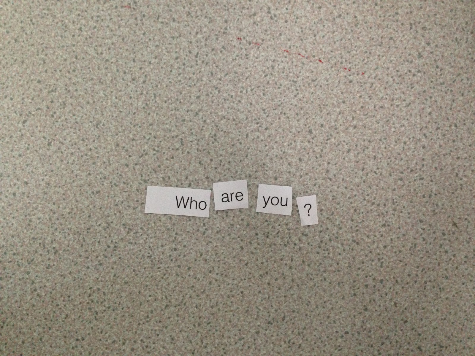


The larger and bolder words gave the impression that they were being spoken loudly or even shouted. The smaller lighter ones gave the impression that the were being whispered. During the task we had fun rearranging the words several times and saying them out loud in the way they appeared to be written.
They also gave hints to how the question was being asked, especially when an emphasis was put on the larger letters.
* * * *
TASK FOR NEXT WEEK
For this task we were give 11 different accents:
Essex
Australian
French
Irish
Jamaican
Gordie
Pirate
Russian
Scouse
Yorkshire
Welsh
Our task was to visualise through type, how the phrase 'who are you' is spoken in these different regional

AUSTRALIAN ACCENT.

ESSEX ACCENT.

FRENCH ACCENT.

IRISH ACCENT.

JAMAICAN ACCENT.

JORDIE ACCENT.

PIRATE ACCENT.

RUSSIAN ACCENT.

SCOUSE ACCENT.

WELSH ACCENT.

YORKSHIRE ACCENT.
In the session it proved very difficult to work out many of the accents. where the typefaces had a distinct personality, i found it easier to work out what the nationality was, but this did not really have anything to do with how it was actually written.
No comments:
Post a Comment