
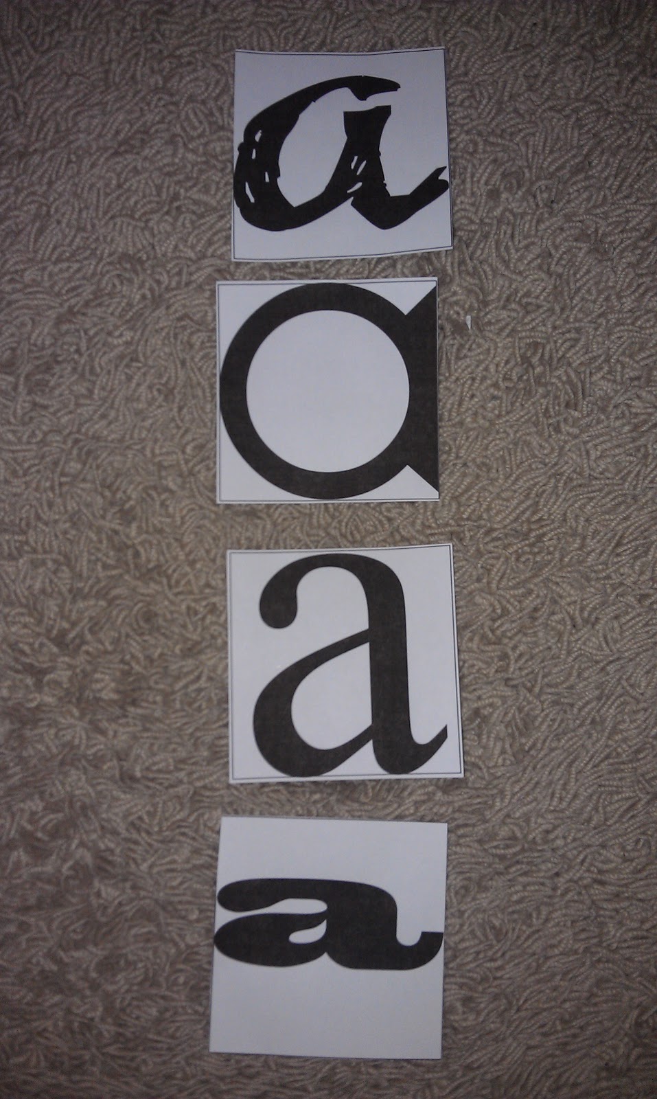
We were asked to choose a typeface from each of the categories of block, script, roman and gothic and size them to fit in to a 10 by 10 square. These are my chosen typefaces. Overall there are 16 letterforms, A B C a b c in the four categorised types.
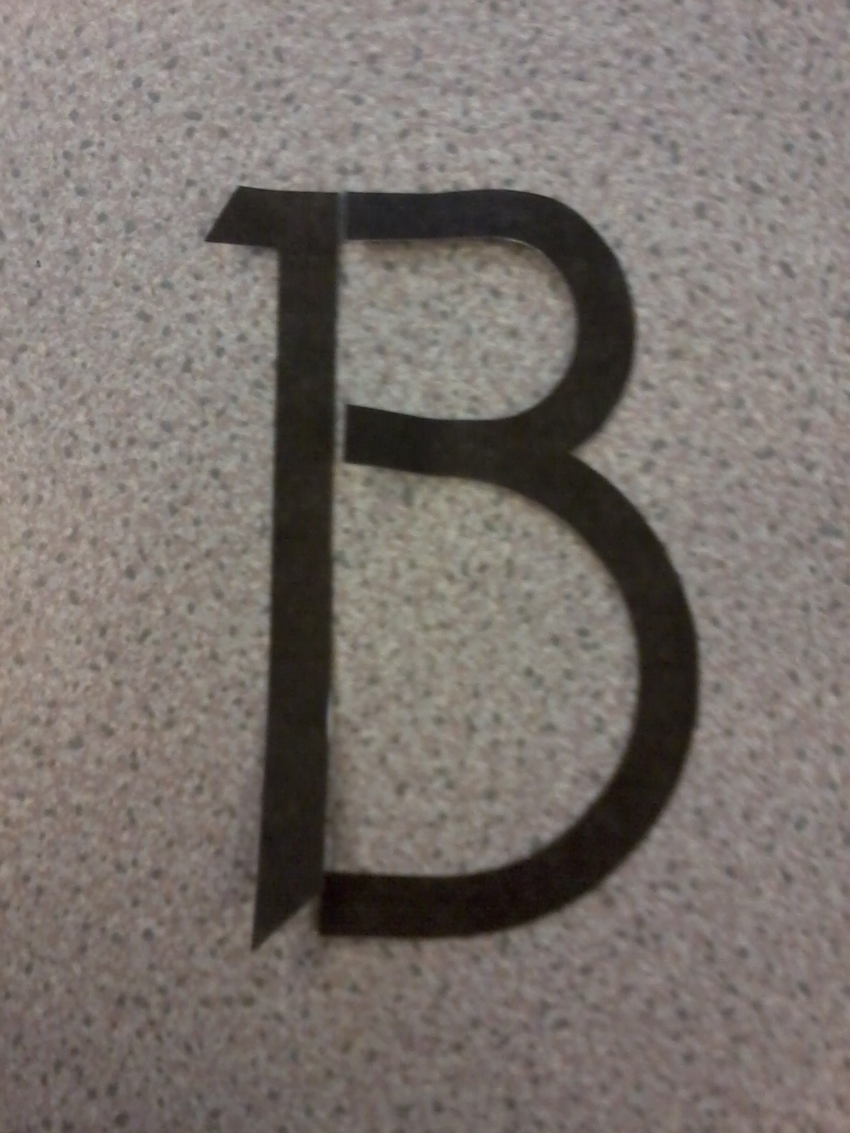
To start working on new shape and forms of the letters, I cut each letterform out and then cut each letter into the sections that make them up (cross bar, stem etc.).


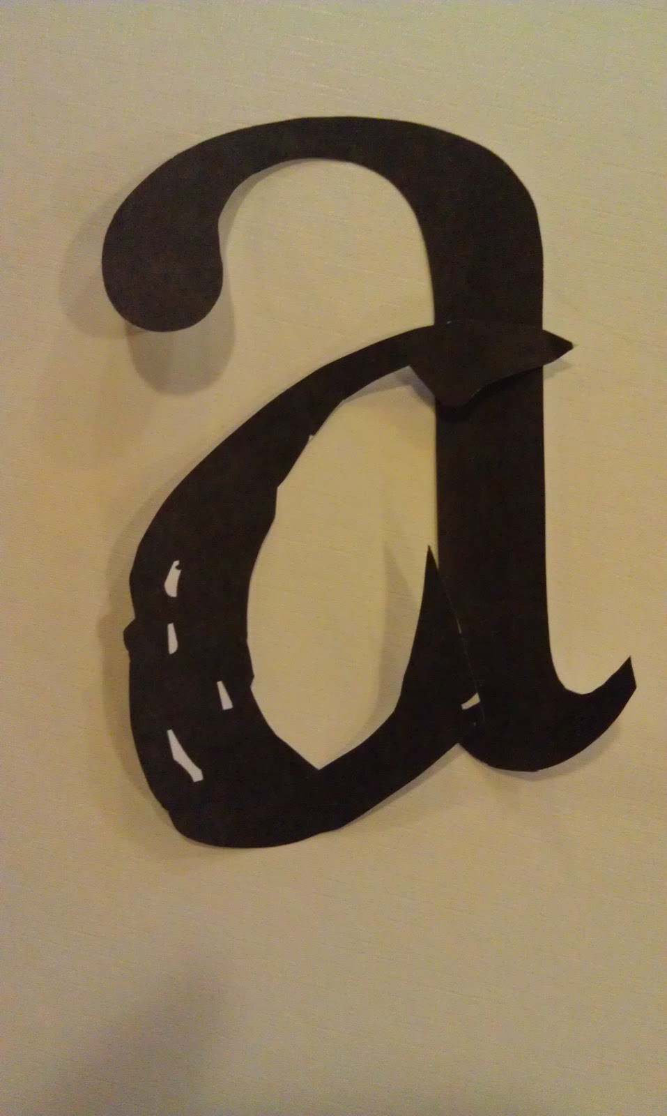
This will allow me to re-arrange and re-create the letter form by mixing and matching each characteristic. I started with the Roman typeface and used their features to create new forms taking good advantage of the serifs.


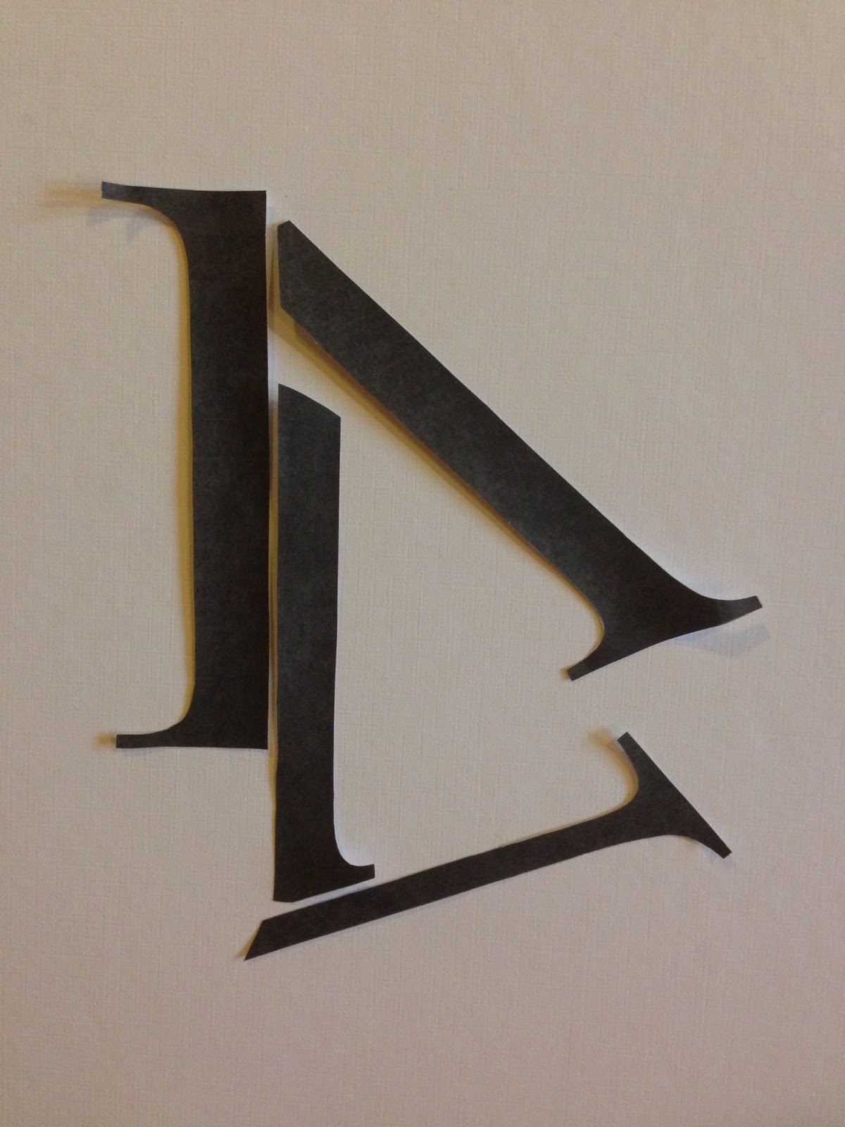
To be honest I started out organised, however the more letters I cut out and arranged the more mixed up the letterforms got as I discovered new possibilities. some successful and some not.


******* !!ADD OTHERS!! *******
* * * *
TYPEFACE 1.
GATHERED FROM EXTENSIVE RESEARCH.

This letterform was created using the uppercase B and lowercase c in the Times New Roman typeface. I really like how the large bowl of the lowercase c gives the letterform an elegant yet bold appearance. The upper terminal of the lowercase c creates a flowing feel and ends the bowl softly. Having the stem of the uppercase B as the stem for this letterform go's well with the larger bowl because it is strong but simple. This enhance the curvature.
I like this shape so I decided to experiment with it.


I think the letterform that has the stem with the slanted serif looks quite promising.
To move on and develop these letterforms I started to use the photoshop software. I used the Time New Roman typeface as a base like I did with the paper cut outs however manipulate them into all new shapes.
First i created my original cut out letterform.


To get the stem of the be i just simply selected the feature of the uppercase letter i did not want and deleted it.

To get the bowl shape for my re-invented b letterform i used the rotation tool to turn the lowercase c upside down.

I then put these two letterforms together and adjusted them accordingly.

To get the desired effect I had to rotate the c letterform slightly more clock-wise

In the image above I over- rotated the c shape but did not like the outcome. I feel that this make the overall b letterform shaper. This is because the most curved part of the c letterform sticks out more when rotated further.


To make the letterform more shape and pristine i made sure the tip of the terminal was aligned with the inner vertical of the stem.

I also made sure that the gap between the curve and stem was the same measurement as the hight of the serif (0.28cm). it is important that this gap is not too wide otherwise the legibility of this letterform. I want to make sure that each of my letterforms are instantly recognisable.


I decide to try this same method but using the time new Roman, lowercase b stem as the stem to my letterform. I feel that this would soften my created letterform more and the slanted serif may enhance the flow of the letterform even more.


Instead of lining up the tip of the terminal with the inside of the stem I tried aligning the stem with the inner curve of the terminal. I think this tiny adjustment balances out the letterform more as the stem is centred.


I decided to make the stem a little longer to ensure the letterform was recognisable as a lowercase b.
I am happy with the shape of this letterform ad will now go on to create; Aa, B, Cc, Xx, Yy, Zz. I will do this by applying the same shape, rules and flow to which I have already created in this letterform.


I created the lowercase a by using the same bowl and terminal a in the lowercase b but turned upside-down. I then use the same stem with the slanted serif and turned that upside down and shortened it. Using the guide lines i made sure that the bottom of the stem and the bottom of the bowl sat on a horizontal line.


* * * *


While trying to create the lowercase c a hd a good deal of difficulty in trying to apply defining features to my typeface. I tried to put a serif on the bottom end of the bowl, but somehow it just didn't look right to me.
Also making the serif too big makes the c look like a g.


Im not happy with the shape of the c letterform but i will carry on with my other letterforms and see if anything comes up throughout their development that could help me make this letterform better.


The A letterform was pretty straight forward as i wanted to keep the shape simple and include the important curve feature.


I got the idea for the upper case B through another one of my cut out experiments that used the same characteristics to the lowercase b I had chosen.


I used the 2 c shapes to create the 2 bowls of the uppercase B. I wasn't planning on having the curved terminal on the to bowl however once there it gave the letterform and elegant yet bold look. The only problem with this is that the serif at the top is not uniform to the typeface I had originally come up with so I had to change it.

I decided to move on to the Xx Yy Zz letterforms while still applying the same rules as the previous letterforms. With the x i swapped the thinner stem with the curve and played around with its direction to see which shape looked best.


I prefer having the curve pointing inwards because i think it follows the bold and elegant feeling i am trying to maintain.

I decided to you the x with the equal curved shapes as the lowercase x (left) and use the x with the larger curves as the uppercase version (right).


I started to experiment with the y letterform by using the same stem but flipped in the opposite direction. I settle on the far right version because I feel they follow the previous letterform with the curve pointing inwards.

To make the the uppercase version i simply mad the curve larger and more pronounced.

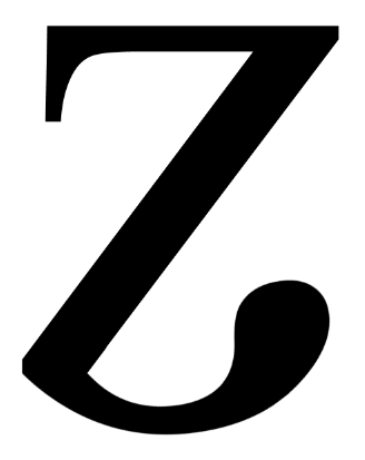
I kept the stem of the original roman z but replaced the other feature with my curved shape making sure they were lined up correctly. This is to make sure the letterforms stay clean and pristine.


COMPLETED TYPEFACE.

Aa Bb Cc
MEASURE ACCURATELY

Xx Yy Zz
MEASURE ACCURATELY


I have decided to call this typeface 'Brow' due to the horizontal curve in the first A letterform. It reminds me of the brow of a hill.
* * * * * * *
TYPEFACE 2.
GATHERED FROM EXTENSIVE RESEARCH.

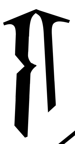
I like this letterform because of its almost oriental look. The serifs of the original Roman letterform act as a type of roof giving the re-invernted letterform a completely different look and feel. To start with I re-created this shape using photoshop.


I cut up the uppercase A like idid with the paper cut outs be separating the two stems that make up the pointed structure.

I used the guideline tool on the photoshop soft ware to help me place the stems in a vertical position.

After making sure each side was vertical i then made sure the end of each serif aligned at the top so that the letterform had a neat finish.


I had a play around with the height of the cress bar as well as its thickness.

On the original cut out image it appears that the two stems are tilted on a slight angle so i decided to see what this affect would have on my computer rendered version.

I tilted the stems inward at a 2.4 degree so they would be at the same position. I also made sure that the top the serif were re-aligned. I think i prefer the letterform with slanted stems because i feel that this balanced up the letter against the heavy serif features.

When thinking about what to do for the lowercase a, I could already see the shape within the uppercase A i had just made. Because the bowls in many typographic styles are more pronounced that the stem i decided to use this theory when developing the shape for this a. To do this i swapped the stems around so the thicker one would form the bowl and the thinner one would form the stem.


I added and end to the bowl to close the a, making sure that the angle of this feature was the same and the serifs t the top

I used the guideline tool to help when shortening the stem to create the tail. I made sure that this tail sat on the same line as the bottom of the bowl. Some how I felt that this letterform was not balanced enough and it felt to big on the top.


To counter this i decided to place the same serif that is at the top of the stem at the bottom. I think having this more pronounced tail helps balance out the letterform. To make sure it stayed uniform


To make the bowl of the lowercase a look more like a bowl, i decided to a a curve to the bottom like the one already at the to. I feel this makes the letter form feel a bit softer.

Through the lowercase a I could already see the uppercase B.


I elongated the stem of the a and took away the bar that made up the bottom of the bowl. I then used the thick stem (made in to a bowl) by duplicating this layer and flipping it upside down.

I then got rid of the serif from the bottom, however when i added the bar to the bottom to close up the lower bowl, the angle of it way too severe.


Because of this i made the thinner stem longer so that he the bottom of the bowl was at the same angle as the other letterforms. This ensures that its shape is uniform

I also added the same smaller serif as on the lowercase a to, again, balance the letterform against the heavier features at the top.

i made sure that the uppercase letterforms were to the same hieght and look as if they belong together.


The uppercase B had a lowercase d hidden with in it, so i decided to play on the and the flip it to transform it into a lowercase b. All I had to do was take the top bowl off, neaten it up and flip it horizontally.


I stood the uppercase and lowercase versions together to make sure that they came to the correct size and maintained the features i was aiming for. I think having them tilt in opposite directions, and letting the sharpness of the bowl decide this, works very well.


With the lowercase c I found it difficult to incorporate the main characteristic of the serif roof. I feel the right version shown above had no flow to it and hindered the legibility of the letterform.

Because of this i decided to use the more decorated letterform as the uppercase version and the plainer one as the lowercase.

I experimented quite a lot with the x letterform because i felt that there were a lot of possibilities. Because the 2 stems of an x go in opposite directions, this made it difficult to include the pointed characteristic seen in the other letterforms.


Because of this i decided to use the larger stem so as the angle of the serif still follows the same angle as the other letterforms.

I decided to use the x letterform with the two serifs as the uppercase version because i feel these added features make it more pronounced. taking the smaller serif away makes the lowercase x recognisable to it partner but makes it feel more inferior.

For the Y shape I reversed the angles of the uppercase a and then experimented on the positioning of each feature.


I decided to use the Y with the widest stems as the uppercase version and the thinner one with the longer tail as the lowercase.

I rally think these to letterforms compliment each other nicely as well as sticking with the look of the typeface.


To create the shape of the z I used the stem from the y and transformed the left side of the serif into the top arm.

I made sure that the angle of the stem was the same as the y and the lowercase be ensuring the uniform of the letters.
COMPLETED TYPEFACE.


I have decided to call this typeface 'Corbel Dynasty' as it reminds me of the Corbel technique with in Traditional Chinese architecture.
* * * * * * *
TYPEFACE 3.
GATHERED FROM EXTENSIVE RESEARCH.


I then played around with the height of the crossbar to see what affect it would give to the overall feel of the letter from. However after experimenting a little I was most satisfied with the hight that my original cut out showed.


I also felt that i should thicken the crossbar to help maintain the boldness that the letterform shows off. I also had i little fiddle with the left stem by moving it inwards slightly because i felt that this may enhance the curve and terminal of the terminal. i did like the outcome of this slight change however because i have to create more letterforms that have to apply to the same rules as this one, it would make it easier to have the lined up accurately.


To create the uppercase B i wanted to use the same slightly squared cure of the original lowercase a to create the bowls.


I shortened the pointed stem and made each bowl line up to it in the same way as the previous letterform. I also used the cross bar from the A to split the bowls in to two as well as tilting the letter on the same angle.

The upper case C was very straight forward to create by utilising the original curve.


I really didn't want to do the obvious shape with the lowercase a by making it a similar shape to the original Times new roman letterform. Because of this i decided to flip the curve horizontally to transform it from a stem with a terminal to a bowl. I also flipped the stem so the point was on the inside and shortened it even more. I didn't like how abrupt this made the letter so i added the same tail from the uppercase A on to the end helping to soften it and maintain the ethos.


To make the lowercase b i transformed the lowercase a by elongating the stem but got rid of the terminal as i got over-lapped. To get rid of the sharpness problem i had encounter in the previous I added the curve to the top of the stem.

I then flipped the letterform to take it from a d to a be and altered the angle. To make sure it was to scale i used the guideline tool to compare it to the a.

To make the lowercase c i just shortened the uppercase version.

For the shape of the x i used the reoccurring curve feature as one stem and the pointed straight edge os the opposite stem. Once again making sure that the terminal is inline with the bottom end of the stem.


The y shape was pretty straight forward as I used the same two shapes with one flipped upside down. i them put them together and arranged them accordingly.


The tail of the lowercase y would sweep underneath the baseline were as the uppercase y would sit on top of it.

To finish them off i tilted them back on the uniform angle.

I had the curve features turn outwards from the pointed stem. I think leaping the curves closer together keeps the bold feeling i am trying to maintain.

To make the uppercase version i decided to simply elongate the stem however keeping the curves below the height of the stem. I feel like this keeps the uppercase letterform more composed as well as pronounced.
COMPLETED TYPEFACE.


I have decided to call this typeface 'Bulb' Due to the shape that droops down on several of the letterforms.
* * * * * * *
TYPEFACE 4.
GATHERED FROM EXTENSIVE RESEARCH.

I really like the simplicity of this letterform. The sharpness of it and the slightly angled stems give it a very futuristic look.


To gather the feature of my re-invented typeface I took the stems from both the uppercase B and the lowercase b.

I made these two stems into new stems for my uppercase A utilising the detail at the top to join them.

I then tilted the two stems inwards on a 2.4 degree angle. To netted the top of the A after tilting I created a block with the shape tool ensuring the measurements were the same as the stems. I the put this on an angle so it mirrored the angle of the pointed detail on the left stem.


I placed this on top to close the counter trimming it as i went to make sure the joins were seem-less.


I could already see the uppercase B within the A letterform. By closing up the stems and the bottom however keeping the angle detail at the left bottom corner. To make it more recognisable as a be i cut a wedge out between the bowls to define them more. the wedge is made up of the same angles displayed on the over-hang of the cross-bar and the bottom corner.

The uppercase C letterforms was very simple and straight forward to come up with as all its feature we all ready within the two previous letters.


So instead of trying to use the top section i moved down to the bottom section to see if i could get more success with this longer shape. T make this letterform i closed up the bottom of the stems with the same size of bar used for the cross par part of the uppercase A. i then trimmed down the left stem to create the bowl shape of the lowercase a. i think using the uppercase a as a template for this letterform helps me to ensure the same scale and angle keeping each letter uniform and consistent.

I used this same method when creating the lowercase b. i used the uppercase version and altered it slightly by getting rid of the top bowl.

The lowercase c was very easy to make by simply chopping the stem down to meet the crossbar end and placing which also brought the top section down to complete the c.

This was the first x shape i created but felt the stems were too close together.

Because of this i decided to tilt them in on themselves slightly so the stem flare out more.

to make the uppercase version i just elongated the whole thing.

COMPLETED TYPEFACE.


I have decided to call this typeface 'Ribbon' as i think it personated the shape of folded ribbon material.
* * * *
GATHERED FROM EXTENSIVE RESEARCH.

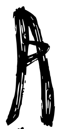
I like the really ruff feel this letterform has which also makes it different to the other typefaces i have done. I feel this B looks as if it has been made using ribbon and this is something i think would be fun to work with.


My cut out letter was created using the script typeface 'Advert'. I took the left stem, along with the crossbar hangover from the uppercase A and took the looped bowl of the lowercase b.


I played around with the angles and brush stroke effect to come up with the best possible outcome.

I played with the stoke of the bowl slightly were it overlapped the stem so it looked more natural.


To create the uppercase of my typeface i used the original stem and duplicated it as well as flipping it horizontally. to attach them together i flipped the duplicate again but vertically.
I think that the looped crossbar helps to maintain the loose, playful ethos.


To make the c shape i took the hooked crossbar from the original a by using the eraser tool.

I then rotated this bit clock-wise about 90 degree and duplicated it. with this copy I flipped it upside down and attached it making sure the curve flowed seamlessly.


Fort the lowercase i tried to use the curve from the c as the tail with parts of the original stems to create the bowl. I didn't like this shape because it was too big and broad which is the opposite of the letterforms i have made previously.


I feel this lowercase letter looks a lot more uniform to the previous creations.


Within the lowercase a I could already see were I could get the shape form my lowercase c. I just simply removed the loop decoration.


I created the lowercase b using the c shape and adding the stem from the uppercase A. I then flipped the letterform so it transformed into a b.

To make these letterforms work together i made sure that the heights of the bowls were all level.


I used the same two stems to make the x shape but flipped one of then around so as they looked like two individual strokes.


I used some of flicked tail features and loops to make the lowercase x. I liked the left version however thought the hoop may affect to readability of the letterform. Because of this I just used the erase to to define the shape more.


I used the bowl of the original lowercase b twice to create the lowercase y by playing with the angles and making sure the lined up accurately so it appeared the letterform had been created in one stroke.

I used the the regular stems to make the uppercase Y ensuring the features didn't flare out too much.

I started experimenting with this shape to create the z however couldn't quite adjust it to suit the ethos of the rest of the letterforms. I was also possible to mistake it for an s shape.


To make the uppercase version I just elongated the stem.
COMPLETED TYPEFACE.


I have decided to call this typeface 'Bark Scratch' as i think that the texture of the letterforms resembles that of the bark from a tree.
* * * * * * *
Overall I a very pleased with the outcomes of my typefaces. I feel that they are all completely different and have there own personalities. It was hard to keep the angles consistent with each letterform, and i think that if I did it again I would ensure that the angle was a straight number to make it easier as well as helping to keep the letterforms consistent with each other. I have really enjoyed creating these letterforms as it is something I have never done.
No comments:
Post a Comment