11TH FEBRUARY 2013.
SECRET 7
ELTON JOHN.

The first the artist that appealed to me the most from the list was Elton John. I am very familiar with his music and am a great fan of his work. Even though I was pretty set on pursuing this brief through the choice of Elton John, i still wanted to listen to the other 6 options available to me.

I have decided to stick with my initial choice of elton john because I enjoy his music and am already familiar with the 'Bennie & the Jets'
After looking through various album covers for inspiration and ideas, I started to think about ideas for my music sleeve design.
I sketched some ideas and options as thumbnails to get my thoughts on paper. I didn't know whether to base my design on Elton John the artist or the 'Bennie and the Jets' single.

Because Elton John is such an iconic artist through his style as well as his music, i thought about utilising this quirkiness when designing the sleeve. Elton John has many recognisable features such as his choice of glasses and his extravagant outfits. As well as these well known aspects of this mans identity, I also thought about other less distinguished features such as certain items of jewellery (skull earring).

SONG LYRICS.
Hey kids, shake it loose together
The spotlight's hitting something
That's been known to change the weather
We'll kill the fatted calf tonight
So stick around
You're gonna hear electric music
Solid walls of sound
Say, Candy and Ronnie, have you seen them yet
But they're so spaced out, Bennie and the Jets
Oh but they're weird and they're wonderful
Oh Bennie she's really keen
She's got electric boots a mohair suit
You know I read it in a magazine
Bennie and the Jets
Hey kids, plug into the faithless
Maybe they're blinded
But Bennie makes them ageless
We shall survive, let us take ourselves along
Where we fight our parents out in the streets
To find who's right and who's wrong
'We'll kill the fatted calf tonight' - I looked up this metaphor and found out its meaning.


One idea I had initially when I heard this quote came from a famous statue situated in Rome. This statue shows a boy carrying a calf for sacrifice. I thought about swapping the boy for a featureless mannequin adorned with accessories relating to elton john. I feel this would work very well because in the song, Elton John is a narrator who is a fan of 'Bennie and the Jets' and is very excited to see them preform. therefore he is the one preparing the sacrifice.


I also had the idea that of just creating a simple shape representing a dead cow which would then have a streak of rainbow pouring from it in the place of blood. This would display this gory action of sacrifice and fit with the neon, electro rock theme.
I also thought about visualising the lead singer of the depicted band by using the description given here in the lyrics.

After getting a few sketches down on paper I decided to start creating them on the computer so I could play with the layout and colour as well as experiment further with ideas.


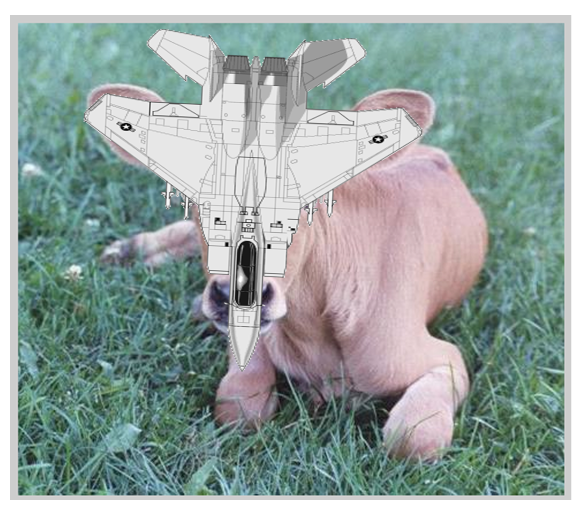
I frist played around with a couple of images taken from Google of calfs and jets. i though it would be interesting to combine these to opposite things to create a type of monster.


* * * *


* * * *
While sitting in my front room pondering on ideas i took notice on some antique objects used to decorate. My dad used to have an antique store and he has a few antique bits and bobs hanging around the house.

I though that these old cobblers boot tools could come in handy when visualising the lyric 'Electric boots'. In my head I just thought of having a lighting bolt hitting the shoes rather than having the lightning bold added on as embellishment.


I also decided to enhance the contact and vibrance go the lightning bolt to make it stand out even more.


I played with the composition on the layout, however in the end I decided that having the image central and quite small is the best way to present the object.

I also decided to try the image on a black background, however didn't feel as though it looked as strong as the white version

I also added a gold border around the outside to frame the image. I believe the negative space around the boot helps enhance the whole ethos of the sleeve design. I also like how it is not totally obvious to the song at first.
* * * *
I decided to play with the simple online of a jet to see what king of shapes i could get by overlapping them and arranging them in different ways.

I uploaded my sketch of the basic silhouette and experimented further using various softwares.


Using several specialised paint brushes on the Photoshop software I created a background resembling that of a galaxy to create a mystic feel as well as one of multi-colours.

I live how the space left in this design does not really look like it has been made of jets therefore only making a subtle connection to the single.


I continued to play with this patterned frame I had created by placing the same jet shape with in it as well as a basic yet quirky shape of glasses hinting the artist.


I liked the idea of having a stream of rainbow colour coming form the jet as this could represent the flamboyance of the artist as well as the 'Gay Pride' banner.


I played further with the frame pattern adding highlights and outlines in an attempted to emphasise certain aspects.

I took reference to one of my thumb nail ideas by having the silhouette of a simple pair of glasses with the outline of a jet within the lenses. i feel like this looks as if whoever is wearing the glasses is looking up at the jet which is reflected in the lenses.


I quite liked the ida of just simply placing a email jet central with a lot of surrounding negative space. I like how the simplicity of layout, colour and minimal appearance gives quite a bit of strength to the design.

I also had the idea of adding the galaxy textured background to a stream that appears to be coming from the jet. i really like the simplicity and the symmetrical appearance this particular design has.

* * * *
I decided to have a little shopping trip to find inspiration for this project, I bout shop cheap little jets from a second hand toy shop in town and started to experiment with these.

I first played with the style of the image by using various tools on photoshop as well as the colour.


I quite like the range of colours i can apply to the jet image and this kind of follows the rainbow feature i had experimented with in previous ideas.
I decide to experiment with the jet image however keeping the original colour of the toy. i started to lay multiple duplicates of the image to create a pattern.


* * * *
I decided to take this new icon of a jet I had taken from a toy and revert it back into one of my previous ideas.


I used the idea i had with the calf with a jet for a head. i experimented with a few of the filter tools on photos hope however i still wasn't entirely happy with the way this concept turned out. I think that this idea just looks better in my head, and that it should just stay in my head!
* * * *


My last idea was to create various relevant shapes using multi-coloures sweets because i prefer the outcomes that i have created previously using the camera. however due to a lack of time I couldn't follow through with this concept to create it in a way that was high in quality.
* * * *
15TH FEBRUARY 2013.
SECRET 7
MY PERSONAL FAVOURITES.
* * * *
15TH FEBRUARY 2013.
SECRET 7
GROUP CRIT.


After discussing my ideas and sharing may favoured designs with the rest of the group, the stand out design was the photographic electric boot. The runner up to this image was the small white jet with the galaxy triangle. When I asked their opinion on whether the electric boot looked better on the black or the white, everyone agreed that the white background suited better as it helped the main image to stand out more. They suggested to me to experiment with the size of the image, but otherwise everyone seemed happy with the structure, colour and concept of this idea.
* * * *
17TH FEBRUARY 2013.
SECRET 7
SUBMISSION.
I wanted to create something simplistic yet intriguing, using the lyrics from the song, however visualising them in a subtle way. I interpreted 'Electric Boots' in a different way to which it was intended in the lyrics by displaying an antique cobblers tool being struck by a bolt of lighting made using a gold christmas paper. Having this image presented in a photographic way adds to the intrigue and depth of the composition an I feel the bright, metallic lighting bolt strikes a hint of glamour and a slight flamboyance which represents the character of the great musician himself.


* * * *
No comments:
Post a Comment