Thursday 31 October 2013

Design for Web / Session 3 / Study task 6


31 / 10 / 13
OUGD504
DESIGN FOR WEB.
STUDIO SESSION 3.


PART 1
Answered within the group session.


Thoughts and ideas


5 PAGE FLOW DIAGRAM


MORE IN DEPTH / PROPOSED


Design for print - Lino print

9 / 10 / 13
OUGD405
DESIGN FOR PRINT.
PRINTING PROCESS - LINO.


Linocut printing is Were an image is traces over the surface of a, rubber like, lino piece and is then cut out of the surface of the lino using specific tools. The surface area remaining is then covered with the ink and pressed on to the desired stock.

Linocut is a printmaking technique, a variant of woodcut in which a sheet of linoleum is used for the relief surface. A design is cut into the linoleum surface with a sharp knife, V-shaped chisel or gouge, with the raised (uncarved) areas representing a reversal (mirror image) of the parts to show printed. The linoleum sheet is inked with a roller (called a brayer), and then impressed onto paper or fabric. The actual printing can be done by hand or with a press.

Although linoleum as a floor covering dates to the 1860s, the linocut printing technique was used first by the artists of Die Brücke in Germany between 1905–13 where it had been similarly used for wallpaper printing. They initially described these prints as woodcuts, which sounded more respectable.

Since the material being carved has no directional grain and does not tend to split, it is easier to obtain certain artistic effects with lino than with most woods, although the resultant prints can lack the often angular grainy character of woodcuts and engravings. Lino is generally much easier to cut than wood, especially when heated, but the pressure of the printing process degrades the plate faster and it is difficult to create larger works due to the material's fragility.
SOURCE

I have had some experience doing lino cut printing in the level 4 during the mandatory workshops however I would like to gain more knowledge on this cut and it results.


This video shows the basic technique you have to got through regarding the lino print method of printing. You have to decipher which part of the image you want to be printed and which parts of the image you want to be left as the stock. You also have to make sure that your image/text is in reverse because once you have pressed the inked lino onto the page your image will be in the reverse of the image on the lino.

I had ago myself at this printing process and used my existing logo I had created the previous year.


Design for print / Laser cut


23 / 10 / 13
OUGD504 / DESIGN FOR PRINT.
LASER CUTTING.
INDUCTION / TESTING

I have used laser cutting before however not for a couple of years, I am already aware of the possibilities that come with this process, however I am excited to utilise the method again now I have more confidence and knowledge on my Graphic Design practice.

'Laser cutting is a technology that uses a laser to cut materials, and is typically used for industrial manufacturing applications, but is also starting to be used by schools, small businesses, and hobbyists. Laser cutting works by directing the output of a high-power laser, by computer, at the material to be cut. The material then either melts, burns, vaporizes away, or is blown away by a jet of gas, leaving an edge with a high-quality surface finish. Industrial laser cutters are used to cut flat-sheet material as well as structural and piping materials.'
SOURCE

To refresh my self and gain the right knowledge to be able to use this machinery I attended a laser cutting workshop.

Within this session we were shown some of the possibilities of working with the machinery from the type of materials that are usable and the effects that you can create using the laser cutter. The most common materials used to laser cut are wood, acrylic, card and paper, however there are endless possibilities on other materials that could be used such as food items, glass and tissue paper.

Here are some examples that were presented to us demonstrating the effects.
CUT THROUGH / CARD BOARD


WOOD / ETCHED FOR STAMPING


GLASS / ETCHED


LINO / ETCHED FOR STAMPING


PAPER / CUT OUT

ACRYLIC / CUTOUT

Materials such as metal or materials that have a mirrored surface are not suitable to use in the laser cutting machinery. This is simply because they will reflect the laser been causing it to bounce back.
There is a way around this by using mirrored acrylic that have a matt surface on the back. This means that you have to ensure your design is cut backwards so as when turned over the design on the acrylic will be the correct way round.

It was then demonstrated to us how to set up your document to print using the laser cutter. There are 4 effects to choose from:
KISS CUT - very light raster one the surface
ENGRAVE - Deep indent into the surface
RASTER / ETCH - in between engraving and kiss cut.
CUTOUT - Laser penetrates straight through the material.

First you have to ensue that thou have chosen the desired effect from the four above with in the different lines of your design. Then make the correct set ups regarding the type and depth of your chosen material.

After inserting your material, use the measuring block supplied to make sure the tip of the laser pointer is at the correct distance from there surface of you material.

Using the directions on the laser cutter screen enter in the dimensions by directing the laser beam manually from the bottom left hand corner up to the top right hand corner. This will allow the machine to work out the dimensions of your plate.

For the laser to start you have to make sure that the lid is shut tight, you can then send your design to print.
This is the test print I was able to make during the session with the guidance of the technician. it used the methods of etching, cutout and engraving


This was another example that the technician produce to demonstrate how you can etch images using the gradient and tone present in the picture. this was done using the rester technique after the image had been adjusted to the correct settings.


*  *  *  *

30 / 10 / 13
LASER CUT SESSION
EXPERIMENTATION.

After the induction I booked a slot for my self so I could then  get used to working with the machinery on my own to gain confidence. I went with a few different things to use for experimenting however I had not set up the illustrator files correctly and I was only able to use one of them due to the time limits.

I wanted to cut out for embossing as well as etching and engraving but I was only able to etch at this point.

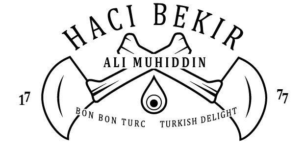
This is the design I used for an experiment, I used a 3D typography to see how this would appear when etched into wood. (This is just a little tester piece that a whipped up in about 2 minutes!)
The short video above shows the laser cutter in action when etching and cutting out my design from a scrap of ply wood that I was supplied with by the technician.

i am very happy with the out come of the little bit of practice I had however I definitely want to come back to the laser cutter and try it out a lot more. I would like to experiment with different materials as well as the different methods and design types.


Tuesday 29 October 2013

Design for Print / Initial Ideas / Group Crit 1

25 / 10 / 13
OUGD504 / DESIGN FOR PRINT.
INITIAL IDEAS.
INFORMATION PACK FOR PRINT.


Even though I have introduced my self and experimented with most of the print processes available at collage, I still didn't really have much of a clue on what you could do for the actual information pack. To start thin ink of possibilities and getting into the frame of mind regarding an actual product a sketched up a quick diagram to get some initial thoughts and ideas on paper.
This helped me get the thought process going and start to develop possibilities.

The purple, highlighted features of the diagram are things that stood out to me. Regarding the 'Available Print Process' I decided to highlight the process that I felt that were more regarded as useful for Graphic designers and what could be important for the work of Graphic designers.

These processes were:

- Digital Print (Laser/Inkjet)
- Screen print
- Embossing
- Foiling
- Flocking
- Lino cutting? (Not completely sure).

The thought of making something specific to Graphic Design came to me while taking part in the workshops I had put myself forward for as well as experimentation and reintroduction works I have done in my spare time. While printing with the mono-print, chemical etching processes and talking to Technicians about the lithograph and Collograph processes, I realised that there wasn't much chance as a Graphic Designer to use these processes to complete works and design. This came in a range of reasons such as time consumption, complexity and cost.

At first i thought that aiming this product at first years of Graphic Design. I felt that this was a very viable option simply because that I have been that audience along side my peers so I know what can be useful for new students who are excited to try new things.

I also think it is a viable direction because, to make this kit on my own i can only really utilise the facilities we have at collage. This is also the same for new students coming into collage and realising that there are restrictions on what you can produce considering the facilities and methods available at LCA, however I want to open up the possibilities students have under these facilities.

After deliberating through my spider diagrams I feel that I definitely want to make the most of the fact that the product has to be a kit rather than a simple book. I wanted to create something that was different to the norm of a simple manual or instruction book.

At first I though about making a book that included information on each specific printing process. this would be accompanies by pieces with in the kit that would act as examples of each process. so things such as posters, business cards, postcards etc.
However I felt that this would be a bit boring and bland, especially as the examples would have to be something quite erelivent from the book/product its self as they would be something random that just looked good.

Through this I came up with a concept of, instead of having accompanying example pieces, have them included in the actual product. Almost as if the product is inside out. 
For example, I could emboss the cover of the book and within the content would be the stage by stage visuals (most probably photographic) of how I made the embossed cover. That way the audience is reading and taking in visuals on he process and also see visually how the finish of the process looks as well as how it fits in with Graphic Design.


*  *  *  *
28 / 10 / 13
GROUP CRIT.
A few people from level 5 set up a group crit over a lunch time period and I was invited to come along. Even though my idea is very much in its infancy, I felt that it would be helpful at this early stage to gather other/new opinions on what I have planned and the possibilities of how the product could be.


FEEDBACK RECEIVED.

- Think about the inclusion of linocut / Is it relevant enough to include?

- Perhaps a wooden box with a sliding lid.

- Have visual stage by stage chapters of each process while having the finished example present in the kit/as part of the kit (e.g show the stages of a screen print visually and have the finished print as a page, fold out page in the book or as a poster accompanying the book inside the kit).

- Prices regarding the print processes is important for students to know. This could be through stating how much this process cost me regarding how I have used it in the kit, this way the audience can visualise what is there while considering the cost.

- Audience would be ultimately 1st year Graphic Design students. It would be better to be specific to 1st years at LCA as the kit will only cover what is available for me to produce at collage.


POST-ITS FROM CRIT MEMBERS

Monday 28 October 2013

Design for Web / Initial ideas / Logo Development

28 / 10 / 13
DESIGN FOR WEB / OUGD504.
INITIAL IDEAS.

After looking at existing web pages and the original Haci Bekir web page, I feel that I have a better understanding of what would be appropriate for the web page. Through my summer brief research I also have knowledge on the content and aesthetics that would be appropriate for my rebrand of the Haci Bekir webpage.

Because we are in the process of learning about how to build a web page in the sessions organised, I started to think about how I want the rebrand to look and what kind of ethos I would like to present to the audience however keeping in mind the origin and cultural presence the existing brand already has.

On my context of practice blog, I have already looked into the existing Haci Bekir web page as well as other brands of Turkish delight that have an online market. This has given me some idea on what it already out there as well as how I can make my webpage better than theirs.


*  *  *  * 


I started to think about what my web page would include and what navigation would be needed to make the page work.

The main pages of this website that i am sure of are:

PRODUCTS 
This would be based on the types of hokum available / possible explanation on the different types / images of the products available / possible information on the making facilities and processes

(I like the idea of a taste generator which would work by the viewer choosing form a list the flavours they like, and then the page would supply this viewer with the confections they would like regarding their flavour preferences.)


HISTORY
This would tell the story on the background of the company and how it originated and established in 1777 / The invention of the turkish delight confection we know today / As feel as historic information on the shop there could also be a section on Istanbul its self as it is such an iterating place.

ABOUT
How the company is managed today / Stores in istanbul / contact details and addresses.


*  *  *  *  


LOGO DEVELOPMENT
I decided to start visualising my ideas by starting with a possible new logo. The chi bekir logo at the moment it very complex and even though i do appreciate the tradition and sentiment behind it, I don't think it is understandable to people approaching the brand to day. i wanted to see if there was a way I could hold on to this tradition as well as looking modern and appealing.


I started sketching my ideas.


I started to play with a special tool that is used to cut turkish delight. it is curves so the blade can role and cut through the sticky confectionary. This is a recognisable tool that is used a lot for many many types of sweet int Turkey, not just turkish delight.
I started to play with the addition of turkish patterns to make the logo appear more authentic and add a touch of tradition.
I feel that the knives make the logo look a bit too medieval and harsh which i don't think is very suitable for the business 


For this variation I started to look at merging the H and the B from Haci bekir and making the work together in formation.
At first i really liked this logo as i think it looks elegant and vintage. After a while of looking at it thought I think that it wasn't very suitable for the type of company Haci Bekir is. I think it looks more like a logo suited to a hotel.


DIGITALISATION OF LOGOS.
Before i gave up completely i decided to try and digitalise these logo ideas to make it easier to visualise them in the form the would be shown on a web site as well as arrange and play with what I have.


I started looking at possible typefaces that could be used. I looked for typefaces that looked vintage and authentic yet still had an air of modernness.


 I started to play around with the tool shape and adding text to get an idea on possibilities.


 I started to create a pattern that helps to make the logo look more traditional and authentic. I like how the logo below almost looks like a tag and feel that this would look nice as a large logo on the opening page. i still had to figure out the inclusion of a pattern.


*  *  *  * 


I tried to revert back to the origins of the first logos that were created to represent the company because they looked very interesting. I planned to use the original logo as a template and simplify it in order for it to be more recognisable.


As i started to draw up this concept, i just did not feel very inspired by what I was doing. i decided to leave what i had so I could present the I'm the crit coming up so I could get a consensus on what i had and what others interpreted them as.

i did not want to loose the originality of the traditional logo, so i thought that maybe perhaps of getting rid of it all to gather, i could use it as a kind of stamp of approval.