28 / 10 / 13
DESIGN FOR WEB / OUGD504.INITIAL IDEAS.
After looking at existing web pages and the original Haci Bekir web page, I feel that I have a better understanding of what would be appropriate for the web page. Through my summer brief research I also have knowledge on the content and aesthetics that would be appropriate for my rebrand of the Haci Bekir webpage.
Because we are in the process of learning about how to build a web page in the sessions organised, I started to think about how I want the rebrand to look and what kind of ethos I would like to present to the audience however keeping in mind the origin and cultural presence the existing brand already has.
On my context of practice blog, I have already looked into the existing Haci Bekir web page as well as other brands of Turkish delight that have an online market. This has given me some idea on what it already out there as well as how I can make my webpage better than theirs.
* * * *

The main pages of this website that i am sure of are:
PRODUCTS
This would be based on the types of hokum available / possible explanation on the different types / images of the products available / possible information on the making facilities and processes
(I like the idea of a taste generator which would work by the viewer choosing form a list the flavours they like, and then the page would supply this viewer with the confections they would like regarding their flavour preferences.)
HISTORY
This would tell the story on the background of the company and how it originated and established in 1777 / The invention of the turkish delight confection we know today / As feel as historic information on the shop there could also be a section on Istanbul its self as it is such an iterating place.
ABOUT
How the company is managed today / Stores in istanbul / contact details and addresses.
* * * *
LOGO DEVELOPMENT
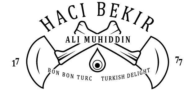
I decided to start visualising my ideas by starting with a possible new logo. The chi bekir logo at the moment it very complex and even though i do appreciate the tradition and sentiment behind it, I don't think it is understandable to people approaching the brand to day. i wanted to see if there was a way I could hold on to this tradition as well as looking modern and appealing.


I started sketching my ideas.


I started to play with a special tool that is used to cut turkish delight. it is curves so the blade can role and cut through the sticky confectionary. This is a recognisable tool that is used a lot for many many types of sweet int Turkey, not just turkish delight.


I feel that the knives make the logo look a bit too medieval and harsh which i don't think is very suitable for the business
For this variation I started to look at merging the H and the B from Haci bekir and making the work together in formation.


At first i really liked this logo as i think it looks elegant and vintage. After a while of looking at it thought I think that it wasn't very suitable for the type of company Haci Bekir is. I think it looks more like a logo suited to a hotel.
DIGITALISATION OF LOGOS.
Before i gave up completely i decided to try and digitalise these logo ideas to make it easier to visualise them in the form the would be shown on a web site as well as arrange and play with what I have.


I started looking at possible typefaces that could be used. I looked for typefaces that looked vintage and authentic yet still had an air of modernness.


* * * *
I tried to revert back to the origins of the first logos that were created to represent the company because they looked very interesting. I planned to use the original logo as a template and simplify it in order for it to be more recognisable.

As i started to draw up this concept, i just did not feel very inspired by what I was doing. i decided to leave what i had so I could present the I'm the crit coming up so I could get a consensus on what i had and what others interpreted them as.
i did not want to loose the originality of the traditional logo, so i thought that maybe perhaps of getting rid of it all to gather, i could use it as a kind of stamp of approval.
No comments:
Post a Comment