20 / 11 / 13
CREATIVE SUITINDESIGN.
SESSION 3.

When setting up a new document, there are many variable you can apply such as the number of pages as well as the size of the pages.
When setting up to print it is essential to know the type of pagination you are going to use as well as possible stocks, print process and inks.


This can then allow you to make this shape how you would like by adding text, a fill or stroke.


Selecting the white option indicates the stock you would be printing on.

Global colours


This box allows you to see the amount of ink from the CMYK colour mode.


When you have created the colour you would like to use this will then add to your swatch palette so you can use it again and again.
When specifying a tint you cannot change the ink percentages you can only alter the tint of the selected colour.


You can add a specific swatch colour for many of the available colour matching systems such as pantone.


Once you have selected your colour it will appear in your swatch bar. You can different the tint while still only using one colour.

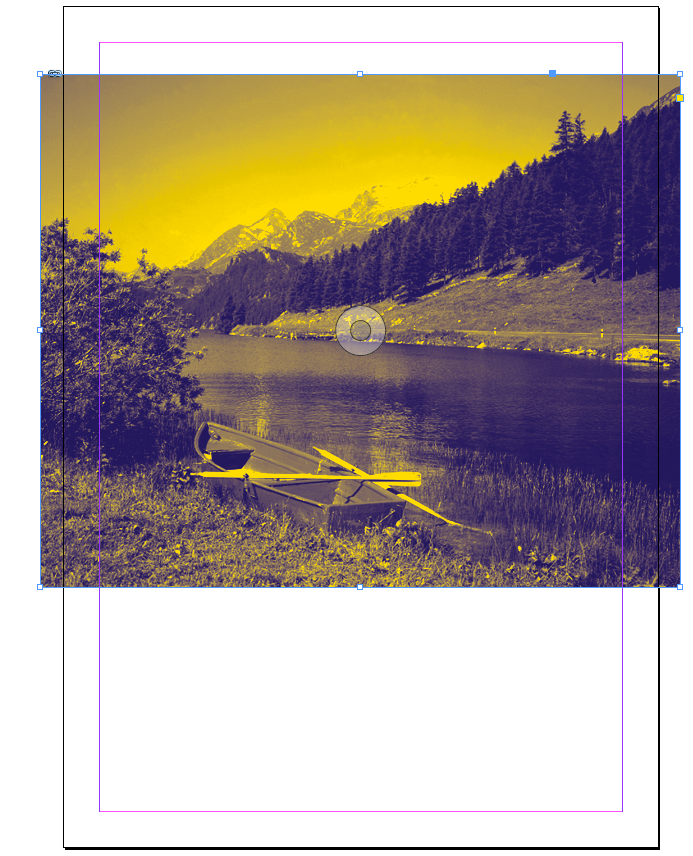

When entering a duo tone image onto indesign from photoshop brings up the colours used in the image into you swatch palette so you know you are working with the same two inks via there registration number.


Colour swatches also remain consistent when placing a file from illustrator.
When setting up an image through PHOTOSHOP you need to make sure that:
- The image is set at 300dpi
-The image needs to be prepared in photoshop to make sure that the size is the same size as you want in in indesign. If you change the size of the image on indesign, you are just making the pixels bigger and smaller which can effect the quality of the image.
- You have to make sure that any colours you are working with remain within the colour mode of CMYK or SPOT gamut.
- Make sure that the format of the image has been saved as a photoshop document or and tiff FILE. This allows you to work with transparency.
When setting up an image through ILLUSTRATOR you need to make sure that:
- We do not have to consider resolution as the images are vectors. this means you can re-scale images within indesign without hindering quality.
- If you are saving for use in indesign you can just save it as an illustrator file or you can copy and paste.
The seperation preview palette.


This option allows you to seperate the colour with in the image.


This allows you to see which pieces of the image have the level of ink selected. This is a similar process to screen printing as it shows the layer of colour it takes to make up the finished image.


We can advantage of the ability to create positives for silkscreen printing.
A good practice is to delete any unused colours from your palette so there is no danger of you being charged for using an ink that isn't actually present.


when setting up to print you can change the default output settings so that the swatch colours for the image are activated. If there are colour in here that are not in use you can un-check them so there is no charge.

The smaller the dot means the less ink being used with effects the tint of the image. When printing with CMYK the different dots of colour will overlap to create the image.

The angles are specific as they effect how the dots work together and overlap.
This process only works on laser printers. Were there are ink jet printers you cannot output separations of your image.


When you have to overlapped colours this is called overprinting or knocking out.
Were the shape is overlapped, you can see that think has been removed that would appear to be underneath.

The opposite to knocking out is over printing. When black is over lapping a colour, the ink will just go over the lighter colour.
This can apply when you plan to vanish over an image as any shape or text that is overlapping an image will get knocked out of the image, leaving a space for where the vanish would be place. You have to ensue that the overlapping shape has been se to be knocked out.
You can use the over-print option combined with a series of tinted colours. This give you a larger range of possible colour. You can make a number of mixed ink swatches by specifying the percentages rather than adding it a multiple of times. you can only work at this level with indesign.
No comments:
Post a Comment