7 / 12 / 13
DESIGN FOR PRINT / OUGD504LINOCUT PRINTING.
FINAL PRINTS.
I definitely want to keep my initial idea of having the stages of cutting lino and printing it like before.

ORIGINAL

UPDATE
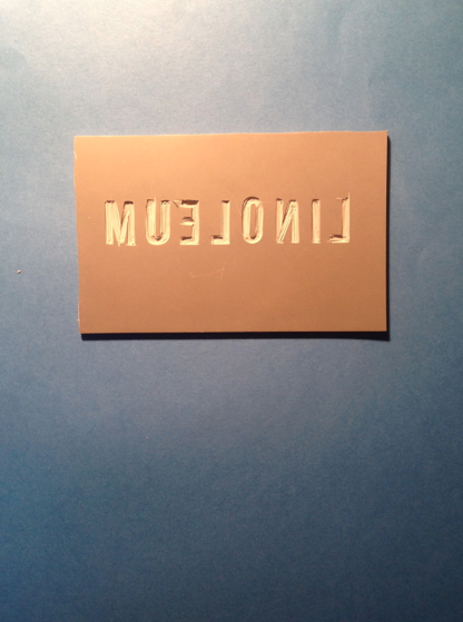
At first I thought that having i script like font (like above) to show the method was the way to go however on reflection, having a typeface that is easy to read my be more reliable with using a print technique that will give a hand rendered quality with imperfections.
Because of this i used the Bebas Neue font so it remained constant with the rest of the pages in the book.
I started by drawing on the letters and taking pictures that would be suitable to use with in my book.


I then cut out the design.


I rolled ink over the lino.


I wanted to have the links placed on a darker stock so that when the ink wa pressed to print it would show a light in on a dark stock and the lino would remain in the same place in the image as well as the print.

However because the ink is metallic, This played with the camera as it reflected making the blue background look black. This gave a dilemma as i want the background to reamin the same trough out each stage.
Because of this i decided to print out the images anyway and whether i cut cut out the image of the lino and stick this on the page to give the sensation of the photographic paper resembled the lino as it stood off the page.
This did not look good at all so instead I decided to make an alteration and make the background white so the images were easier to photograph.


The plan is have the lino images in as photographs and the print created stuck in directly.
To make the images consistent with each other and with contents with in the book, i enhanced the photos in photoshop and made sure the lino sat straight with in the page.

For the comparison of hand cut lino and laser cut lino I felt that by simply having similar designs with one cut by hand and one by a laser and showing the resulted prints would be enough to show the effects that can be achieved.
I had already tried this in previous testing.


I like the effect this shows and i would like to have this as part of my book. However, even though I have housed the same typeface for all three go my lino prints, I feel that this is slightly negative aesthetic as everything looks the same and a little bland.
Instead I decided to use the other typeface I had been using through ou the other pages for my book 'Harbell'. This way the aesthetic of hand rendered designs is displayed too.
Because of this I decided to cut out some new prints by hand and with the laser cutter.
 (Set up for laser cutting)


 Originally my idea was to have the lino and the resulted print in presented together. I thought that the best way to do this was through photography.


 Even though i was very happy thither the way this turned out, somehow I wasn't satisfied that having the examples displayed as print outs as they would not do them justice. After thinking about it for a while I decided to play with the possibility of actually sticking in the slabs of linoleum.


 Once I had cut out the same section form the paper above the print, I made a few adjustments so the lino would be able to slot in the cut out nicely.
 I am happy with this outcome and i feel that it remains integral to the type of print the aspects represent.
To make the images consistent with each other and with contents with in the book, i enhanced the photos in photoshop and made sure the lino sat straight with in the page.
I had already tried this in previous testing.
I like the effect this shows and i would like to have this as part of my book. However, even though I have housed the same typeface for all three go my lino prints, I feel that this is slightly negative aesthetic as everything looks the same and a little bland.
Instead I decided to use the other typeface I had been using through ou the other pages for my book 'Harbell'. This way the aesthetic of hand rendered designs is displayed too.
Because of this I decided to cut out some new prints by hand and with the laser cutter.
I decided to use a brighter ink to liven up the pages a little.
To do this I took some safe grey board and cut out e section for the lino to fit.
No comments:
Post a Comment