DESIGN FOR WEB / OUGD504
DEVELOPMENT OF WEBPAGES.
AESTHETICS & CONTENT.
For the background of my pages i looked into applying a pattern that i had found that resembled those used to adorn Turkish tradition.

The colour Turquoise comes from reference to the colour of the sea in Turkey. This is a colour I always see and always reminds me of the feel and culture of the country.


I started trying to apply my designs to the Dreamweaver software.
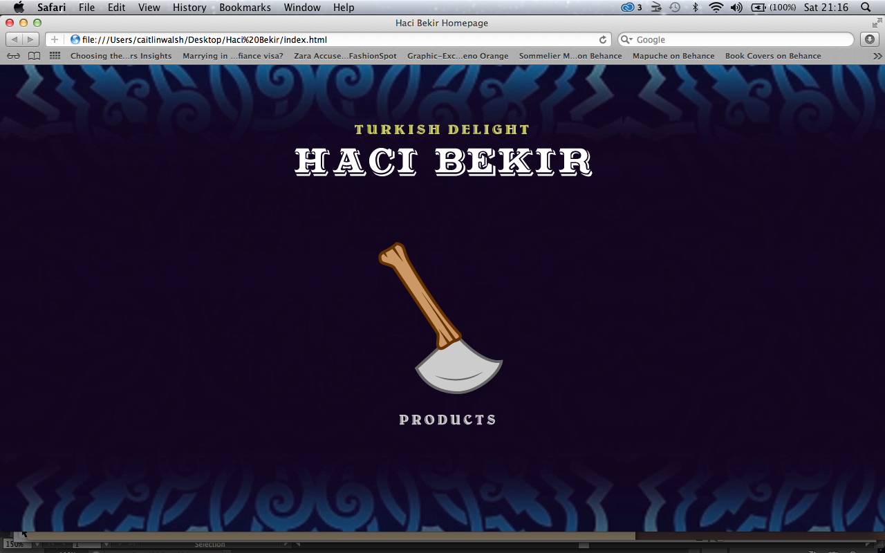
HOME PAGE.
I started with the home page.

I entered the background image i had created by using the 'insert image' tool.


I adjusted the background image accordingly. I was happy with the situation of the heading through adding central alignment, however i wasn't able to get the aesthetic I wanted.
I stated making headings through illustrator so i could then enter these as an image and make them into links that will allow the user to go back to the home page if they require to do so.


I made sure that the image was an appropriate size for the page and was suitable for a heading.


I also added padding to each image so that the icons were spread across the page in a balanced fashion.

I was happy with the way this looked, however there was quite a bit more negative space than I had anticipated. i decided to resize each image so they were slightly larger.

I saved each layer on the Illustrator file individually so as the remained the same size and would flow as they rolled over.
To insert the image i went to the 'insert option' and selected the 'roll over image' tool.


I started to apply the same methods with there other icons.


I think that having shorter test on the rollover images mean that the audience will be intrigued more to click and discover more on the subject. for example, moving 'The Haci Bekir story began in 1777' gives a sense of the begging of a story. By stating something that is very interesting and that is also integral to the companies background, it makes you feel like you want to know more about what has happened and taken place through all of those years.
* * * *
PRODUCTS PAGE
Because my products page follows the same layout as the home page, i simply saved the home page under the new name of 'Products'. This allowed me to keep the layout I had already completed and add in the new information specific to the products subject.
I made a new image for the heading that remained consistent to the heading i had created for the home page.


These are the images I decided to choose to represent each of the categories available on the hack Bekir website.
I used the photoshop software to make the images appropriate to work on the dreamweaver software.


I enhanced the colours of the images just to bring out the vibrance of the colours more. I also cut out the images so they have a transparent background and saved it for the we use.
I made a new heading in the style of the previous page.

I also added in navigation to the heading by making it into a rollover image that would change in a appearance a well as navigating back to the home page.

Before I added in the images I had to make sure that the rollover image for each of the lokums was in the right place as well as being at the size. For the roll over image I decided to just add a brief description on the type of lokum.

I started with the central image first in the sultanas lokum. and added a little decoration with the description, so once the image is hovered over, the image swaps from just the image and its name to the image, its name, a description and some added decoration.


This worked very well and because i had saved the images at a lower quality the flip over on th image happens instantaneously.

I applied the same rollover image effect to the rest of the images as well as adding the same decoration.
I used the same document so I knew that all the images were the same size as well as making sure that the type was all at the same level so the sat level on the page when shown all together.


I was so happy that I had managed to achieve this aesthetic, It was exactly how I was hoping it would, however I think that I needed to make the accompanying type larger to make it easier to read and understand.

I also adjusted the heading of the page slightly by adding a little subheading just to give more affirmation on th page and hat it is supplying.


I felt that making the rollover image grander gave a bigger impression when added to the 1st image.
* * * *
No comments:
Post a Comment