4 / 2 / 13
OUGD505 / DESIGN PRODUCTION 2DESIGNBOARDS.
WORKSHOP.
In todays session we were asked to bring in 5 design sheets that are based on the research material we had accumulated over the OUGD505 research brief.
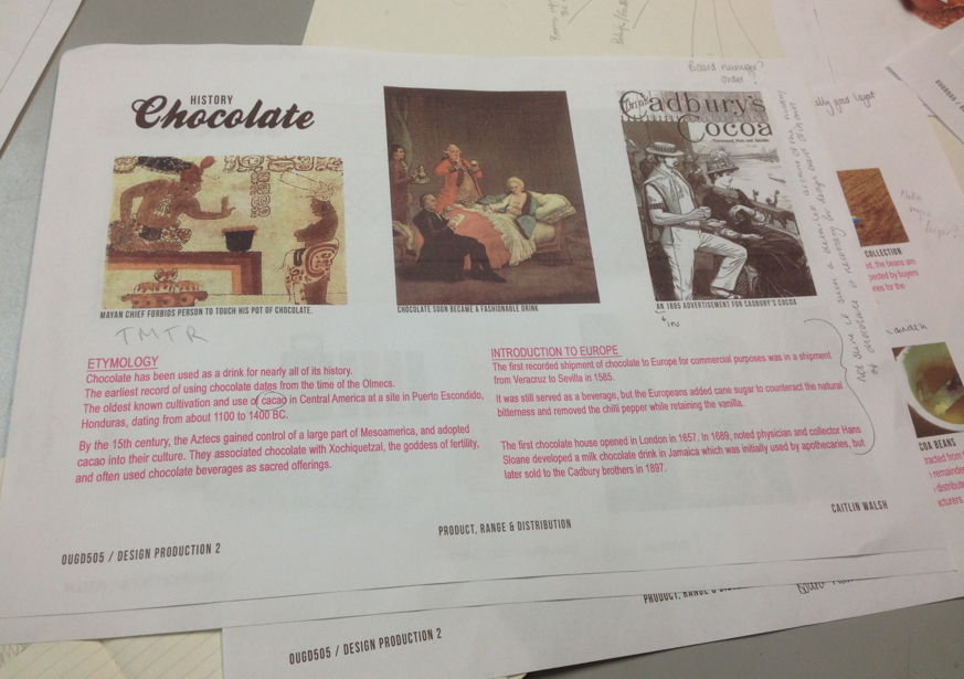
I had chosen the subject of chocolate. Here are the design boards I had created to present to the group. While presenting I talked about the interesting information I had found out as del as ideas on how I could push this further.
They suggested that as well as looking at possible ways into the product and packaging side of the subject, I could look into the more scientific processes of the creation and ways in which this could be communicated graphically and intriguingly in a form of possible information and way finding.
* * * *
What to not put on Design boards:
- Too much text ( too much to read can put of the reader and distract the from their understanding of your concepts and content.
- Irrelevant information (Unimportant imagery and text).
- Too big a font (Make sure your body copy is at an appropriate size, around 10 - 14 pt size).
- Smudges and Stains (Make sure design sheets are clean and try to avoid printing marks or finger smudges to show professional thought and care).
- Do not use pixelated imagery (this can hinder understanding).
What to put on Design Boards:
- Your name, The Project name and module code.
- Number your boards (So the viewer can follow you work and thought processes accordingly).
- Were appropriate, development sketches and Ideas.
- Proposals for further development / Were you concept could lead.
- A clear and clinical layout that is balanced and easy to take in.
- Spell checked content
We were then asked to swap our design boards with the person sitting next to us. With the other persons work, check for the rules a move and whether they have been met or not.
We then received or work back to see what we had done properly and what we had not.
**** IMAGES HERE ****
From the feedback I received, in the future i need to make sure that:
- My name and module information present on my boards.
- I be make sure imagery is arranged appropriately on the page.
- Think about the stock I have used as well as trimming the edges don't to keep the sheets neat.
- Make sure I check my spelling thoroughly.
- Keep text and images aligned to help the page appear balanced.
* * * *
We then did the same thing using the design boards we have created regarding the new OUGD505 brief.
The feedback I received suggested:
- Primary and secondary sources with short but informative explanations.
- Be careful with the amount of text on the history page, may not be necessary to include too much on this particular aspect.
- Make sure the images are aligned properly.
- make sure your boards are numbered so the reader can follow an order.


No comments:
Post a Comment