7 / 12 / 13
OUGD503 / RESPONSIVEPURDEY'S / RESEARCH / INITIAL IDEAS
D&AD COMPETITION BRIEF.
IMAGES OF EXISTING BOTTLE AND THOUGHTS ON THE ACTUAL BOTTLE.
INITIAL IDEASWhen thinking about the considerations for this brief and how I could approach it with a concept, I drew up a few diagrams to get down my ideas and possibilities.


I started looking at different bottle shapes to get some ideas on the solution I wanted to come up with for this brief (this is on my Design context blog).
I liked the idea of playing with the light sensitive content of one of the beverages and maybe use this to relate and link to the beverage that is not light sensitive.
with my experience win drinking for the existing packaging, i think because it is a thick glass bottle, it was quite awkward to drink from. I feel that this will mean i will have to use a new shape of bottle to ensure the ergonomics and comfort when drinking from the container.
I also feel that the fact that this drink is sold with in supermarkets of small shops like whsmith (this is where i found some in the train station) makes it a little hidden and unnoticeable to the audience that are trying to connect with.
I feel that this brand should maybe look into having supplies situated in coffee shop chains such as Starbuck, or even independent cafe's that are situated in little towns and villages as this is were most of their proposed cliental would be situated.
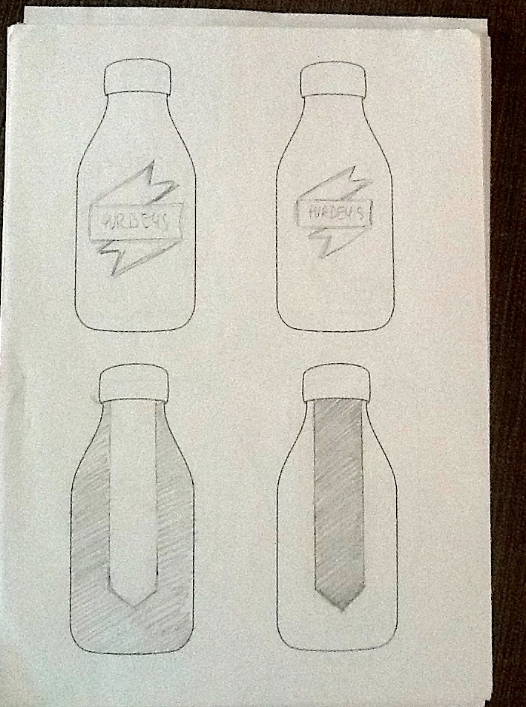
I started by sketching up some ideas roughly onto the bottle shape to get an idea on the possibilities available to me.
I used the existing bottle shape to start with so I could get an idea of size and layout of the product that already exists. I also thought that keeping the original bottle may help to stay true tho the existing brand as well as making it easier for the re-packaging turn over to take place because all they would have to do would make a new wrap.

Because the 'Rejuvanate' flavour needs to be kept covered so as the content does not react to light, i thought about playing with this concept through the packcaging of both beverages.


I also like the die of using some kind of plant and foliage imagery to create the ethos of natural produce and health. Taking ideas from the brief I feel that even though this is to be seen as an energy drink, the fact that this is an energy drink that relays on natural sources for flavourings and benefits is the most important aspect of this product.
To get the right balance between the energy aspects and the natural ethos will be something that i will have to consider through out my design process.
I liked the ida of using plant based imagery because I feel that this is an important aspect of bothe products. I started to look at different way of incorporating such imagery. (shown on my context blog)
I liked the ida of using plant based imagery because I feel that this is an important aspect of bothe products. I started to look at different way of incorporating such imagery. (shown on my context blog)
* * * *
BOTANY
Botany, also called plant science or plant biology, is the science of plant life and a branch of biology. A botanist is a scientist who specializes in this field of study.
EARLY BOTANY
Botany originated as herbalism, the study and use of plants for their medicinal properties. The early recorded history of botany includes many ancient writings and plant classifications. Examples of early botanical works have been found in ancient sacred texts from India dating back to before 1100 BC, archaic Avestan writings,and works from China before it was unified in 221 BC.
SOURCE
I really like the connection that I could make regarding the fact that botanical studies were originally carried out for medicinal purposes and go very well with the fact that the Purdeys brand pride them selves on using all natural ingredients to rejuvenate and replenish the consumer.

BOTANICAL ILLUSTRATION
Obviously due to the lack of technology during the early interest and understanding of plants, the botanists had to illustrate their findings and use these drawing to help identify characteristics and components of specific plat types.Early herbals and pharmacopoeia of many cultures have included the depiction of plants. This was intended to assist identification of a species, usually with some medicinal purpose. The earliest surviving illustrated botanical work is the Codex vindobonensis. It is a copy of Dioscorides’ de Materia Medica, and was made in the year 512 for Juliana Anicia, daughter of the former Western Roman Emperor Olybrius.
When systems of botanical nomenclature began to be published, the need for a drawing or painting became optional. However, it was at this time that the profession of botanical illustrator began to emerge. The eighteenth century saw many advances in the printing processes, and the illustrations became more accurate in colour and detail. The increasing interest of amateur botanists, gardeners, and natural historians provided a market for botanical publications; the illustrations increased the appeal and accessibility of these to the general reader.
SOURCE
I feel like this topic would be a very neat way of approaching the Purdey's brief due to the symbolism and meaning behind the original of this type of art an the way in which this has a viable link to the approach the Purdey's brand has when creating these beverages.
I started to look at different imagery of botany concentrating on mainly the types of fruit and plant extracts that are supplied with the brief.
Apple / Peach / Grape / Oak / White tea.
(I had some trouble with the Natural Energy flavour as all that was given in the ingredients was white tea and fruit juices. Because of this I decided to look at oranges and then possibly in the long run use some of the same imagery used for that Rejuvenate flavour.)
I have been looking at some botanical artists on my ensign context blog.


To be sure that I this method of aesthetic would work well I decided to test my ideas first before I took on the task of hand drawing all the different pieces of fruit.
Through out the idea generation and research I had been looking at different bottle shapes on my context blog. Although I did want to change the bottle from the original shape. I didn't want to make the shape too crazy just because its worth keeping in mind that the product has to be manufacturable.

Personally I think that one of the most integral part of the original packaging is the circular badge that is situated on the lid.

I think this is a very original, simple but clever piece of design and is something that I want to included into my design and perhaps have it as more of a focal point.

I re-created the vector image using illustrator.

I started to apply some of the imagery to this bottle to see what kind of results this would give.

Im happy with the way this does look and i feel a lot more confident in investing time to draw up my own imagery.
No comments:
Post a Comment