12 / 3 / 14
OUGD505 / DESIGN PRODUCTIONBUILD A BRAND
GROUP WORK.
For this task we were put into random groups made up of three. We were then given a profession we had to create a brand and I density for. The group I was in was made up of Melissa G, Ewan and myself. The profession we were given was 'Fire sprinkler installer'.
At first we really struggled to come up with a concept for this profession as it was really quite random. After we did some initial research we decided it may be easier to narrow down our profession. Melissa suggested that we look into sprinkler systems that are specific to electrical fires. This meant we could then have a more targeted audience in looking at office blocks, schools, shopping centres and other larger buildings that needed to meet safety regulations conceding electrical fires. Melissa found that electrical fires are treated through a mist sprinkler system.
We started to work together in coming up with a name for are company in order to then apply it to our concept and build an aesthetic.
Pro.tect
Firefighter
Aquablaze
Shield
Puratect
Fireguard
Defend
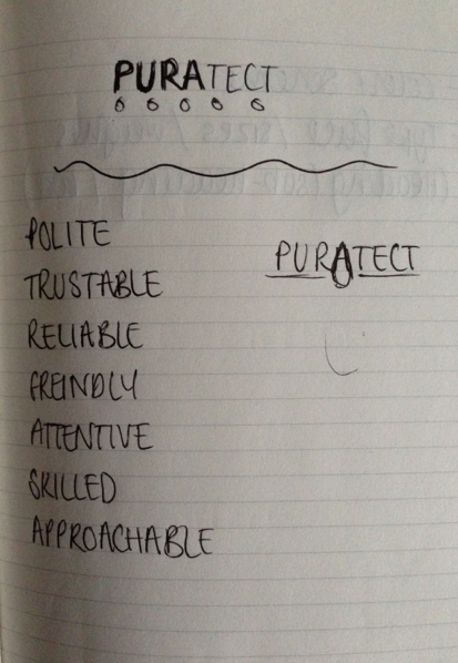
In the end we decided to go with the name Puratect. This is derived from the latin word for water being 'Aqua-Pura' and the concept of 'protection' against fire.
Now we had the name we started to look at possible logo ideas.
We liked the thought of having water encasing fire to enhance the feeling of protection and being in control.
Taking inspiration from some of my sketches I came up wit this simple design.
Adding type to tho image in this way gives the logo a very corporate feel and resembles the kind of companies we are planning to appeal to and offer our services to.
The aqua colour represents the name and the concept behind it.
* * * *
http://issuu.com/ewannorth/docs/brand_guidelines
This is the document created by Ewan regarding our discussions and decisions of the group. (As a group we had decided that the logo should be at the top left hand side of the documents, I'm not sure why Ewan changed this).
* * * *
I started by applying the aesthetics to the basic formats of branding and I density as this would be all that is needed for the type of profession we have. This is done by applying the set colours of the brand as well as the logo sand layouts of type.
I applied the logo to a polo shirt regarding a uniform for the employees and specialists of the company. The polo shirt is smart yet comfortable for working in when installing and maintaing the specialist equiptment.
These vehicles are proposed company cars that can be used by bothe the physical engineers and marketing advisers perhaps out and about meeting on equities for their services.
I also mocked up a magazine / leaflet that would act almost like a catalogue and provide information on the different products that are on offer depending on the need of clients. This document could be sent out to potential businesses and institutes that are with in the category of building to which our products and services could provide for.
* * * *
EVALUATION
I feel that, regarding the short period of time we had to complete this brief, we worked well as a group applying ideas and aesthetics efficiently. Considering we had not really worked with each other before, I feel that we came together as a cohesive unit and excited the brief well. at times, communication perhaps wasn't so effective regarding the letterheads and printed formats, however this is easily amendable. i think that we took quite a difficult profession to visualise and present and applied a strong aesthetic that worked well with the values and services we aimed to apply to our company and the work it does.


No comments:
Post a Comment