14 / 3 / 14
RESPONSIVE / OUGD503LIVE BRIEF / WEDDING INVITATIONS.
INITIAL IDEAS.
Due to the tight time scale I had to complete the first part of this brief (the notice of marriage) I didn't really have time to sketch ideas. I decided to work straight from a digital bases looking at typography and possible icons and layouts.
Many of the examples Mandy had sent me are made up of a couple different style of type so I started to look at what i could use from my library go typefaces. Once I had a good combination of typography I could then start to apply this and to the notice of marriage and the rest of the invitation.


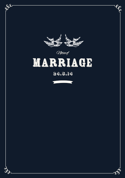
I thought that this was a nice symbol of the coming together of the couple as well as the dove being a good omen in a sailing sense as they were a sign of luck.
I think that the ruffness of this image also goes well with the typeface.

Even though i initially liked the rustic typeface, i think that along with the images it looks a little to informal considering the importance of the event.

I tried another typeface that had a character and a texture but had a cleaner finish .
* * * *
DEVELOPMENT / ALTERATIONS TO BRIEF
About a week after the initial inquirerey from the client, she contacted me again and said that she had changed her mind on the Notice of marriage aspect and instead of having the notice sent out separately, it would be easier for all the aspects to be sent out together.

In a way this made things easier for me as it meant I could concentrate on the whole thing at once, However on the other hand it also made the time restraint that little bit tighter because the notice needed to be sent out a soon as possible to make people aware in good time what was going on.
This means I am going to have to step up and concentrate this quite a bit more to get the designs done so I can then send them off to print in good time as well allow time to put together the different components to send to Mandy.
* * * *
FURTHER DEVELOPMENT
I still hadn't got the feel and aesthetic of the invites were I wanted to then develop and create the actual product. I continued to tryout different layouts, typefaces and visuals for everything.


I added a border around the a5 size format and also looked at different ways in which the title of the card could be arranged on the page.


Now I have a layout that I am happy with I decided to look at how I could apply these aesthetics to the back of this part of the invitations. This part tell the recipient about the wedding taking place in Turkey and an explanation of the circumstances.


Im really happy with this layout. I think that the use of different typefaces helps to break up the information which in turn makes it easier to take in and remember. I also think it adds a sense of fun to the notice and both typefaces are of a traditional feel, the script type looking like hand written message making it look more personal. The second typeface has a vintage feel to it which also contributes to the subtle nautical theme.
* * * *
- On the 24 / 8 / 14
- Starts at 2pm till late
- At the Smith home
I started to apply this information in the aesthetic I had created previously.


This is the back side of both the notice and the invite and I am happy that they are both consistent in aesthetic. Even though I liked the layout and composition i felt that the navy blue colour was a little heavy. t get around this I played with reversing the colours of the invite so even though the layouts remain the same there is still a little diversity between them.


I think that having each piece as inverted colours as it also helps to differentiate the documents in to separate pieces of information but still work together in a consistent manny due to colour and layout.
NOTICE FOR MARRIAGE

CELEBRATION OF MARRIAGE


No comments:
Post a Comment