10 / 11 / 13
DESIGN FOR PRINT / OUGD504FLOCKING & FOILING.
IDEAS / PRINTING.
During my sudden flood of ideas, i thought of a concept to depict flock an foil that related to the concepts i had already created for both lino and emboss. this played on the mechanism of opening the book.


For the flocking and foiling type I decided to remain consistent with other pages in using the 'Harbell' script font.


for both the flock and foil I decided to use a petrol blue as it was the only flock and foils available that resembled each other. There were black flock and foils, however I felt that having a hint of colour may appeal slightly more.


* * * *
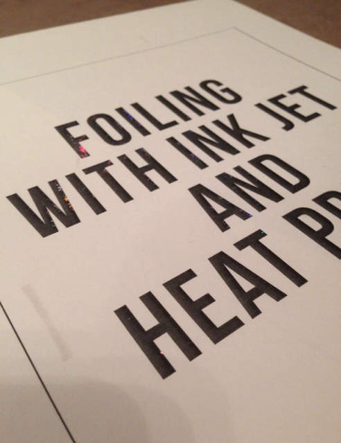
To show the method that used a simple print out and a heat press i came up with the idea of just laying foil over a section of the print out. This way its clear to see how the foil fuses to the ink under the heat.


* * * *
To show the difference between the single heat press foiling method and the screen printed foiling method, To keep the simplicity concept. I decided to just show and example of each similar to the concept used for the lino cutting styles.

This is the layout I printed on to the stock in order to foil with the heat press. I printed the heat press page using just the heat press and the screen print page using a screen.
I decided to use a dark stock for this example as the other foiling examples had been on lighter stock. this will show another advantage of the method.

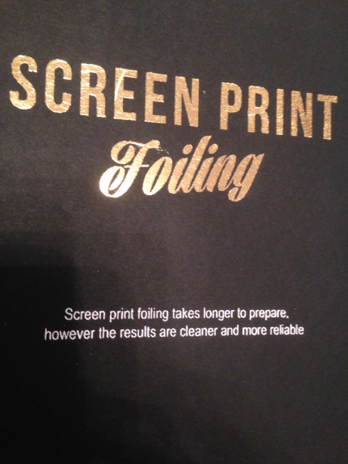

The effects of each printing methods were shown very well in these samples which justifies the statements made in the explanation printed in the white foil.
* * * *
With in the pages I had one free page opposite the introduction page for inkjet foiling.

In my plan I have a simple page that has examples of different coloured foils. Unfortunately I did not manage to get this done while in collage.
Coincidentally, while trying to sort the first foiling example, the one I made to apply a card border around i accidentally stuck some cello-tape to the foil and as I pealing it off the metallic came off with in.
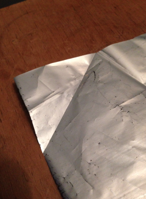


I utilised this 'accident' to my advantage and ooh the left over foil I had.

Even though this page does not have that much of a purpose i felt it was a much better option than leaving it blank.
No comments:
Post a Comment