29 / 11 / 13
DESIGN FOR PRINT / OUGD504SCREEN PRINTING.
POSTERS & PAGES.
Because I am not that confident when screen printing, especially with multiple colours, I asked for help from the technicians down at the Vernon street building to help me carry out the process I wanted to achieve. By doing the posters first with guidance, I felt that this would help me gain insight and knowledge that would help to complete the same process for the inside pages in the future.
I got the specific pots of ink and began to print. I needed at least 4 prints on the 'ink' to start with to which three would be carried on with the additions of the other colours.
* * * *
INSIDE PAGES
Using the same techniques shown to me by those at Vernon, I printed the inside pages with the same design however on a smaller scale.
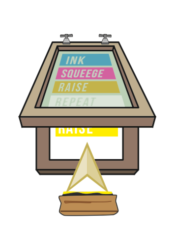
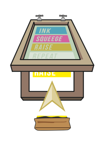
Because I had drawn out the composition of how i wanted the photos to look before i started to try and put these together using the Illustrator software to see if i could picture my ideas in a way that photography wouldn't allow.
I found it hard to draw a squeegee from scratch on illustrator so I drew it up quick sketch first and then traced over it.
I used the 3d effect tool to try and make the ink look 3d like I have made the frame of the screen.
To make the screen appear raised I placed it on a different perspective. The arrow helps to show that the green is raised and the squeegee it to show that ink has been applied.
I used the same style of arrow to keep consistent and also added an inked squeegee.
Im really happy with this outcome. I was nervous to start with AS i did not think that a digital and screen printed images would look consistent with but I suppose using the pure colours of print helps the colours remain the same.


No comments:
Post a Comment