27 / 2 / 14
OUGD503 / RESPONSIVEBEAR CEREAL / COLLABORATIVE
GROUP CRIT / DEVELOPMENT
Sarah and I presented to the group our defined concept and progress we had made. This included my own sketches and the digital variants Sarah had produces as well as our characters and the information and games that would accompany these characters.
After talking to the group about our own brief and the other groups presenting theirs, we were then asked to swap briefs with each other and comment on and advise on what we felt could be done to improve or help the concept.
This is the feed back we had received
**** images ****
- It was suggested that we look in to perhaps striking up a relationship with a zoo or multiple wildlife organisations that could then make it possible to give out vouchers or tickets to these places in a partnership.
- They suggested that we props all the characters to show that the entire alphabet can be covered with this concept.
Overall I think that the feedback and reaction we got from our concept was positive and made both myself and Sarah eager to push on with the more visual aspects and layouts.
* * * *
DEVELOPMENT OF ANIMAL CHARACTERS.
I started to sketch out the animals we had chosen to base our 5 proposal boxes.
I started with the Jelly fish attempting to make the animal in the shape of a J.


I feel that the elephant is quite an awkward shape bu there is no other way to position it to make sure it looks like the letter E.


The owl was the hardest sketch for me as I found it hard to keep the balance between the visuals of the animal and the shape of the letter.


Out of all the animals I have sketched I think that the Chameleon is my favourite. The body shoe was easy to manipulate into the shape of a C.


Once I had sketched out these images I sent the to Sarah so she could the use her skills to digitalise them.
I decided to look into how the cut out could work with a stand and making sure these aspects would successfully when being cut out and arranged from a flat cereal box.
I cut out my sketch and looked and took a simple idea for a stand from some of the research that is shown on my context blog.


While Sarah began to digitalise the character sketches, I started to look at layouts for the box starting with C for Chameleon. In the previous meeting, Sarah and I had decided that we would make this character in to a game that would allow the young audience to colour in the animal in order for it to become camouflaged and hidden into the background so it could then hide from prey.
I looked up various Jungle plants that I could use for the surrounding imagery.


* * * *
Sarah sent me the digital versions of my sketches.


I shared my concerns with Sarah and she understood were I was coming from so she started to adjust the characters.


* * * *
This is the scene for the bear based on the game we came up with before in the research.


I then moved onto the underwater scene for the jellyfish character.

i sent both of these designs to Sarah so she could then apply her digital skills to recreate ready to apply to the box and adapt appropriately.
* * * *
For the elephant game we had decided on a maze based game that incorporated the fact we had found that stated the elephants travel long distance to meet up with each other.
my die or this was to have a party were a couple of the elephant characters would be on the outside of the maze wanting to get to the party/gathering in the middle.
To save time of drawing a has myself. i found a webpage on line that lets you generate your own maze.
http://gwydir.demon.co.uk/jo/maze/makemaze/

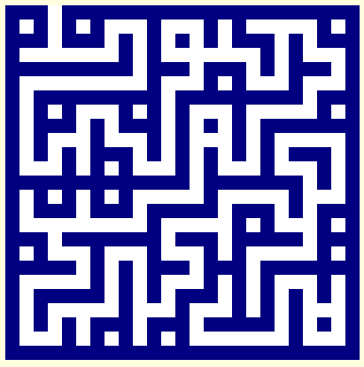

I tried out a few different shapes for a maze using this generated however the square shape seemed very awkward to work with an i don't think it would suit the layout of the box either.


No comments:
Post a Comment