27 / 2 / 2014
RESPONSIVE / OUG503
COMPETITION BRIEF / PURDEY'S.
DEVELOPMENT OF CONCEPT.
I started the botanical type drawings with the apple.
I happy with the outcome of this drawing, it took me a little longer than expected simply because i have not done this type of work for a while, but I am happy with the outcome and confident that this will work.
The peach
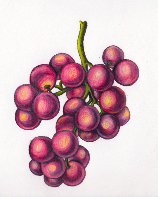
Bunch of grapes
An Orange
Oak bark extract (Leaves & acorns)
White tea (Blossom)
I am really happy with all of these drawings, even though they did take a lot of time to complete, I found the process quite therapeutic and it felt good to get away from the computer screen. I feel that i have enough to move on to applying these to the packaging and seeing what kind of results i can get with my own drawings.
* * * *
To make these images work on a digital basis I scanned each one in.
I opened these images in photoshop so i could tidy them up and enhance the colours to make them as eye-catching as possible.
For each image I used the brightness and contrast tool to enhance and clean up the suit as best I could. i then opened the filter gallery and tried a few different filters to bring out the hand drawn quality these images have.
These are the finished enhanced images.
* * * *
I started using my images and applying them to the bottle like how I had done previously. I also decided to change the colour of the label because the black seemed a little harsh.
to include all of the fruit that are stated with in the ingredient I looked at how the design could wrap around the bottle. I like this idea because it gives the customer something to look at more closely and also makes the bottle look good on every angle.
I wasn't so happy with the front I have made because I felt it looked a little bare and the images were too small which meant the entail was getting lost and hindering the impact.
I started looking at different arrangements that could be achieved with the fruit wrapping around the bottle and featuring on all the sides.
I like this arrangement better because I feel that it has filled out the space better, the apple had a little too much branch making it harder to fill the negative space.
Before I staterd adding more fruit, I had to ensure that I added in the information that needs to be apart of the packaging. Items such as the ingredient, nutritional info and allergy issues are mandatory so I wanted to be sure that these were arranged onto the bottle before I added on decoration so as not to hinder it.
There is also some information on the original packaging the states the values of the product and the benefits of its content though different vitamins and fruit. To show this out of the body text so it is understood faster, I made some simple info graphic type features that show these benefits. I experimented a little with how this info could be arranged on the back of the bottle.
The content of what is written is what i already on the original bottle.
I started to play a little bit with how the fruit on the bottle interacted with the logo, I tried different ways of presenting this as I wanted to make sure that the fruit stood out and made an impact, however I didn't want this to hinder the impact of the logo its self.
Im not sure which version I prefer from the one that is directed across the middle by the two stripes or the one that just has a kind of blind cut across the fruit.
I also looked at simpler layouts considering the fruit images and perhaps having the standing as individual images along with the logo. I actually really like how this looks. I think that the simplicity gives a classier appeal and makes the bottle look more up market and clean.
I couldn't really choose between some of the designs i had produced so I decided to pick what i thought were the most successful and start to make these designs work as a full product. This meant making sure that each side of the bottle worked as well as the front. I had to keep in mind that the images on the front would run over onto the other sides.
I also added textures and light effects to the images I had placed on the bottle to make it look as realistic as possible.
Because I have been looking and altering these designs so much I'm struggling with what design I concentrate on perfecting ready fro the submission.
I like this design because I feel that the stripes on the front offer a more sporty aesthetic which suites the energetic feel that is suppose to be generated fro this beverage. it also distinguishes the pogo and the name of the product which is also important when staring out on a shelf.
I like these designs because of the simple and clean aesthetic they give off. considering the usual audience that purchase this product (Older professionals and the health conscious) I think that the packaging has a quality appeal and also has a no-nonsense feel which is the ethos that needs to be brought across regading the natural energy and rejuvenation that is gained by consuming this beverage.
This design is similar to the top one minus the lines that create a banner. I feel this gives a cleaner look and has a feel of both of the designs above.
* * * *
Because i was struggling with deciding which design I preferred for the brief I decided to have a mini crit with some of the group just to get a consensus on what other thought about the designs.
Th feedback i received on the different designs was all together possessive and there was still mixed feeling on which design was preferred.
The group helped me narrow down my choices to 2 possible designs that i could concentrate on for the submission.
These are the 2 designs that got the biggest reception from the crit so these are the designs I need to concentrate on and tweak in time for the submission.
To sort this design, I have spotted that the grapes on the on the back of the first bottle are a little out of scale with the rest of the images on the bottle. I also need to get rid of the line edges on the sides of the bottle as I feel it would look cleaner with the lines finishing on the front panel.
It was this design that got the best feedback from the crit group as they preferred it to the others.
I think that because both these designs are good examples of the concept I am trying to get cross but are slightly different in the actual visual sense, I am going to submit both to the competition. This way the potential of my design is shown in two different ways and gives the panel a choice in approaches.
PURDEY'S REJUVENATE
PURDEY'S NATURAL ENERGY
PURDEY'S REJUVENATE
PURDEY'S NATURAL ENERGY
I am really happy with how these designs turned out and I am confident in the choices I have made regarding submission. Not only are these bottles eye-catching but they also have a solid and justified concept behind the aesthetic rather than relying on appearance alone. i think that the style suits the origins of the company however thrusts the appeal forward through the images and bottle shape and make the audience feel as though they want to try something new and fresh.


No comments:
Post a Comment