2 / 4 / 14
RESPONSIVE / OUGD50399 DESIGNS / COMPETITION BRIEF.
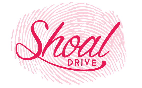
SHOAL WINES.

I saw this competition up on the 99 designs website and I
like the look of it do to the fact that I had not yet completed a competition
brief that was based on product and packaging. Even though I had a little
experience through the Eshkim brief on working with a bottled liquid, I hadn’t
done anything based on wine or any other alcoholic beverage.
Because of the other projects I have going on at the minute,
I only want to spend up to two days maximum on this project so I will have to
work at a quicker pace than usual when generating ideas, developing these ideas
and then executing a final design.


With in the brief, the competition holder made the
suggestion of having his you sons finger or thumb print incorporated in the
design. Even though it is stated that this is just a suggestion, I felt that
the fact that it has been brought up by the person who will decide the winner
of the competition means a design that does have this aspect included may be
preferred in the long run.
I also liked the fact that this would also give me a focal
point and something to work with rather than approaching a design cold.
To save my self time I downloaded an ai file from the internet so I did not have to draw out the print myself (it is stated in the brief that this is acceptable and if a fingerprint based deign is chosen, the authentic print can be added at a later date).


I tried with a script font as I felt it matched the
illustrative, hand rendered example this competition holder had added to the
brief as a guide of inspiration to what he was looking for. I also thought that
this would fit the inclusion of an actual fingerprint.
I played around with a existing typeface called ‘Dragon is
Coming’. I liked the way the s looped back to the front of the letter form and
exaggerated this slightly so the loo reached the end letter of Shoal.


I also tried applying the print to the lid of the bottle but because of the scale all you could make out was the texture. Even though this kind of happened by accident I do like the aesthetic given.

and not too obvious.


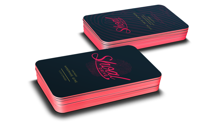
I tried the yellow type on the pink as a background colour and though this was a really good combination. I think it gives the brand a boldness that is eye-catching but because the layout and type is simple its not too over the top.


I also played with the layout for the lid sticker to show the origin of the wine and an added bit of decoration.


I reverted back to my original design so I could define it as well as look at how the labels would work on different types of wine. i think its important to look at the colour of the product as this can have a big impact on the design and colour of the label.
I reverted back to my original design so I could define it as well as look at how the labels would work on different types of wine. i think its important to look at the colour of the product as this can have a big impact on the design and colour of the label.
I have decided that I am going to submit both of the designs I have done so far so I need to make sure that both are ready. it had taken me more time than anticipated to create and mock up my work so I need to start making decisions so as not to take up to much time.


In my opinion i think the darker colour label works better on the darker wine and I think that it suits the taste and muskyness of red wine also and is therefor more fitting. Then i think that pink on the white wine is also fitting as light wine are usually zestier in flavour and this is represented through the vibrant pink colour.
For the patterned version I also lengthened the label slightly because i think this gave a more elegant aesthetic and showed of the fingerprint patter a little more.
Now I have decided the design I want to used i am going to make the final mock up so I can submit to the competition.
 This is the final image I am going to submit as well as images of the individual bottles.
I am really happy with the way in which these designs have turned out and even thug they are suitable for the brief given i think that they are also a good portrayal of the type of design i like to do. They a simple and clean yet bold and i rethink this will help when standing out on a shelf.
I am really happy with the way in which these designs have turned out and even thug they are suitable for the brief given i think that they are also a good portrayal of the type of design i like to do. They a simple and clean yet bold and i rethink this will help when standing out on a shelf.
The design that uses the thumb print as a pattern offers a solution that does not take the idea of a thumb print to liturally and means that that the tpe based logo can also be used on its own when it comes to other printed parifanailier.
Because this is a smaller brief compared to others, I made sure I planned my time eficientlty and did not take to long in creating a successful design. I also made sure I factored in the time it takes to mock up a design as this can often take longer than expected.
* * * *
No comments:
Post a Comment