12 / 4 / 14
RESPONSIVE / OUGD503LIVE BRIEF / NEED BROCHURE.
DEVELOPMENT.


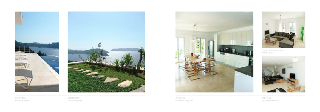
I also started to apply all the different properties to the layouts. For the time being, many of the properties are named with numbers. I was told, this is because other real estate agencies in the region often steal property information and images to pre mote on there agencies illegally.
KALAMAR BAY


KALKAN


KAS


Now I have the content of the book sorted I had to create both a front an back cover. This need to be impactful enough to make a potential client pick up the brochure in the first place, however I do want to want it to reflect the style and layout used on the inside.
I started with an Image that came in the file with the pictures of the properties. I liked this images because it bad a focal point in the centre of the page, However it also shows al aspects of what make the area that this real estate company special and unique: The incredible views, Modern aesthetic and furnishings, Architectural style and flawless construction. i feel that with all this in mind this image presents the professionalism that comes up the Need company as a whole.


I experimented with different ways in which I could incorporate the logo for need company. At firths i thought having it the left hand side would stay with the layout that makes up the content of the book, but this did not sit right with the image that is naturally aligned in the centre.
to accommodate this I aligned the logo in the centre so this remained a focal pint, and to bring this out even more I created a strap and a reduced opacity so the image behind didn't hinder the readability.
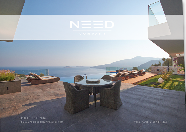
Im really happy with how this looks and i think that having the front page heavily image based reflects the content and also gives a sense of purity in that the work done by this company is pure, simple and professionally excited. So in a way the image speaks for itself.
I started to look at possibilities for the back page of the brochure.


No comments:
Post a Comment