FURTHER DEVELOPMENT.
PUBLICATION PACKAGING.
Even though i had ye main layout of my box already completed however I wanted to implicate a pattern that I had created myself inspired by patterns from the regions and cultures surrounding the origins of the product.
Taking inspiration from patterns I had found through my research (shown on my context blog) I stated to build my own pattern.
I liked how the petter I had used is made up of squares which makes it look as through the pattern is intact a material sure to the illusion of texture. I tried to apply this through a design.
I used illustrator to start and put together a pattern. I started with this diamond shape made up of rectangles that are stacked together on an angle.
I added to this with square shapes that go all the way round the outside of the central diamond. I also added in a straight edged diamond to the middle.
I then took this pattern and duplicated it over and over again to create the pattern in a large scale in order for it to cover a larger surface area.
I then applied this pattern on to the front of the box layout reducing the opacity slightly to make it look as it it is a part of the stock.
I laid out my box with the new pattern so it measured appropriately for the net taken from the mock up I had made previously. This way, once it is printed all the measurements will allow me to cut and fold with out having to make any adjustments and will aid the overall neatness of the package.
I added a little description about the content of the box over the top of the logo so, once folded, this will be on the top side of the box.
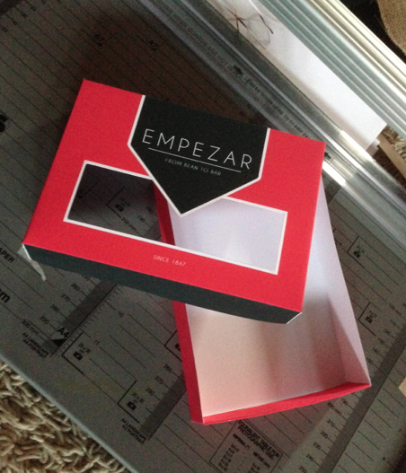
For the bottom of the box, I simply created a sheet of a3 paper that would be printed in the pink colour shown on the top of the box. This way I can the draw directly onto the box, the net needed to make it in to the bottom section.
When putting the box together, I first cut out the rectangular space for the acetate to sit, Th folded each part appropriately accruing to the original mock up net.
I glued the sides down so they dddi not catch on each other and could be put together with ease.
Im really happy with this box and I feel that is works very well in terms of the way it opens and closes as well as the pattern and logo layout. Im excited to see what the book will look like inside the box. once the acetate is applied.


No comments:
Post a Comment