EMPEZAR / BEAN TO BAR.
FURTHER DEVELOPMENT / PRODUCT & PACKAGING.
Taking inspiration from my sketches and the materials I was able to get a hold of, I started to look at how I could apply this to my box in a way the represents the brand and its values well. I did this digitally to look at colours and composition.

I feel that having it as an opaque pattern also gives the sense of underlying tradition on origin that is still apart of this product, but with everything else, brings the appearance and aesthetic in to a more modern light.

In my crit one suggestion was to try browny, red colours. i did try this but I felt is wasn't really fitting to the image I was trying to portray. I feel that the navy blue colour gives a sense of luxury and high end produce. Paring this with the traditional pattern keeps the two perspectives cohesive and workable.


After a while, I realised that having vinyl for the large label would not be very practical for 2 reasons. The first being because it would possibly rip the soft brown paper on the box if it is continuous peele on and off. The second reason is because I realises that using this type of material was not very fitting to the aesthetic of organic and natural.


I have found, when printing negative space in darker colours, you have to really consider the weight of the light coloured type as it always prints thinner and less visible that you might think. The fact that I am also looking to print onto cartridge paper. I have to be aware of it uncoated texture and how this distributes the ink.

* * * *
COVERING THE BOX
I decided to take a break from the digital side of the packaging project and cover the chocolate box with the brown paper. i have to do this in away that will look as if it is make from this material. Using an existing box to propose this product in away that seems viable, even though in reality I would want to make this from organic materials.


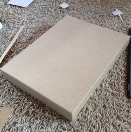


I am really happy with how this turned out.
* * * *
I turned my attention to the back of the belly band were I added in the nutritional values of the produce and a short description of what the company/brand offer and what is in the box.


I took an image from the internet that refered to the nutritional information of a chocolate box. I adjusted this to conform with the colours already a part of the box.
Once I had covered the box in the material. I thought back to the idea of having a print on this stock. i really think this aesthetic would be really fitting to the theme of my product.
I did some testing of this paper, applying the pattern I had created in the brawn colour, matching the stock.


The one on the left is the lower opacity and the one on the right has a fuller opacity.

I incorporated the pattern image that i had created for the belly band and applied it to the image of the stock to get an ida on appearance. I adjusted the colours of the logo so it to suited the stock and the surrounding pattern.
I liked this idea because it relates to the concept used in my research book as well as the whole concept applied to my project. The origins of the product are still subtly present through out the produce and are uncovered through out the experience. One the belly band is slid of this almost 'indentation' of origin and beginning remains a constant backdrop.


I printed this and added it on to the top of the box.
* * * *
Concerning the idea I wanted to portray with the different shade of chocolate ad how the show the strength of the chocolate, I felt that I needed to actually complete this in order to get a true sense of its workings.


While at the craft shop, I found some really nice chocolate moulds that were perfect for the aesthetic I was trying to get across. The fact that they are solid squares mirrors the no-nonsense, straight forward ethos of the brad in just simply brining the audience pure chocolate.
I bought chocolate that was available to me in order to show the stages of chocolate. i got the darkest possible from the super market, 85% as well as milk and white chocolate.
(For the real thing I would like to have a couple different shades of chocolate to give a wider range but at this point I do not have the ability to do this. This is why, for now I will present three stages).


I filled up the mould with the colours side my side so I could be sure there would be a noticeable difference in shade.


While the chocolate hardened up in the fridge, I cut out slots in some foam in order for the chocolate to sit in side the box with out moving around. I also looked into including the burlap material as this symbolised hoe the original coco pods are transported, It shows that this is the closest thing you can get to the natural produce.


I tested out the chocolate in the slotted foam to make sue my idea would work and it did. I also looked at how the burlap material could overlap the chocolates giving a sense of a reveal.
Seeing the way the material is fold gave me another idea. while making this box and the packaging to go with it, I knew I need something that would explain the concept behind this box. I though, along with the belly band on the from to the package I thought that i could have something similar inside the box that sits over the top if the chocolate and explains the content.

Using the same layout and aesthetic for the belly band front and back. I created this slip that can be place inside the box over the chocolate explaining what the taster set is and what it contains.


I really like the aesthetic this give and I feel that it really gets across the ethos and appearance that I want my brand to show. I reduced the opacity in the pattern to draw more attention to the information present. i did toy with the idea of including photographs of each individual chocolate however this would not work on the blue background.


I printed off the bellyband and put the final touches to the box.


I am really happy with the packaging created for this chocolate tastier set and i feel it gives a goo portrayal of the ethos of the brand. It is also easy to see how the brand can be increased to similar products,
No comments:
Post a Comment