Studio Brief 2 / Further Development / Bottle
STUDIO BRIEF 2 / OUGD505
EMPEZAR / BEAN TO BAR.
DEVELOPMENT / BOTTLE PACKAGING.
For this bottle packaging I tried out a couple of mock ups. because the shape of the bottle is quite complex. I had to consider how I was going to apply packaging effectively as well as remaining consistent with the packaging and brand aesthetics I have already produced and applied.
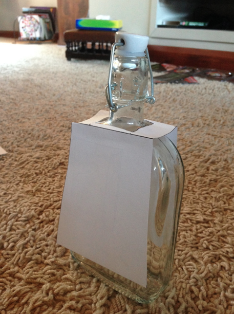
The first label goes on over the top of the bottle like an apron and has parallel sides that run straight down just off the bottom of the bottle.
This label sits on the bottle in the same way but the bottom of the label flares outward.
This apron label it wider a the top and thinner at the bottom.
I do prefer the label that had parallel sides because I think it gives the bottle more balanced and will be easier to apply a design to.
I tried an apron design that ran straight down the bottle and was thinner that the one previous. i feel that this gives off a more elegant appeal which is something that would target the audience I am aiming for.
because the label is not fixed down, I think it may hinder the working of the bottle a little as the label would get in the way when picking it up.
Because of this I made a mock up that saw the label ran all the way around the bottle so it would stay fixed to the bottle and not side around.
I wanted to incorporate the brown stock so as to remain consistent with the other packaging produced. I didn't like how a square shape sat on the bottle as it just looked awkward.
Instead, i warped the paper around just like my mock up to get a feel on how this would work and I was happy with the outcome. I also looked at adding in the labels I had bought at the craft shop. I actually liked how this looked but I felt it didn't really look like the box I had made.
I took the shape from the label as well as the belly band that is part of the box and applied this over the top of the brown paper. I made it easier to attach the printed label and mad it curve around the bottom. I really like how this looks and I feel that even though it is unique to this bottle it still resembles the packaging used on the box.
For label purposes, i filled up this bottle to know how much it holds.
I created the label by taking the measurements from my mock ups and then applied the aesthetics created previously to it.
I included the ingredient making sure that they had the information on the strength of chocolate.
To show the stage thing regarding the strength I wanted to make one more versions (even though I would like this to cross at least three or four strengths) I decided to make one more version of strength.
To indicate the difference in flavour I lightened the colour of the blue just like I have done with the actual chocolate. I also made sure that the information given in the ingredients catered to the strength of chocolate in the product.
I attached the label to the bottles like i did with the mock ups. I also added in some of the burlap material around the neck of the bottle to tie in further the aesthetics that keep the brand consistent.
Im really happy with how this turned out and i feel it keeps with in the ethos and aesthetic and brand. Rather than the burlap material I added in the crafted ribbon. I think the knot adds to the crafted side and natural side of the the brand.


No comments:
Post a Comment