Wednesday 26 February 2014

Design Production 2 / Research Publication / Crit

26 / 2 / 14
DESIGN PRODUCTION / OUGD505.
RESEARCH PUBLICATION / CHOCOLATE.
GROUP CRIT.

For the crit I gathered the work I had got so far from my research and possible ideas.
This included the drawings of ideas i have proposed, as well as the few page ideas I had created online. I also put up my blog to show the information that i wanted to summarise through out my book regarding the production process.

IMAGES / SCREEN SHOTS *******

We sat in groups and first discussed what we had come up with as well as were we wanted to take our concepts and how we wanted to do that. After presenting our progress we then placed out work on the tables and went from each project felling out crit papers that state what we feel are strength and weaknesses with in the project as well as recommendations.

We were also given the opportunity to ask our own questions on our projects to gain specific opinions on possible choices.

Questions I put forward:
- Which book and packaging combinations do you prefer?
- Concertina or book format?
- Do you have any suggestions on possible layouts?

I also wrote a little note explaining that i thought having an audience based on chocolate lovers that consider the source of their purchase.


IMAGES OF QUESTION SHEET *******

Tuesday 25 February 2014

Studion Session / Jackson Rising

25 / 2 / 14
OUGD505 / DESIGN PRODUCTION.
STUDION SESSION
JACKSON RISING.

In todays studio session we were set tasks that tested our layout skills and information presentation regarding an event and its promotion. For the fist stage of the session we were asked to arrange the information provided on to an a5 sheet in the from of a leaflet.
We were only allowed to use black and white.


This is the leaflet I created. I used the unbalanced logo at the top of the page and positioned it in way that bring a little more order to it, by having the sides and corned of it up against the straight edge of the page gives a cleaner appearance.

The rest of the information is presented in a similar typeface to the one used in the logo, yet more legible for body copy. The main description is arranged in the centre with a centre alignment giving it more attention in displaying the description of the event.

The other information is presented either side of the page keeping the central balance of information. the sponsors logos appear at the bottom also at either side.
Having a black background give a sense of mystery and intrigue.


LEAFLET

The next task was to apply these aesthetics to a leaflet that will contain information about the artists in the exhibition as well as examples of work and body copy.


This is the layout I created for the leaflet. The images over lap the folds in the leaflet to give the content a nice flow. The alignment of the type continues to be a centre alignment to remain consistent with everything else. The space for each artist had been made equal including the amount of type for each participant.


FURTHER DEVELOPMENT


I felt that today helped me to improve my layout skills. I also think that working with information that has already be created for you to apply is a lot easier to work with and also replicates what working with clients will really be like. I feel like i got  lot done in a short amount of time and created an aesthetic that can be successfully applied to different formats.

Saturday 22 February 2014

Responsive / Eshkim / Sample Pack

4 / 2 / 13
RESPONSIVE / OUDG503
LIVE BRIEF / ESHKIM.
FURTHER DEVELOPMENT / SAMPLE PACK.


When initially talking to the client when first talking bout his product and what he wanted from me, he gave me some of his pomegranate syrup. He also mentioned that because he had already got interest from potential buyers in countries like Japan he had sent samples to these customers so they could experience the product before investing.

I thought that creating something for the Eshkim for the purpose of spreading the brand and allowing potential buyers to sample the product. I think that this would be a positive thing as it shows these investors that the company is willing to go the extra mile for a potential partnership. It also shows the Eshkim company is proud and confident in its product by paying the expensive of creating a simple pack and putting it out there.

While I was looking at bottles on ebay for the actual product and packaging of the Eshkim syrup, I saw some miniature bottles that are usually used form decoration purposes

 I found these miniature bottles that were a very similar shape to the original bottle. I thought that these would be fitting when supplying samples of the syrup. 
I made some smaller versions of the label for this containers.


These miniature labels resemble the original label shape however stays a little simpler due to the smaller scale and lack of space.

To accompany these samples I designed a little leaflet that could potentially contain information about the business such as its roots, values and plans as well as how they handle their goods and produce the product. It could also contain recipe examples and the potential the products has.


As the final step I quickly mocked up a box that all this could be contained in securely and sent out. Again this incorporates the aesthetics created to remain consistent with the brand


Wednesday 19 February 2014

Responsive / Bear Cereal / Initial ideas & research

16 / 2 / 14
RESPONSIVE / OUGD503
COLLABORATIVE / BEAR CEREAL
INITIAL IDEAS.


Sarah and I sat down and discussed the possible ways in which we could interpret the brief as well as including our initial idea of 'cut out letters'. Even though this is somethiing we really want to use, we have to ensure that this aspect is relevant to a specific, educational subject regarding the alphabet. 

Together we thought about the letters and how we could make them go from a flat item and then transform into a 3d form. We really liked the die of having the letters, almost like building blocks, so the would be 3d and stand on there own once assembled. (similar to what is shown below).


We were excited about this idea, until be began to realise the difficulties this would cause when taking into consideration the size of the net according to individual letter shapes. Because we would like all of the letters to be the same size, this may not be easily achieved as the net may take up too much space. By making the letters smaller may make it more and more difficult to put together successfully.

We also had to take into account the possibilities of printing complicated nets onto the boxes. We thought about screen printing the net onto the inside of the box so this would not interrupt the information given on the back of the box. However, because this would be all on the same sheet, what ever was on the reverse side of the card, would be present on what ever has been cut out.

While we were still trying to consider how to make the collectable, cut out letters work, we also began to think of accompanying games and activities that would also run with the ethos of the alphabet and what can be done with it. As well as this I also started to look at existing activities that could serve as inspiration (shown on context bog).

Because the brief states that the activities on the box should aim to keep kids entertained on a morning for at least 5-7days. Due to this we need to perhaps look into multiple games that can be situated on the back of the box and maybe also games or activities that can maybe be played more than once.


*  *  *  *  


I started looking at the different animals that can be used for the different letters of the alphabet.

A - Aligator, Ant, Anteater, Antelope, Aardvark, Armadillo, Alpaca

B - Bee, Bear, Bushbaby, Bat, Bird, Bandicoot, Beaver, Buffalo

C - Cat, Crab, Caribou, Cheetah, Chimpanzee, Cobra, Cockatoo, Cow, Cougar, Crane, Crocodile, Crow,

D - Deer, Dog, Dolphin, Dingo, Dove, Duck

E - Elephant, Eagle, Emu, Elk

F - Fish, Flamingo, Fox, Falcon, Frog

G - Gazel, Gecko, Gannett, Giraffe, Goat, Goose, Ground Hog, Gull

H - Horse, Hound, Hedgehog, Hog, Hair, Heron, Hen

I - Ibis, Iguana, Impala

J - Jackal, Jaguar, Jack Rabbit

K - Kangaroo, Killer whale, King Fisher, Koala

L - Lark, Lemur, Leopard, Lion, Lizard, Llama, Lynx, Loris

M - Macaw, Monkey, Macaque, Magpie, Mallard, Manati, Meerkat, Moose, Mouse

N - Nilgae, Nyala

O - Octopus, Orca, Ostrich, Otter, Owl, Ox

P - Parrot, Pelican, Penguin, Pheasant, Pig, Pigeon, Platypus, Puffin, Puma, Python

Q - Quail

R - Rabbit, Rooster, Rhino, Rat, Rattlesnake, Raven, Reindeer, Robin

S - Salmon, Seal, Shark, Sheep, Shrew, Skunk, Sloth, Snake, Sparrow, Springbok, Squirrel, Stork, Swallow, Swan.

T - Tiger, Tortoise, Turkey, Turtle

U - Urial

V - Vulture, Viper

W - Whale, Wallaby, Wild boar, Wolf, Wombat, Wood Pigeon, Worm

X - 

Y - Yak

Z - Zebra

The names highlighted above are those that I feel had more relevance and suitability for children. I think the the most obvious such as Cat, Cow and Dog can be made interesting by teaching children new things about these animals and the more irregular animals such as a Otter, Puma and Iguana are intriguing because they are new and perhaps not yet known.


*  *  *  *

REFINING OF CUT OUT
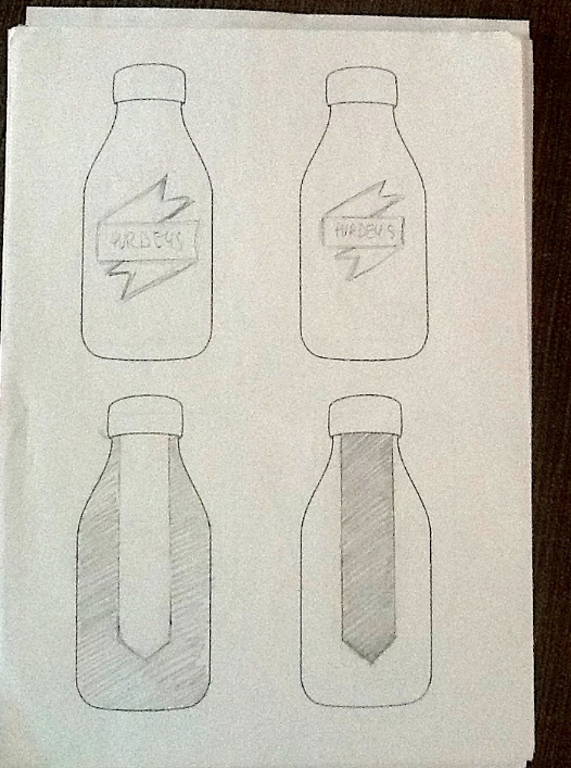
After speaking, Sarah and I thought that rather than looking at nets to make the 3d letters, we could simplify this concept by having a simple 2d cut out that could then be propped up on a simple slotting stand or with a hinged stand similar to those on a picture frame that can also be cut out and assembled.

I feel that this may help us to include more detail into the letters and the animals that with be present on the letter as well as helping to free up space on the restrictive size of the side of the cereal box.


CONCEPT DEFINITION ISSUES
As we started to look further into the ideas of animals as letters and the games we could proposed i started to feel a little unsure on the direction and definition of the idea that me and Sarah had decided on, I messaged Sarah my concerns and she had felt the same while trying to research and come up with ideas. because of this we decided that we had to meet up again and refine the concept as well as the aspects that we are willing to use on the product.

We agreed to carry on working and coming up with visuals until we could come together on Thursday. Then we could share ideas and imagery and determine a more defined concept that will result in a culmination of these ideas.


*  *  *  *


I continued to look at the different animals that could be used for each letter of the alphabet,. Now I had options, I started to look at how this could be visualised in to the animal characters. To do this I printed out a4 sheets of the first few letters of the alphabet in uppercase form. This then allowed me to maintain the integral shape of the letter while drawing possible animal shapes over the top.


*  *  *  * IMAGES *  *  *  *

I am happy with how these first few sketches turned out, however I feel that there should be a little more definition for the shape of the letter rather that the animal. Otherwise the letter can be lost and defeat the objective we are trying to perceive.


IDEA ON THE TEAR BACK QUESTION AND ANSWER ASPECT


*  *  *  * 


MEET UP & DISCUSSIONS
20 / 2 / 14

Sarah and I got together and shared ideas as well as some visuals we had both been working on. I showed my animal alphabet sketches and Sarah also brought along  some work she had been doing digitally.


Sarah came up with this visual using the Illustrator software, I really liked the texture and detail she had achieved as well as the shape and how it stayed integral to the shape of the letter (like I had stated previously). We both agreed that the animals had to look a little friendlier and fun, so as they appeal more to younger children, and this could be achieved by perhaps adding whites to the eyes, as well as softening the shape of the teeth.
Other than this i think that the initial progress has been very good.

After showing what we had so far, we started to discuss possible ideas and concepts that would then help us to get a more concrete concept that could be applied to each box.

1).  We will aim to achieve the designing and proposal of five different boxes that will be based on five different animals

2).  Each box will have:
- An animal shaped letter for cut out and directions for this.
- 5 interesting but understandable facts about the animal that is featuring on the box.
- A game that will also feature the animal and concentrate on the characteristics of the animal that will also be present in the facts.

Concerning the idea I had put forward about the question, answer and clue activity, We discussed the possibility of perhaps having some playing cards placed inside the box that can be collected. These cards can have questions relating the the 5 facts that are learnt on the outside of the box and can help children to retain the information they have learnt by with either playing with their parents or friends that are also familiar with the cereal and are collecting cards.

After settling on the basic idea for each box, We started to decide on the animals we wanted to base our 5 proposed boxes on.

We decided to stick to more abstract animals that children perhaps have not come into contact with before and may only see in zoos. We think that learning something completely new about animals that are not the norm, may be more beneficial. After deliberation on the possibilities we narrowed down some possible choices to: 

- Chameleon
- Jellyfish
- Octopus
- Elephant
- Owl
- Bear
- Gecko

We then started to look at the facts that could accompany the animals and how these could be transformed into games.


OCTOPUS
-  Octopuses have 3 hearts. Two pump blood through each of the gills and 1 pumps blood through the rest of the body.
-  If all else fails, octopuses can loose one of their arms to escape a predator and they will regrow in time with no real permanent damage.
-  They have been known to play with a toy and to have individual responses and temperaments.

SOURCE

-  The areas around the eyes, suckers, arms, and web may darken so the octopus appears more threatening.
-  In early spring, octopuses move closer to the shore to mate. Two months after mating, the female releases 100,000-500,000 eggs. 
- There are 300 different species of octopus, all are venemous, but only one is deadly. 


*  *  *  *


GECKOS

-  Geckos are reptiles and are found on all the continents except Antarctica. These colorful lizards have adapted to habitats from rain forests, to deserts, to cold mountain slopes.
-  Geckos are also able to shed their tails if a predator grabs them. The gecko runs off leaving its twitching tail behind.
-  Most geckos make noises such as chirping, barking, and clicking when they are defending their territory or attracting a mate.
-  Most geckos don’t have movable eyelids and instead have one transparent eyelid which they keep clean by licking it with their tongues.
-  There are over 1,000 species of geckos. 


*  *  *  *


CHAMELEONS 

-  Almost half of the world’s chameleon species live on the island of Madagascar, with 59
different species existing nowhere outside of the island. There are approximately 160 species of chameleon. They range from Africa to southern Europe, and across south Asia to Sri Lanka. They have also been introduced into the United States in places such as Hawaii, California and Florida
-  Colour Changing. Most chameleons change from brown to green and back, but some can turn almost any colour. A change can occur in as little as 20 seconds. Chameleons are born with special cells that have a colour or pigment in them. These cells lie in layers under the chameleon’s outer skin. They are called chromatophores. The top layers of chromatophores have red or yellow pigment. The lower layers have blue or white pigment. When these pigment cells change, the chameleon’s skin colour changes.
Chromatophores change because they get a message from the brain. The message tells the cells to enlarge or to shrink. These actions cause cell pigments to mix—just like paint. A chemical called melanin also helps chameleons turn colour. Melanin fibers can spread like spiderwebs through layers of pigment cells and their presence causes skin to darken.
Many people think chameleons change colour to blend in with their surroundings. 
-  Chameleon eyes have a 360-degree arc of vision and can see two directions at once.
-  Chameleons vary greatly in size and body structure, with maximum total length varying from 15 millimetres (0.6 in) in male Brookesia micra (one of the world’s smallest reptiles) to 68.5 centimetres (30 in) in the male Furcifer oustaleti.
-  They have Ballistic tongues that are 1.5-2 times the length of their body.


*  *  *  *


OWLS
-  Owls are active at night (nocturnal)
- Owls can turn their heads as much as 270 degrees.

-  An owl has three eyelids: one for blinking, one for sleeping and one for keeping the eye clean and healthy.


    -  A group of owls is called a parliament, wisdom or study. Baby owls are called owlets.
-  Not all owls hoot, and owls can make a wide range of other sounds, such as screeches, whistles, barks and hisses.
-  During the nesting season, owl calls can often be heard up to a mile away. 

SOURCE


*  *  *  *


GRIZZLY BEAR

Grizzly bears have a better sense of smell than a hound dog and can detect food from miles away.
Top speed 35 mph.
Today, there are an estimated 1,800 grizzly bears remaining in five populations in the lower 48 states. Most of these bears are located in the Northern Continental Divide Population (including Glacier National Park) and the Yellowstone Population. Alaska is home to a healthy grizzly (sometimes called brown bear) population. 
Grizzly bears need to eat a lot in the summer and fall in order to build up sufficient fat reserves to survive the winter denning period.
Dramatic gatherings of grizzly bears can be seen at prime Alaskan fishing spots when the salmon run upstream for summer spawning. In this season, dozens of bears may gather to feast on the fish, craving fats that will sustain them through the long winter ahead.


*  *  *  *


JELLY FISH


  • -  Some can be very hard to see, nearly invisible to the human eye.


  • -  A group of jellyfish is called a ‘bloom’, ‘swarm’ or ‘smack’.


  • -  Large blooms can feature over 100000 jellyfish.


  • -  Jellyfish don’t have brains.


  • SOURCE


  •  some jellyfish are bigger than a human and others are as small as a pinhead?
     that jellyfish have been on Earth for millions of years, even before dinosaurs?


    *  *  *  * 


    ELEPHANT
    -  Elephants are the largest land animals in the world.
    -  Their brain is 3 or 4 times larger than that of humans although smaller as a proportion of body weight.
    -  Elephants purr like cats do, as a means of communication.

    Elephants have greeting ceremonies when a friend that has been away for some time returns to the group.
    - Elephants prefer one tusk over the other, just as people are either left or right-handed.
    -  The elephant trunk has more than 40,000 muscles in it.

    Tuesday 18 February 2014

    Responsive / Purdey's / Initial ideas / Research

    7 / 12 / 13
    OUGD503 / RESPONSIVE
    PURDEY'S / RESEARCH / INITIAL IDEAS
    D&AD COMPETITION BRIEF.


    IMAGES OF EXISTING BOTTLE AND THOUGHTS ON THE ACTUAL BOTTLE.


    INITIAL IDEASWhen thinking about the considerations for this brief and how I could approach it with a concept, I drew up a few diagrams to get down my ideas and possibilities. 


    I started looking at different bottle shapes to get some ideas on the solution I wanted to come up with for this brief (this is on my Design context blog).

    I liked the idea of playing with the light sensitive content of one of the beverages and maybe use this to relate and link to the beverage that is not light sensitive.

    with my experience win drinking for the existing packaging, i think because it is a thick glass bottle, it was quite awkward to drink from. I feel that this will mean i will have to use a new shape of bottle to ensure the ergonomics and comfort when drinking from the container.

     I also feel that the fact that this drink is sold with in supermarkets of small shops like whsmith (this is where i found some in the train station) makes it a little hidden and unnoticeable to the audience that are trying to connect with.

    I feel that this brand should maybe look into having supplies situated in coffee shop chains such as Starbuck, or even independent cafe's that are situated in little towns and villages as this is were most of their proposed cliental would be situated.

    I started by sketching up some ideas roughly onto the bottle shape to get an idea on the possibilities available to me.
    I used the existing bottle shape to start with so I could get an idea of size and layout of the product that already exists. I also thought that keeping the original bottle may help to stay true tho the existing brand as well as making it easier for the re-packaging turn over to take place because all they would have to do would make a new wrap.
     I thought about using some sort of pattern that could be altered in colour to indicate the flavour of beverage.

    Because the 'Rejuvanate' flavour needs to be kept covered so as the content does not react to light, i thought about playing with this concept through the packcaging of both beverages.
    I thought I could have resembling patterns and layouts on both bottles, however the background to this layout would be covered for the 'rejuvenate' flavour but clear/see through for the 'natural energy' flavour.

    I also like the die of using some kind of plant and foliage imagery to create the ethos of natural produce and health. Taking ideas from the brief I feel that even though this is to be seen as an energy drink, the fact that this is an energy drink that relays on natural sources for flavourings and benefits is the most important aspect of this product.

    To get the right balance between the energy aspects and the natural ethos will be something that i will have to consider through out my design process.

    I liked the ida of using plant based imagery because I feel that this is an important aspect of bothe products. I started to look at different way of incorporating such imagery. (shown on my context blog)


    *  *  *  *

    BOTANICAL

    BOTANY
    Botany, also called plant science or plant biology, is the science of plant life and a branch of biology. A botanist is a scientist who specializes in this field of study.

    EARLY BOTANY
    Botany originated as herbalism, the study and use of plants for their medicinal properties. The early recorded history of botany includes many ancient writings and plant classifications. Examples of early botanical works have been found in ancient sacred texts from India dating back to before 1100 BC, archaic Avestan writings,and works from China before it was unified in 221 BC.
    SOURCE


    I really like the connection that I could make regarding the fact that botanical studies were originally carried out for medicinal purposes and go very well with the fact that the Purdeys brand pride them selves on using all natural ingredients to rejuvenate and replenish the consumer.


    BOTANICAL ILLUSTRATION
    Obviously due to the lack of technology during the early interest and understanding of plants, the botanists had to illustrate their findings and use these drawing to help identify characteristics and components of specific plat types.


    Early herbals and pharmacopoeia of many cultures have included the depiction of plants. This was intended to assist identification of a species, usually with some medicinal purpose. The earliest surviving illustrated botanical work is the Codex vindobonensis. It is a copy of Dioscorides’ de Materia Medica, and was made in the year 512 for Juliana Anicia, daughter of the former Western Roman Emperor Olybrius.

    When systems of botanical nomenclature began to be published, the need for a drawing or painting became optional. However, it was at this time that the profession of botanical illustrator began to emerge. The eighteenth century saw many advances in the printing processes, and the illustrations became more accurate in colour and detail. The increasing interest of amateur botanists, gardeners, and natural historians provided a market for botanical publications; the illustrations increased the appeal and accessibility of these to the general reader.
    SOURCE

    I feel like this topic would be a very neat way of approaching the Purdey's brief due to the symbolism and meaning behind the original of this type of art an the way in which this has a viable link to the approach the Purdey's brand has when creating these beverages.

    I started to look at different imagery of botany concentrating on mainly the types of fruit and plant extracts that are supplied with the brief.

    Apple / Peach / Grape / Oak / White tea.

    (I had some trouble with the Natural Energy flavour as all that was given in the ingredients was white tea and fruit juices. Because of this I decided to look at oranges and then possibly in the long run use some of the same imagery used for that Rejuvenate flavour.)

    I have been looking at some botanical artists on my ensign context blog.


    I started to look at possible imagery for these fruits. This included both photographic images  as well as botanical and hand drawn pieces.

    To be sure that I this method of aesthetic would work well I decided to test my ideas first before I took on the task of hand drawing all the different pieces of fruit.

    Through out the idea generation and research I had been looking at different bottle shapes on my context blog. Although I did want to change the bottle from the original shape. I didn't want to make the shape too crazy just because its worth keeping in mind that the product has to be manufacturable.


    This is my favourite bottle shape that I found through my research. I think that the square sides of the bottle offer a great base to work off of. I also like this shape because the its is different from the normal round sided bottle yet is still entirely reprousable not only in glass but also in plastic. This give a little flexibility to the Purdeys company considering a change of material (plastic may be more cost effective) that will also work with the issue of light sensitiveness.


    Personally I think that one of the most integral part of the original packaging is the circular badge that is situated on the lid.


    I think this is a very original, simple but clever piece of design and is something that I want to included into my design and perhaps have it as more of a focal point.


    I re-created the vector image using illustrator.


    I started to apply some of the imagery to this bottle to see what kind of results this would give.
     I quickly mocked up a bottle with the logo that was supplied through the prep pack downloaded from the webpage. I then arranged the images of the fruit on the bottle to get an idea of layout and too whether this would work.

    Im happy with the way this does look and i feel a lot more confident in investing time to draw up my own imagery.